

Concept Development
I began this project with just an idea for the restaurant: CTRL+EAT is a tech-driven fast-casual restaurant located in the South Congress area of Austin, TX. It caters to tech workers and students and has a clean, digital-first vibe.
I first developed a brand concept for the restaurant, creating a story, personality, and identifying the target audience.
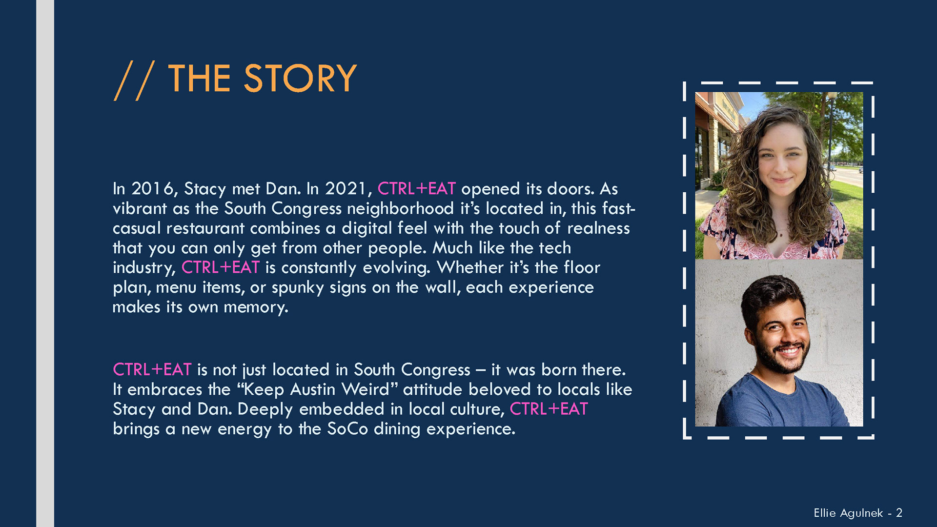
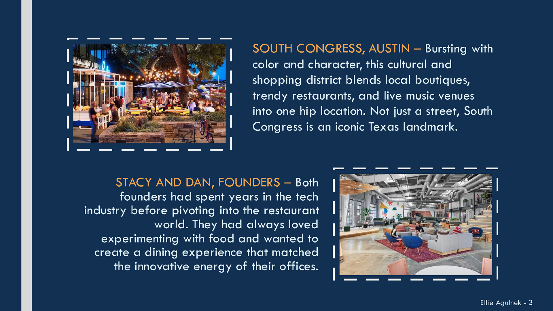
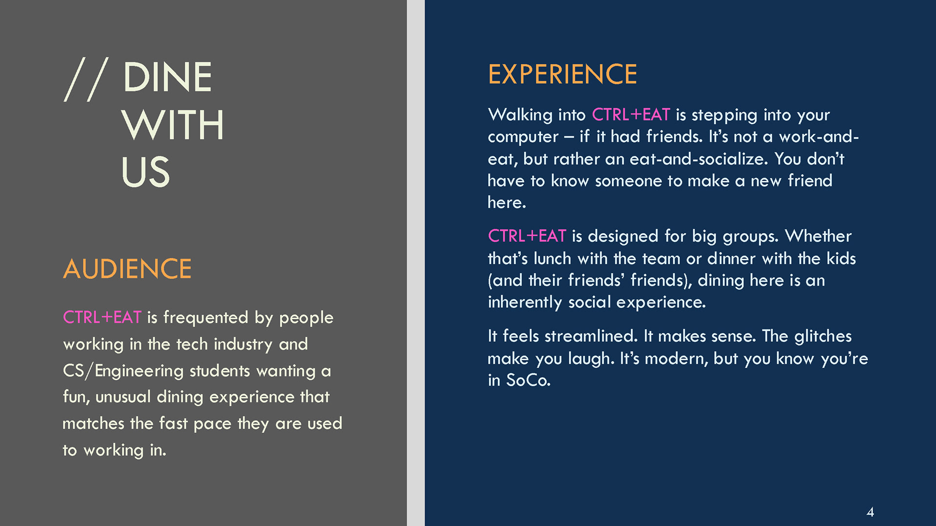
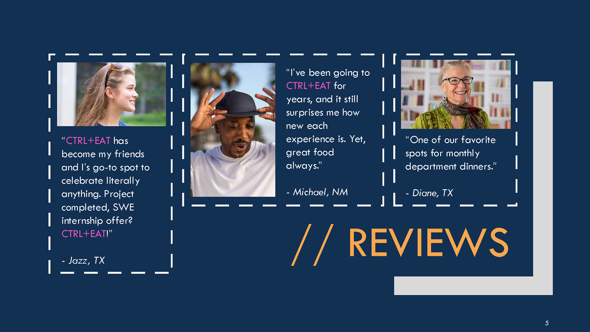
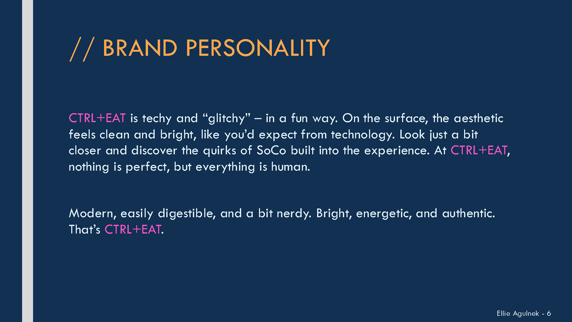
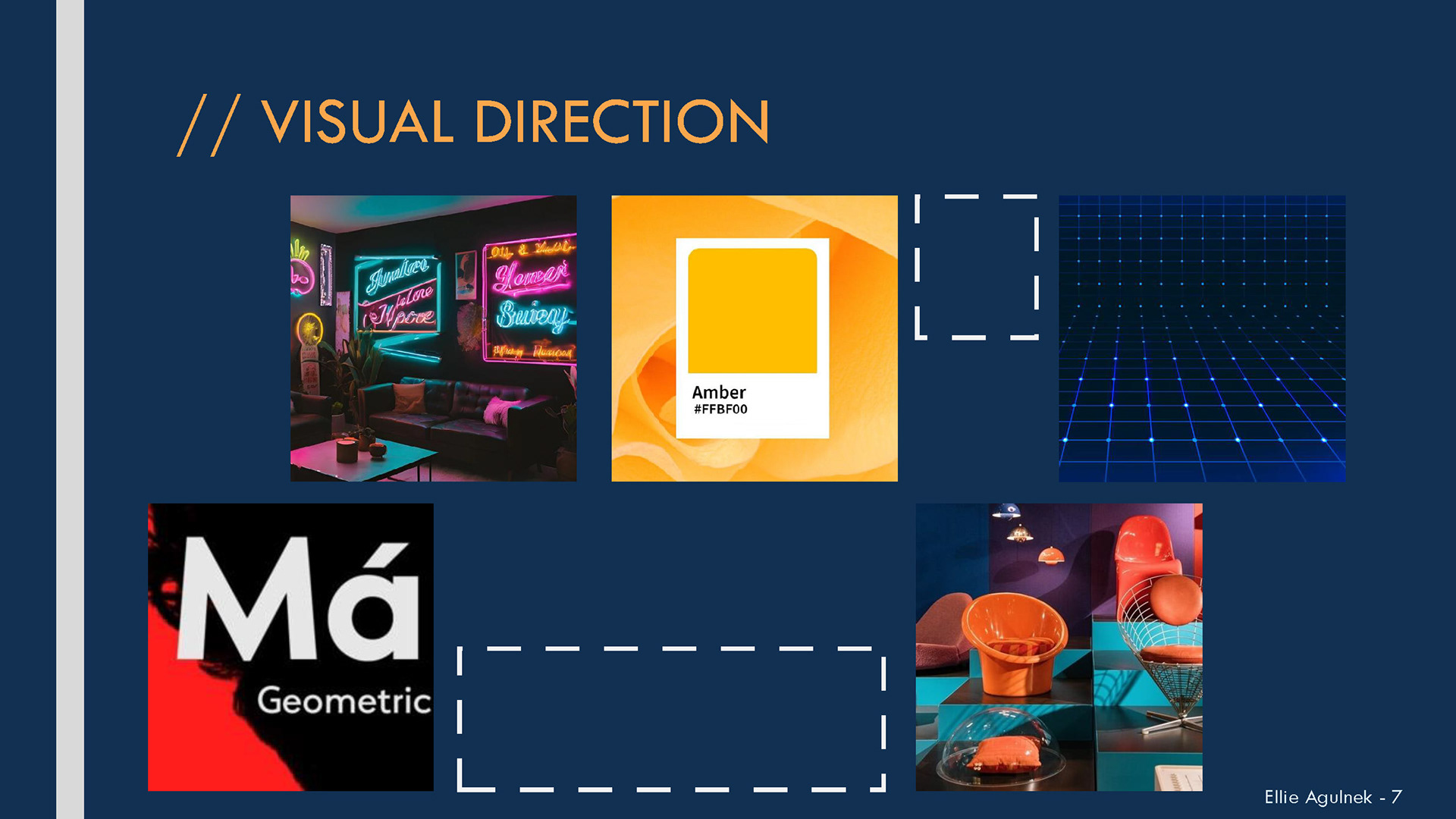
I also developed a moodboard to guide my visual direction as I got into the project.
Logo Development
With an understanding of my brand, I moved into developing the logo. I brainstormed a list of words associated with the restaurant and kept them in mind as I ideated.
While sketching, I pushed myself by developing at least a few of each type of logo: wordmarks, symbols, abstract marks, and combination marks.
Energy
Connection
Techy
Glitchy
Vibrant
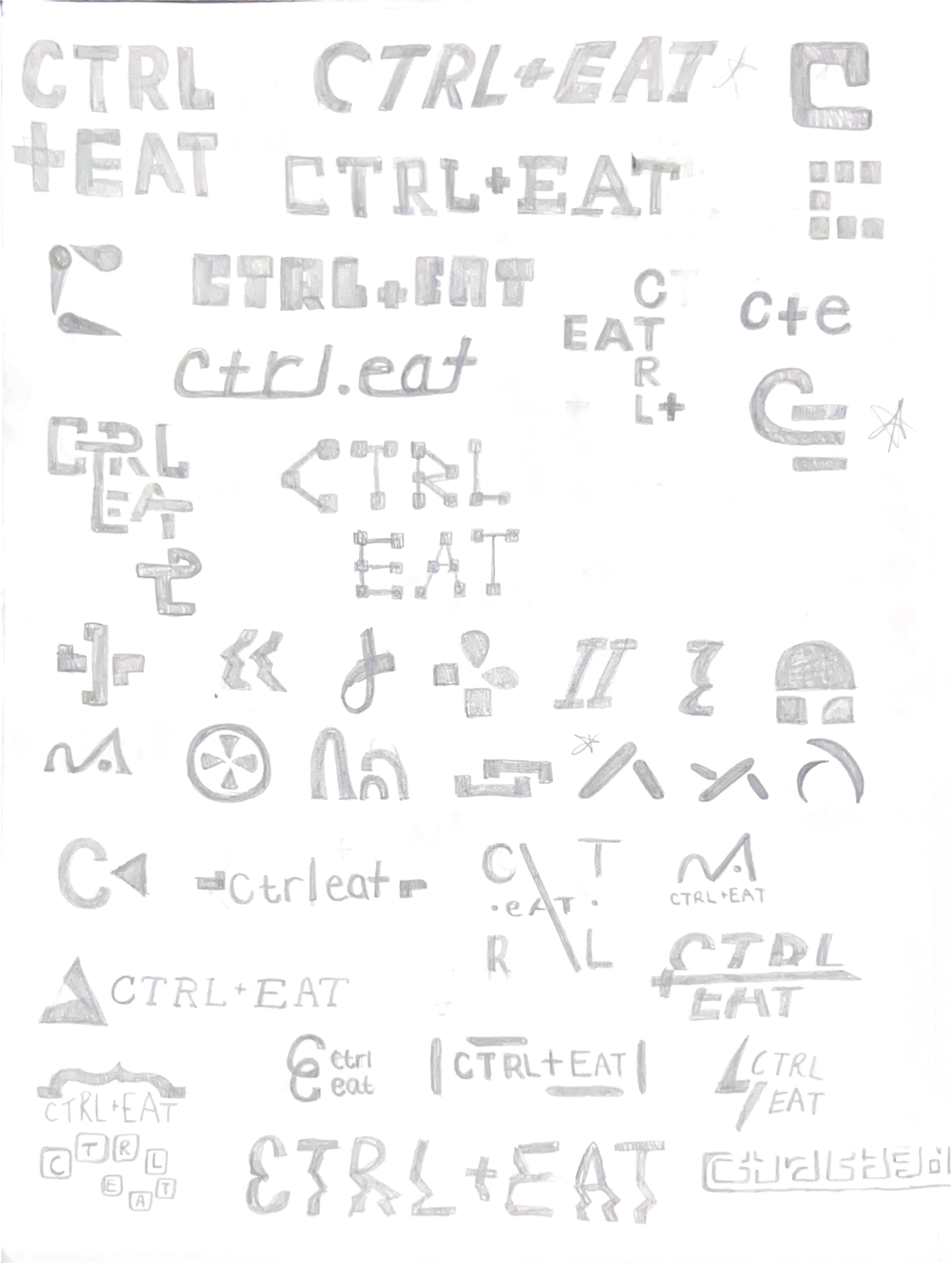
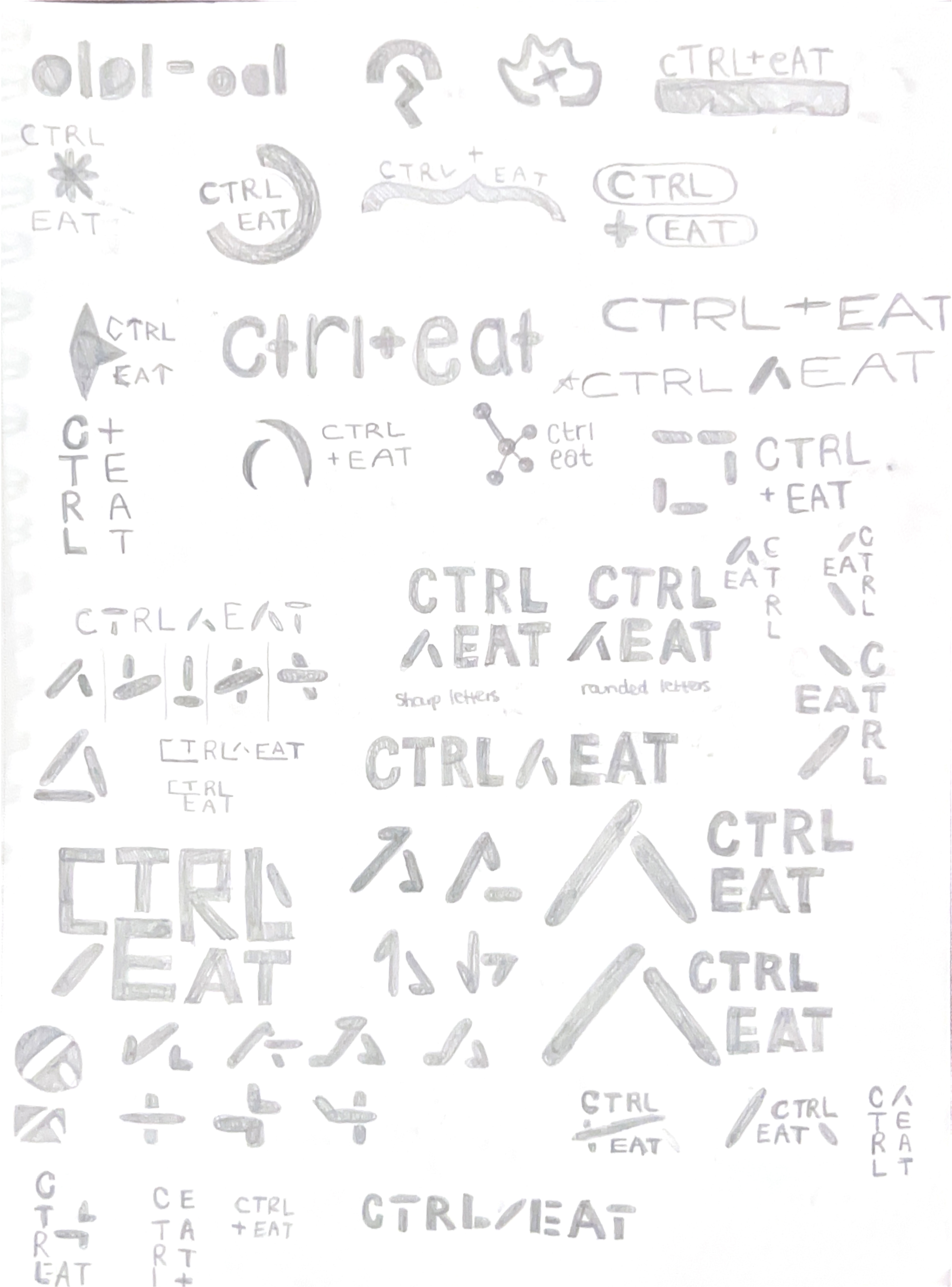
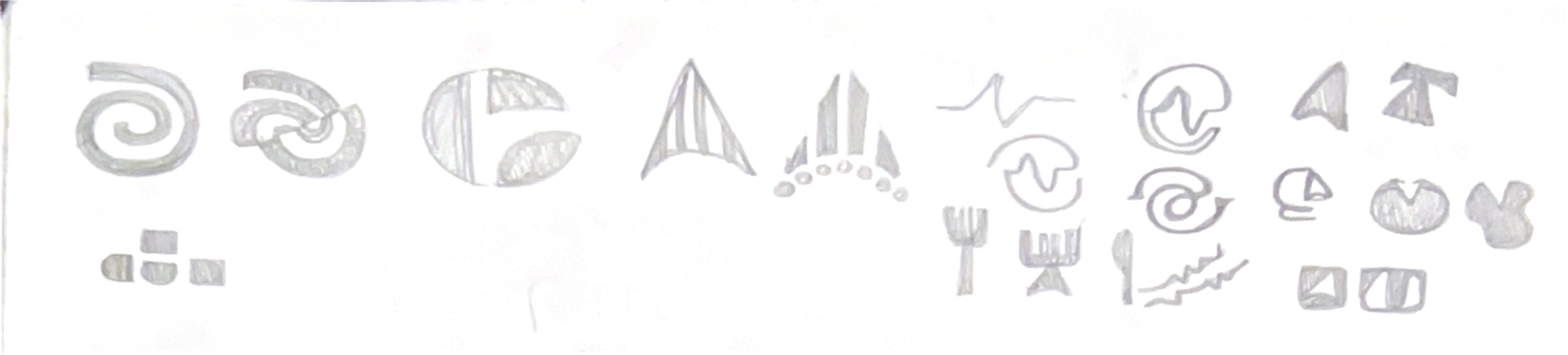
I played around with the /\ symbol quite a bit. I was inspired by the literal representation of the Control key on a Mac keyboard, and liked how the mark was flexible. I gave it a sense of movement through manipulating the figure and how it interacted with the CTRL EAT words. However, after building it in Illustrator, the mark did not feel quite right for the brand. It was too literally related to technology and didn't have any of the quirkiness of the restaurant.
I decided to move forward with one of my earlier ideas: CTRL+EAT in a sans serif letterform, vertically stacked.
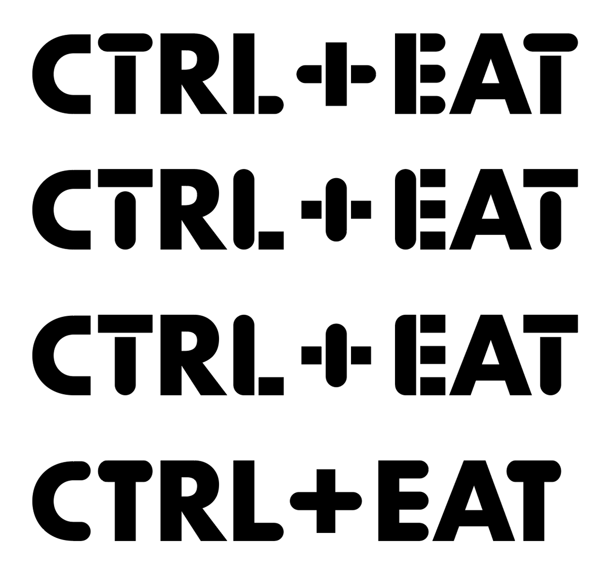
To build in the brand's quirky personality, I created a combination letterform using both square and rounded edge components. I experimented with how to combine them, settling on the bottom option. At first glance, it seems normal, but looking further, you notice the hybrid form.
Using the bottom variant as the base, I built out a flexible logo system for the brand. In line with the techy aspect of the restaurant, the logo is built to be modular and easily applicable.
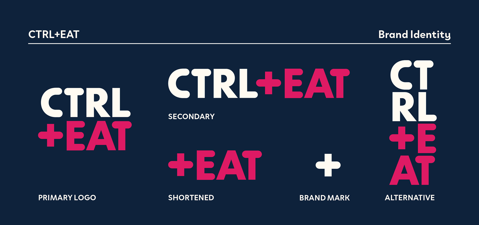
I went back and forth on deciding if the primary logo should be light-on-dark (as pictured), or vice versa. I settled on this to allude to a "dark mode," reminiscent of a digital interface.
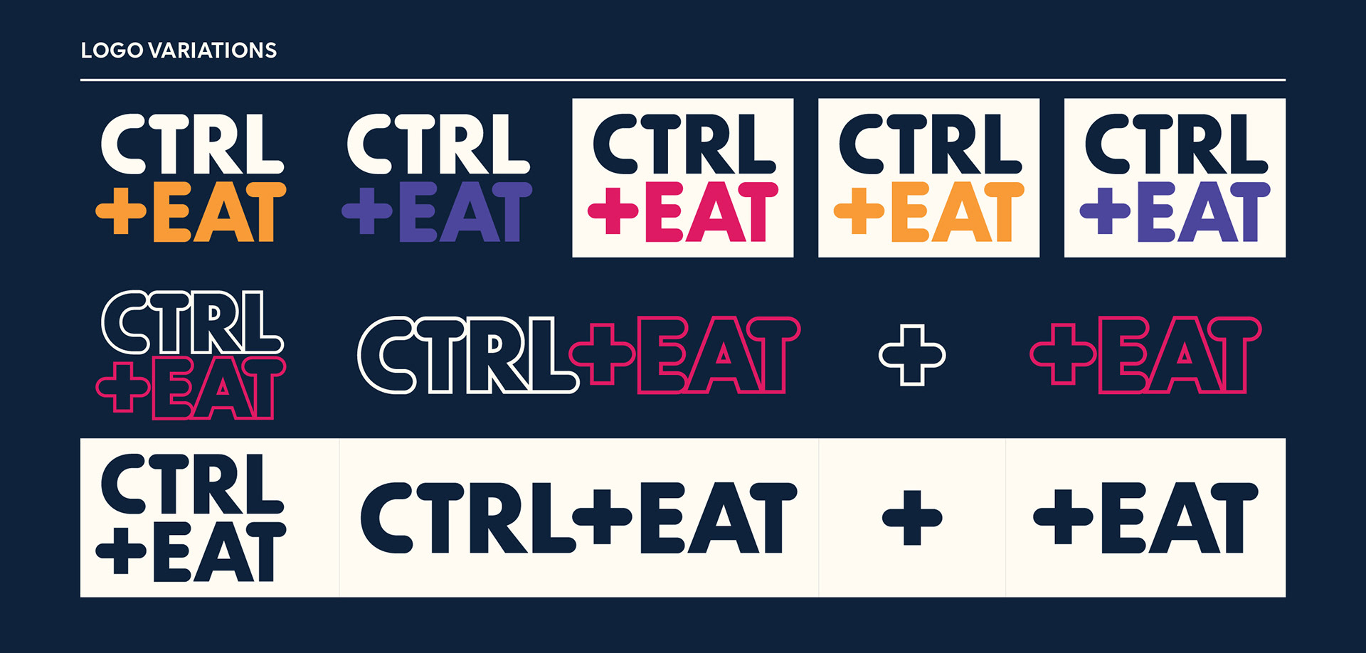
Variations. The logo is intended to be modular and highly flexible across every application, yet still feel part of the brand.
Color, Typography, and Brand Applications
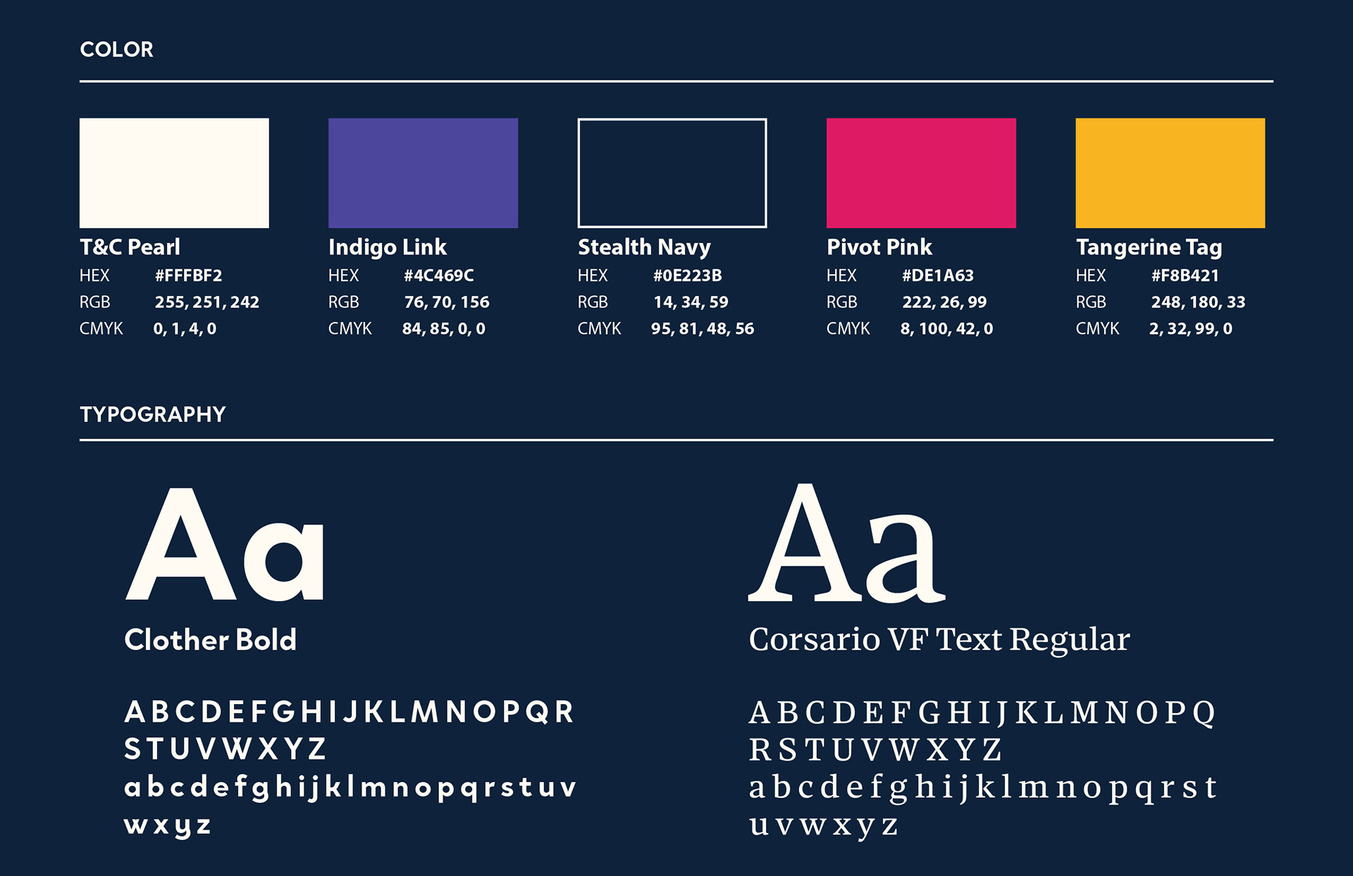
The brand's colors and typography evolved from the original slide deck. The colors were chosen to be vibrant against the dark background, stand strong alone, and when together, complement each other well. They allude to a digital interface and are bright and fun.
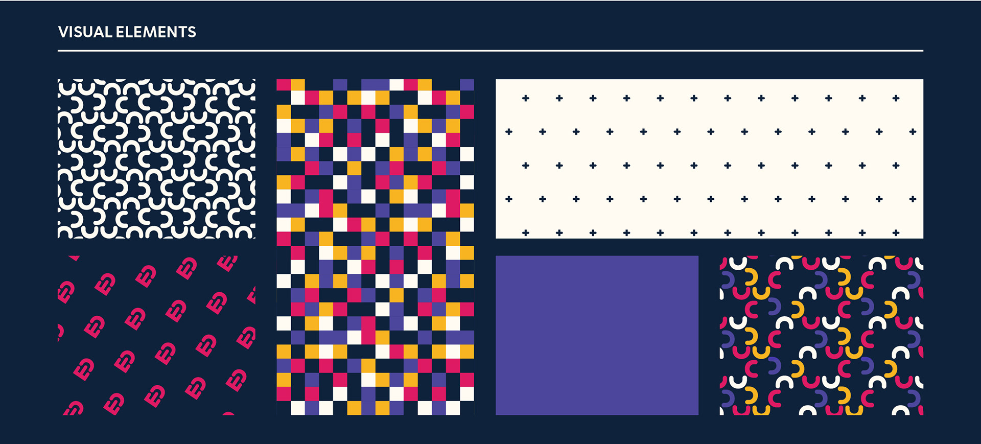
After solidifying the logo and colors, I further developed brand elements to be used across packaging and other applications.
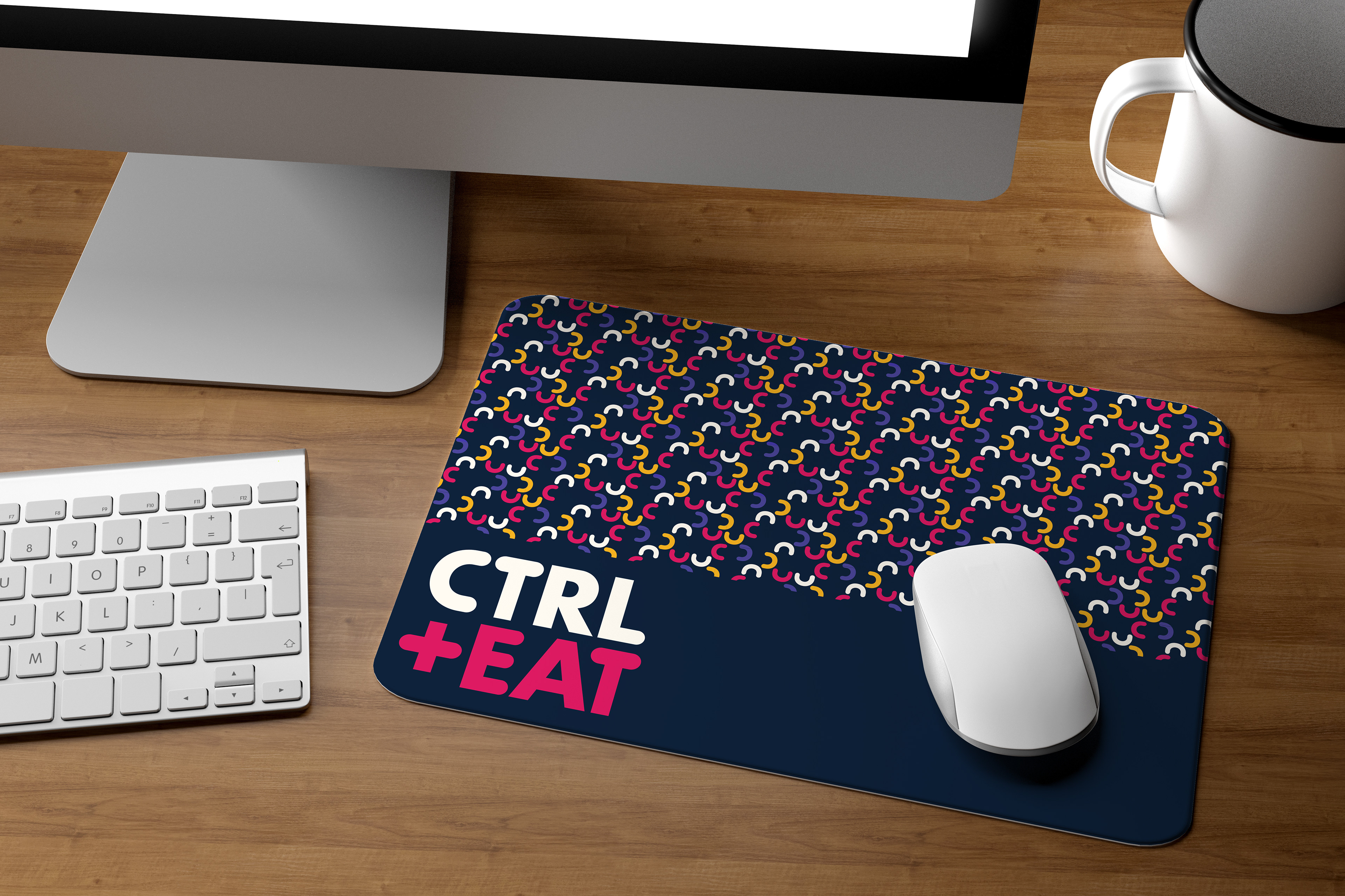
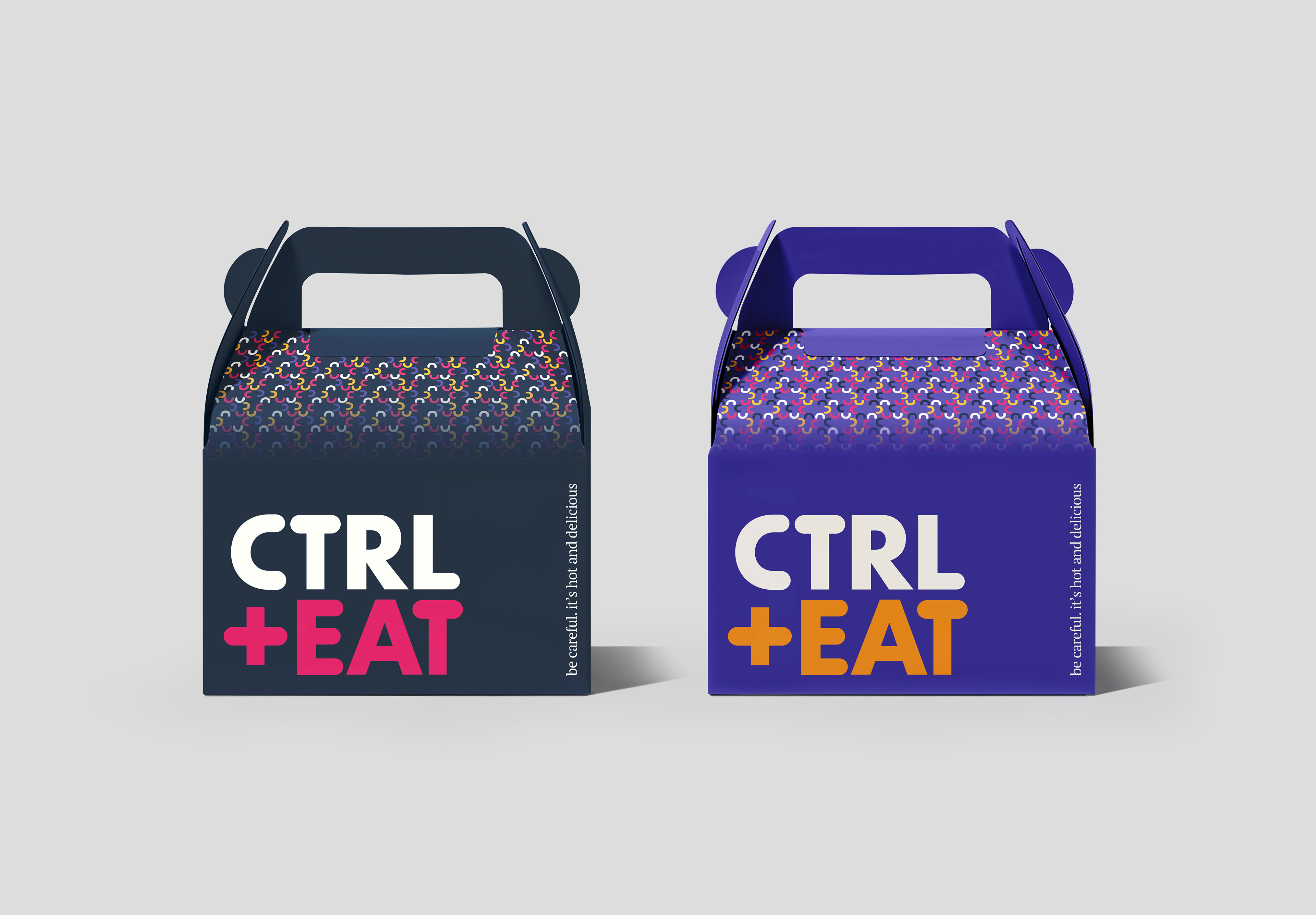
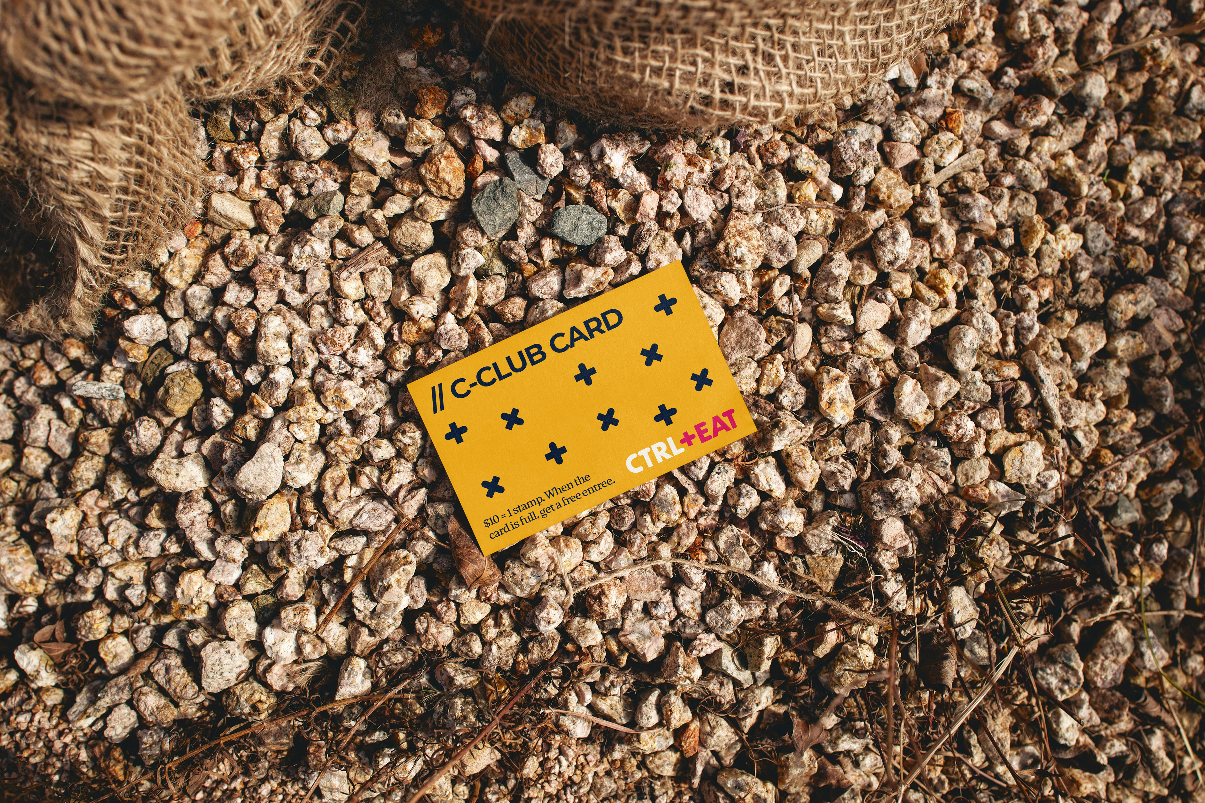
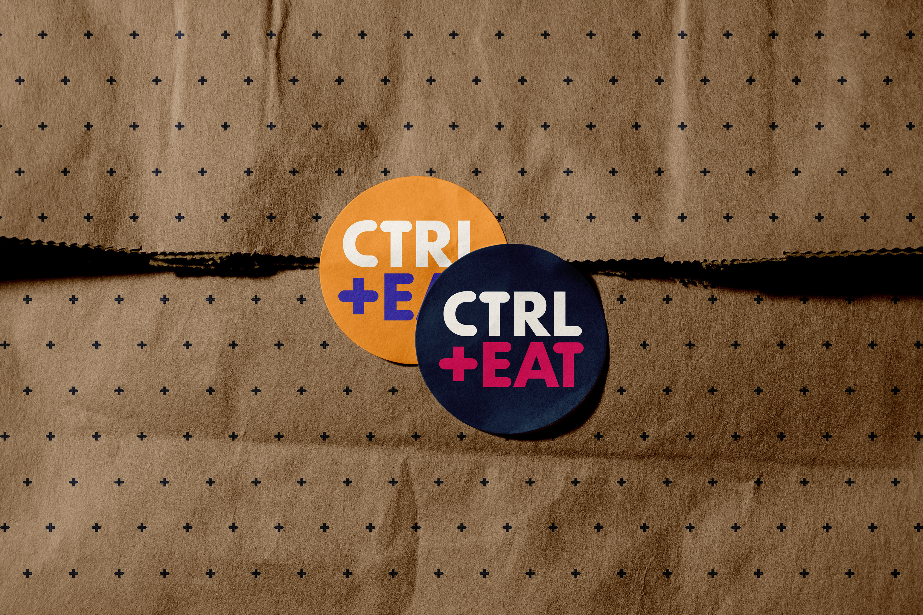
The CTRL+EAT brand in application.
Cookbook Planning
I chose to develop a cookbook for the restaurant to further apply the brand. CTRL+COOK is an extension of the CTRL+EAT brand; as the restaurant is ever-evolving, the book is a saved file of where they are right now.
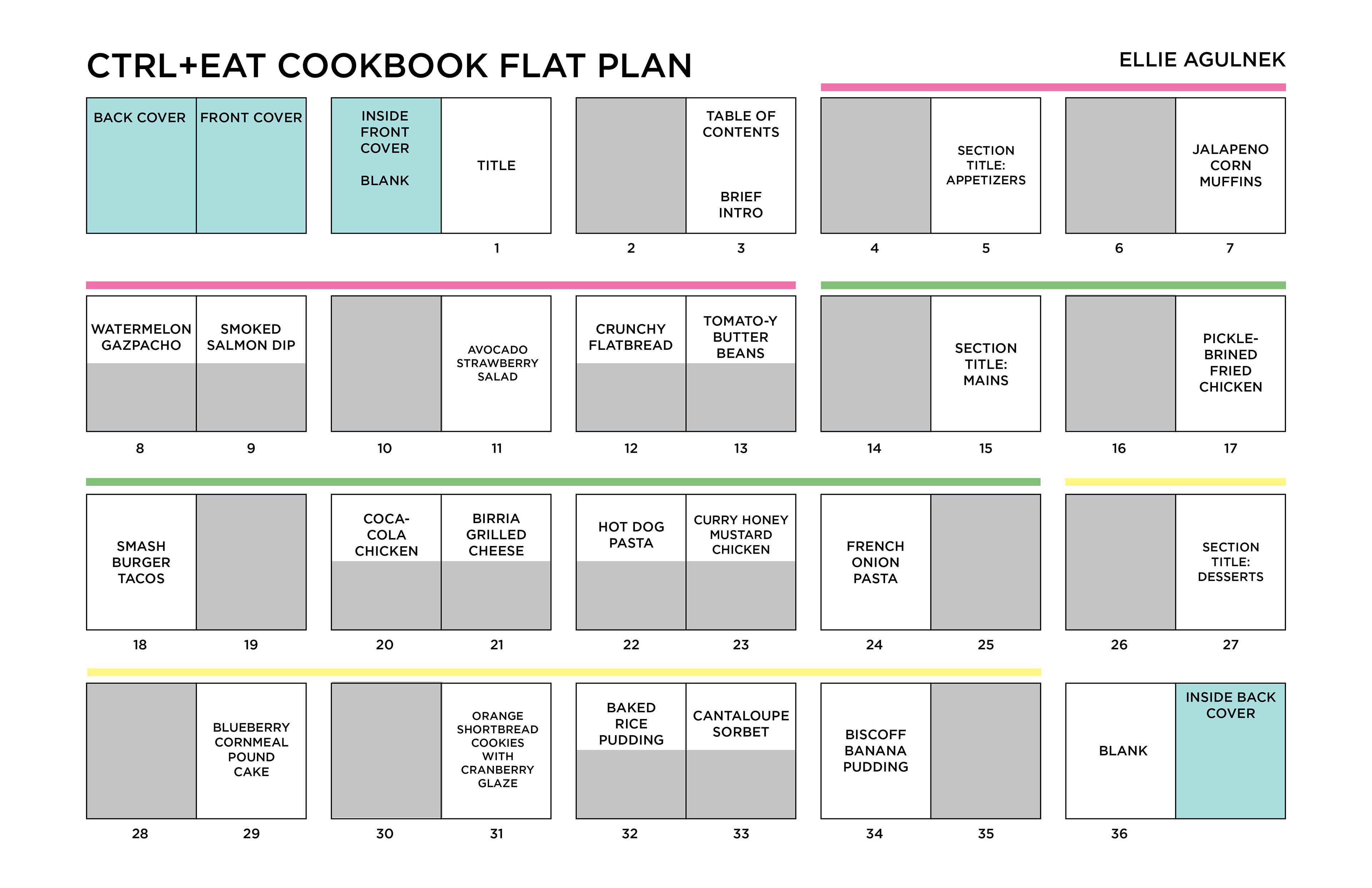
I began by gathering content and photos. True to the restaurant, the recipes in CTRL+COOK are unusual. They may not make sense at first glance, but they exceed expectations on the plate. Based on the content, I made a flat plan for the cookbook.
Spread Design
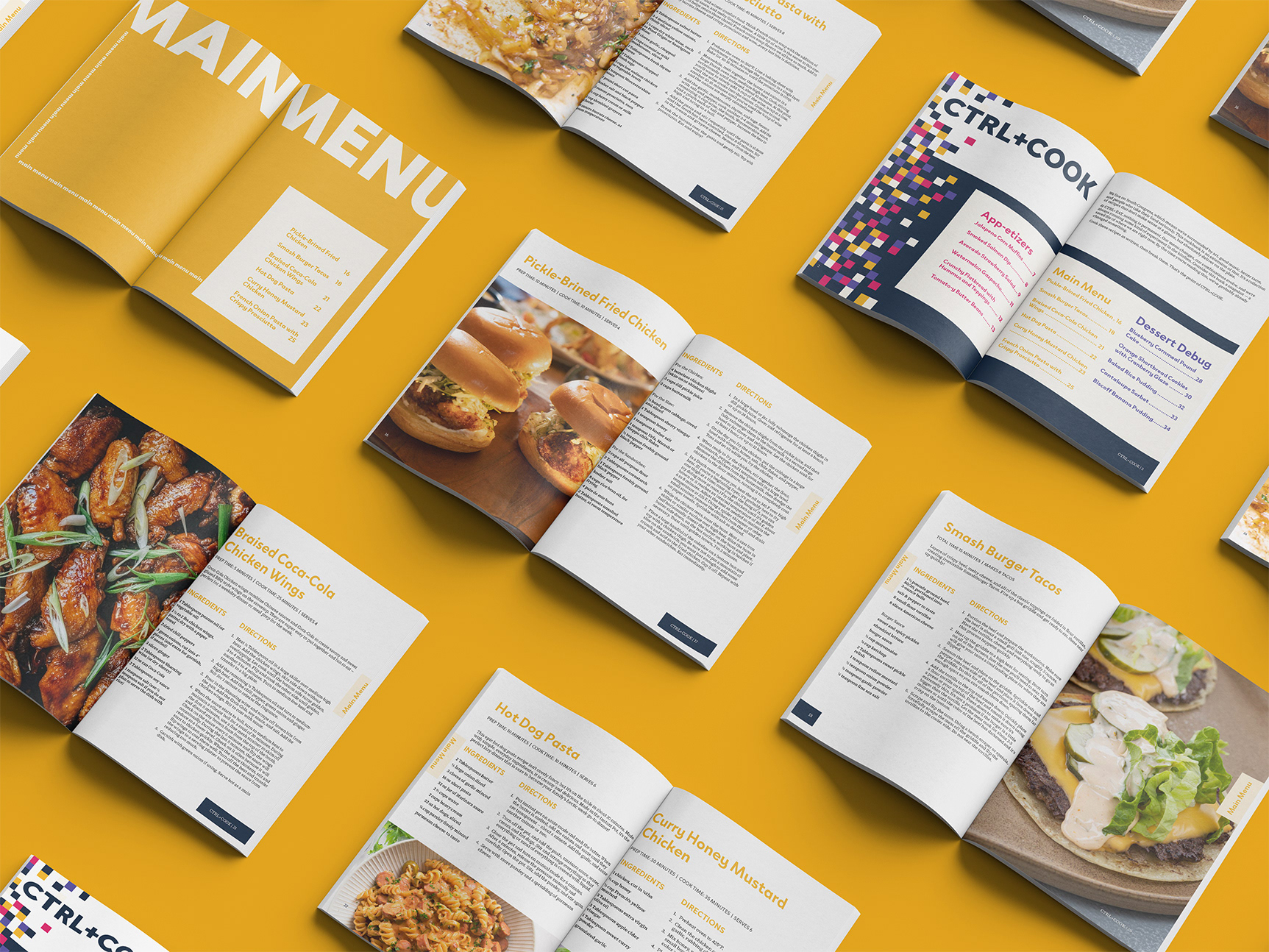
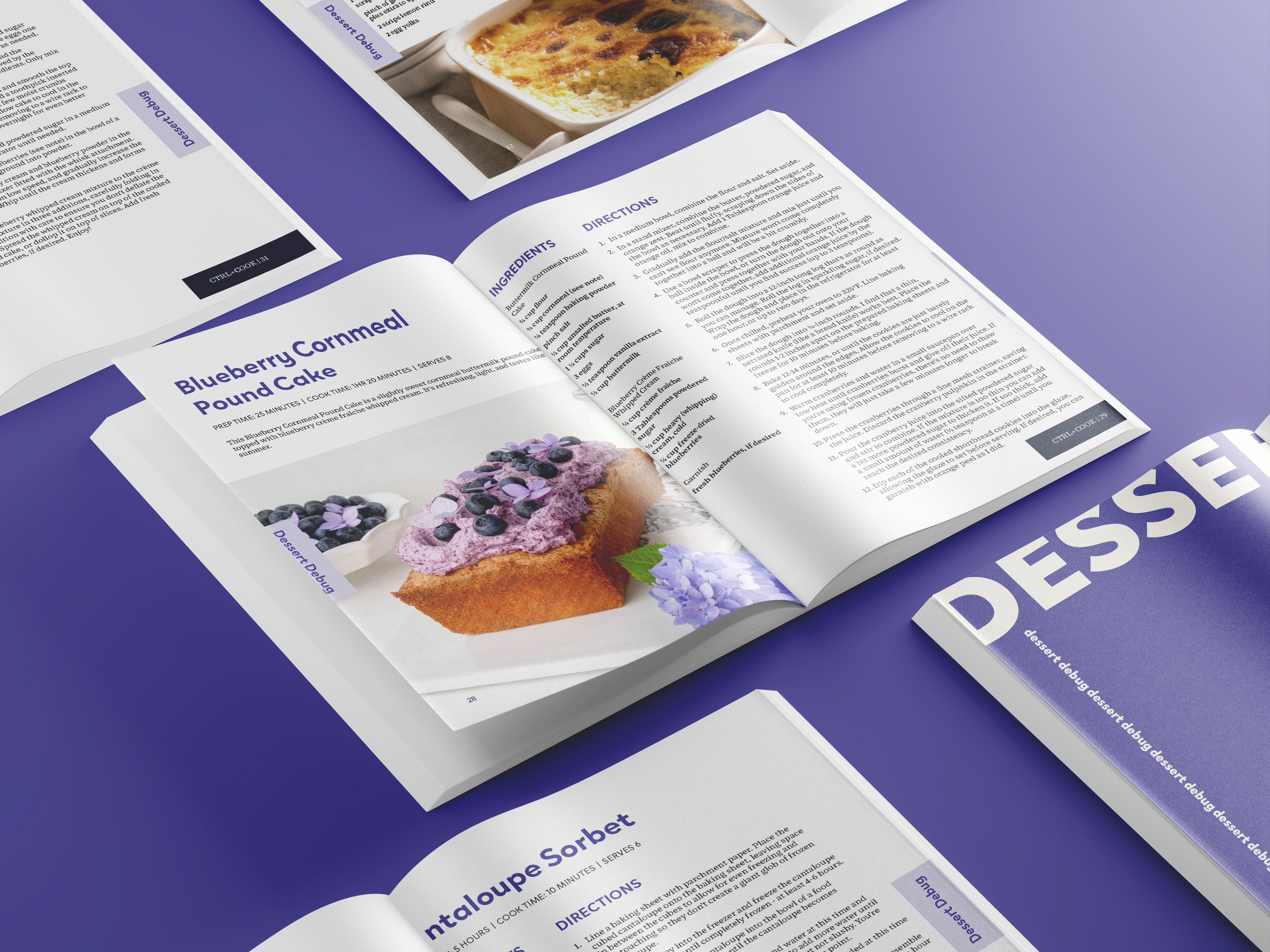
From there, I developed a grid system and style. I used the CTRL+EAT brand's color and typography throughout the book, keeping spreads consistent throughout the sections.

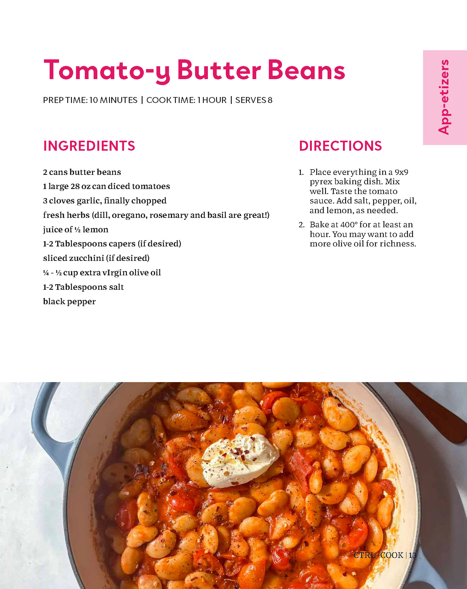
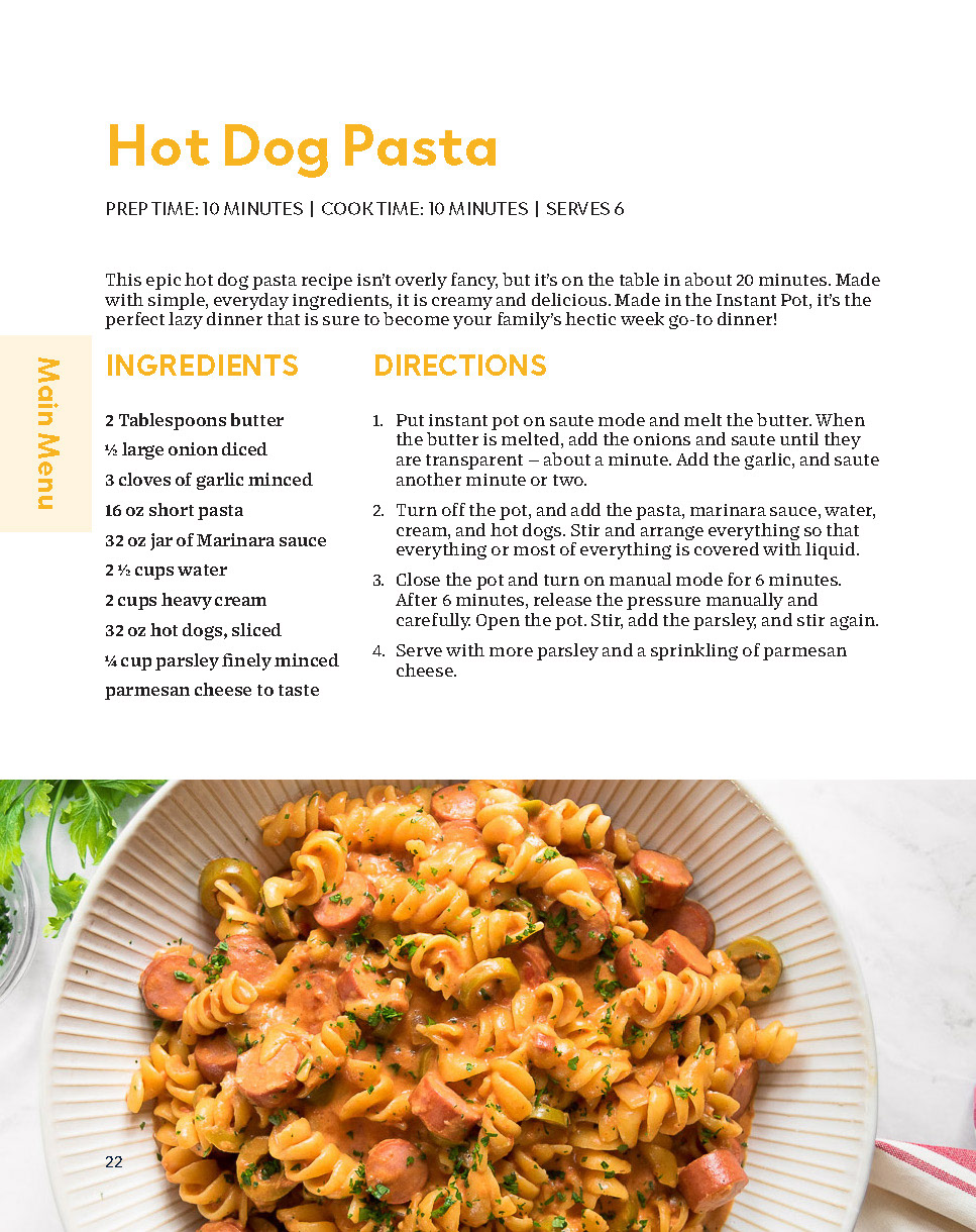
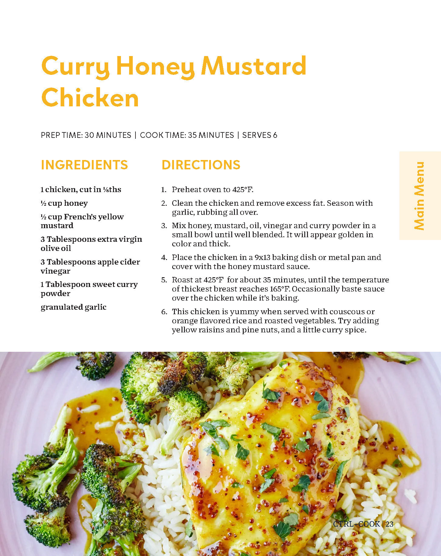
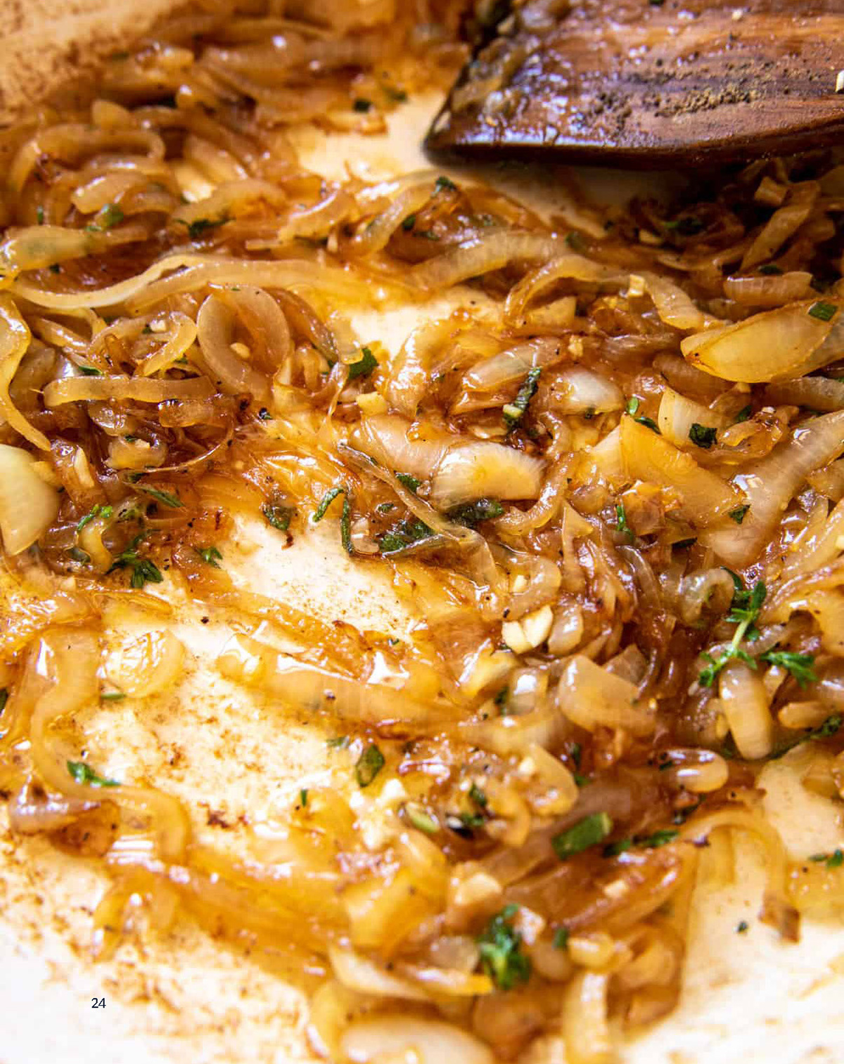
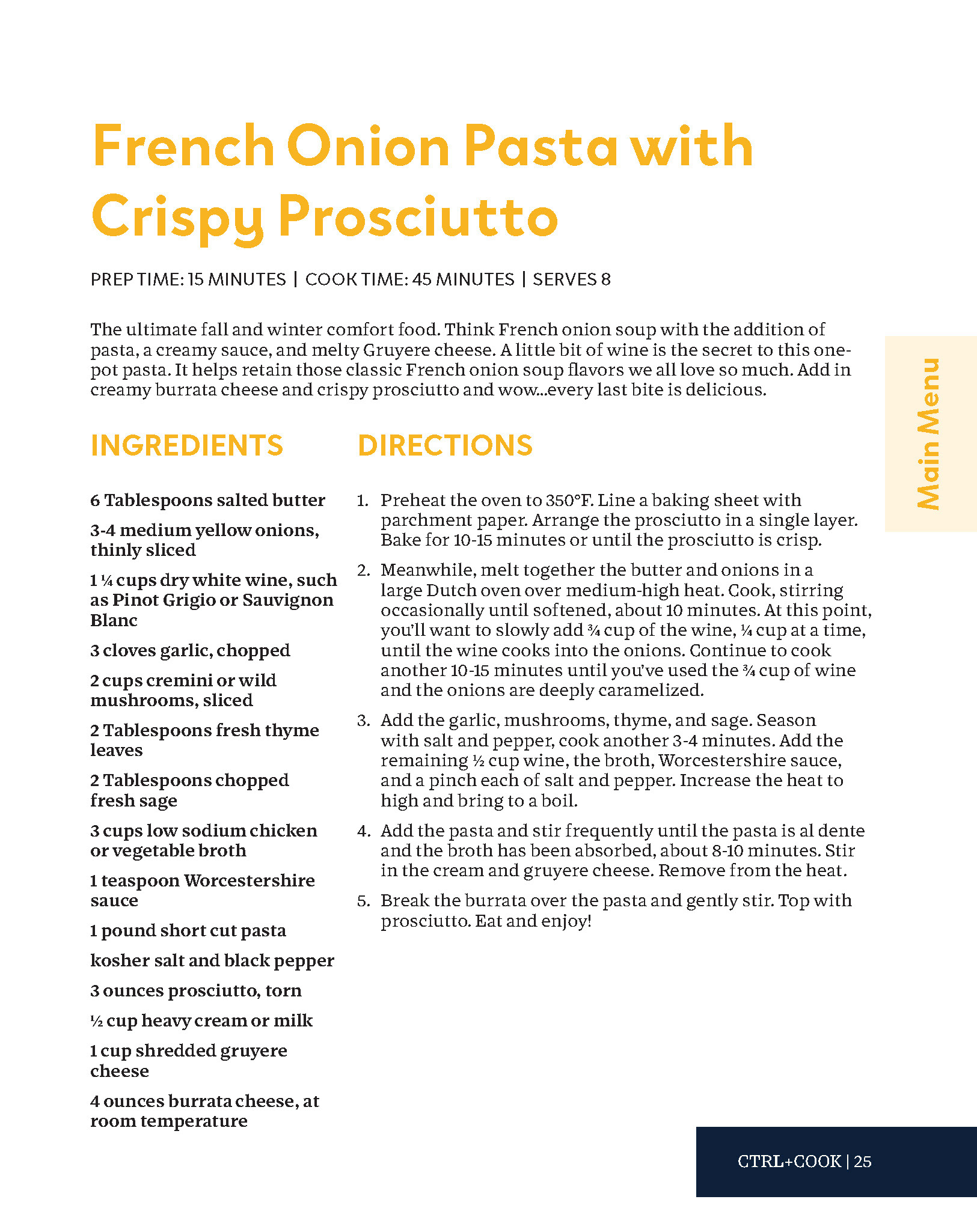
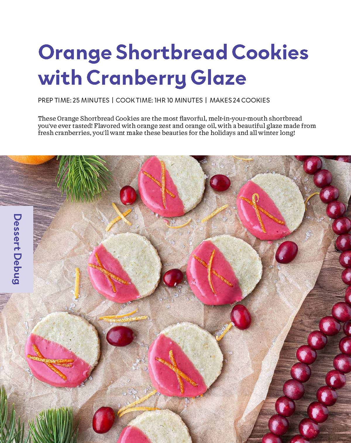
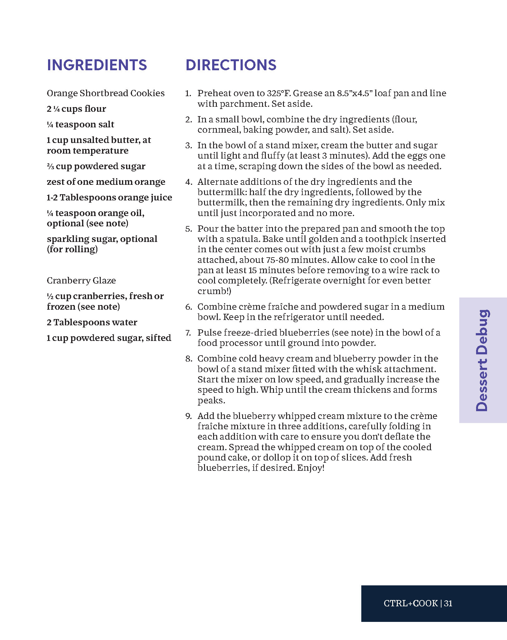
A selection of spreads.
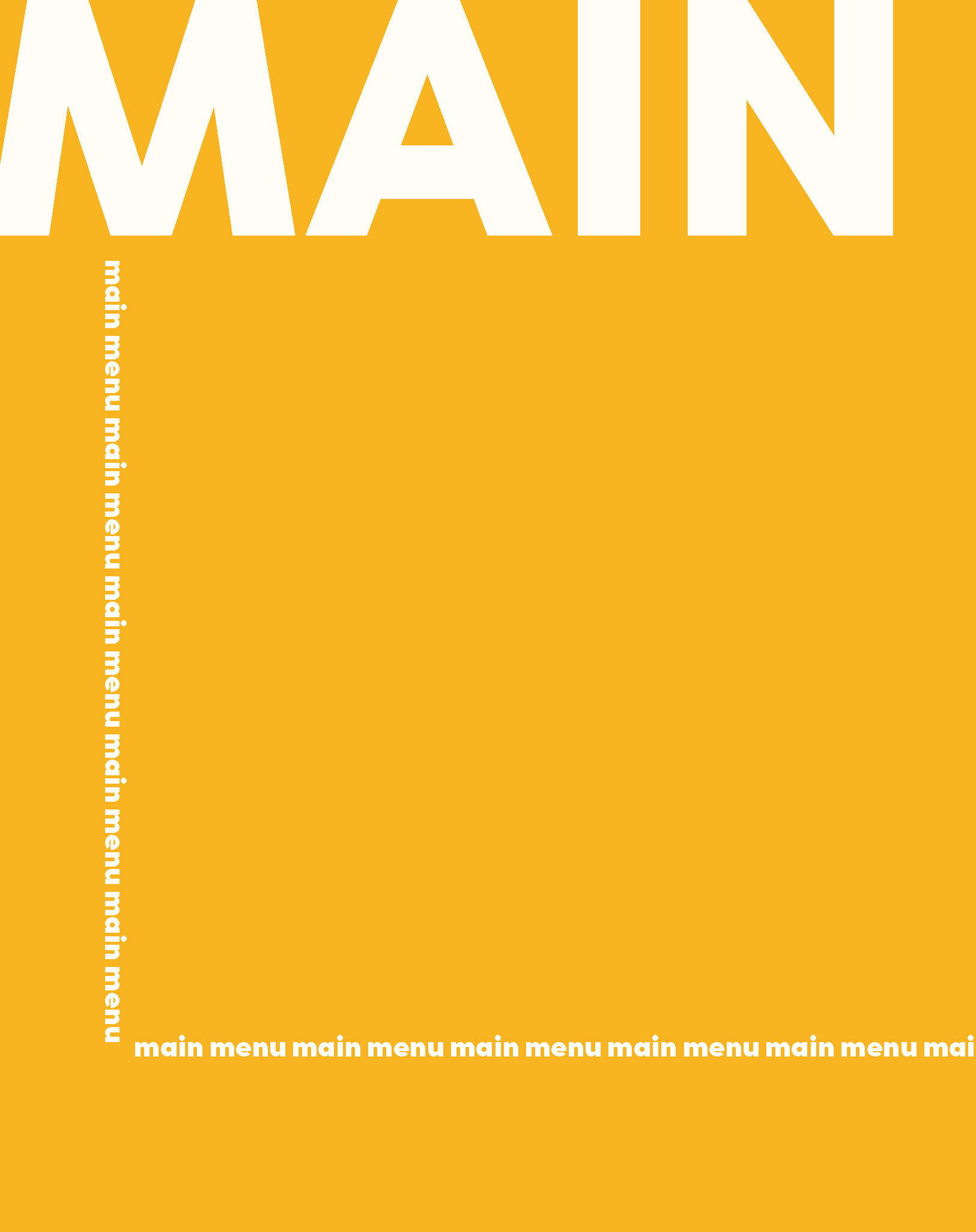
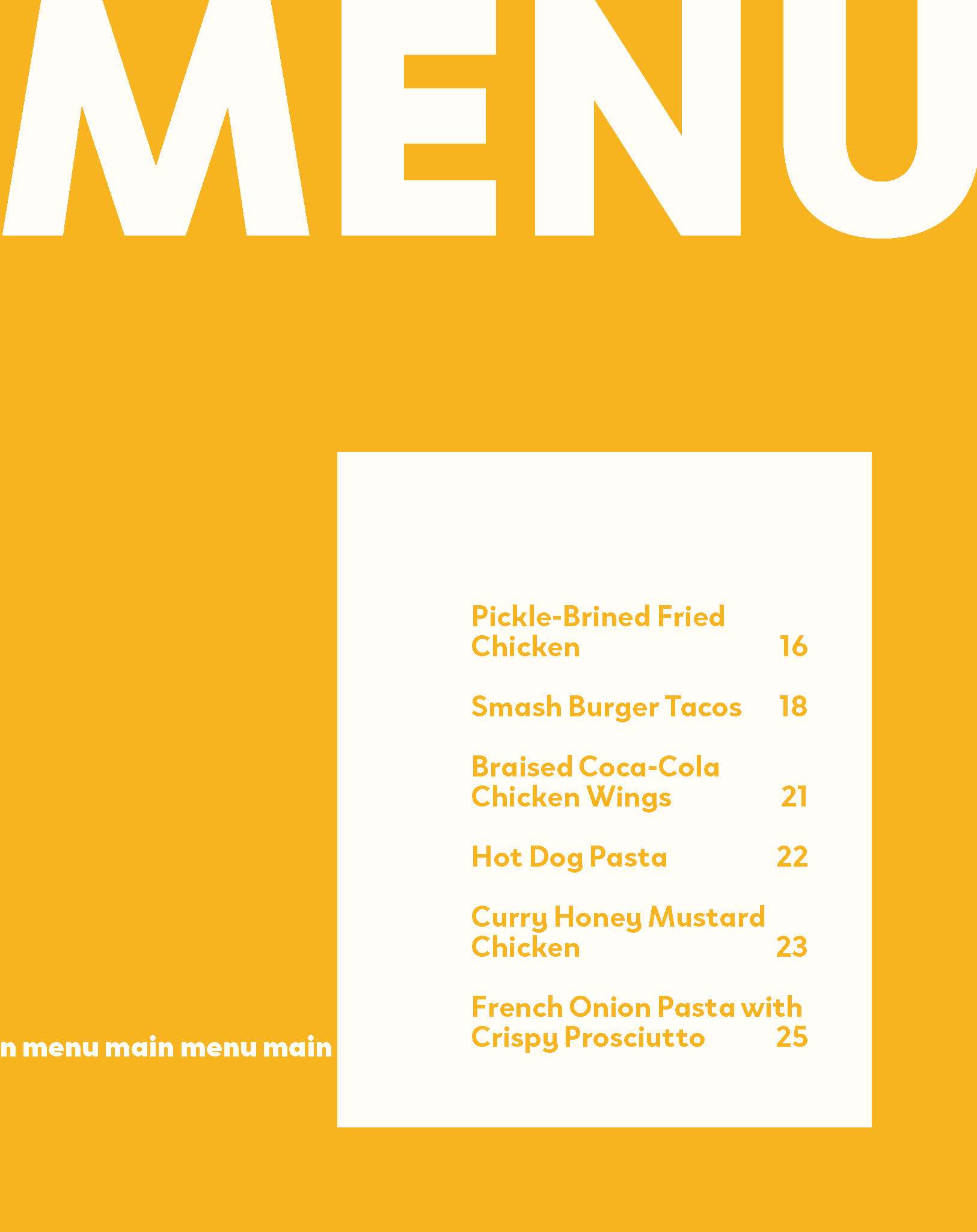
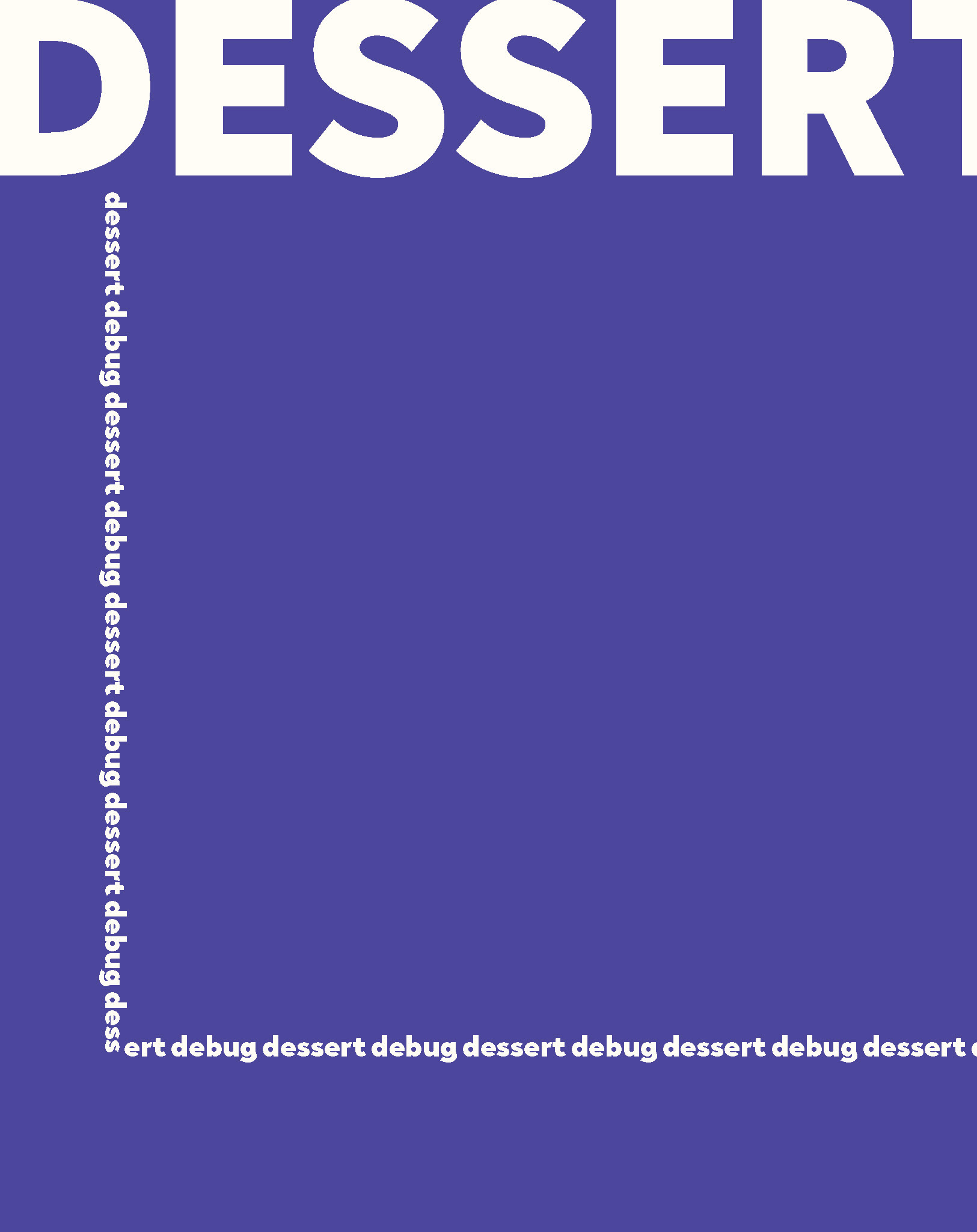
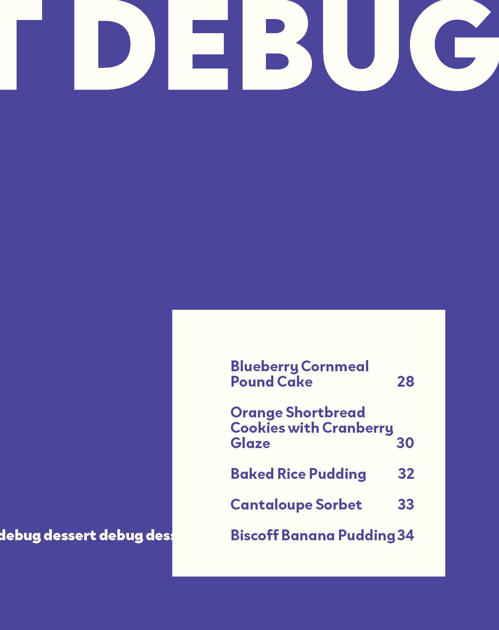
I played around with the section spreads, landing on a design where the color was a primary component.
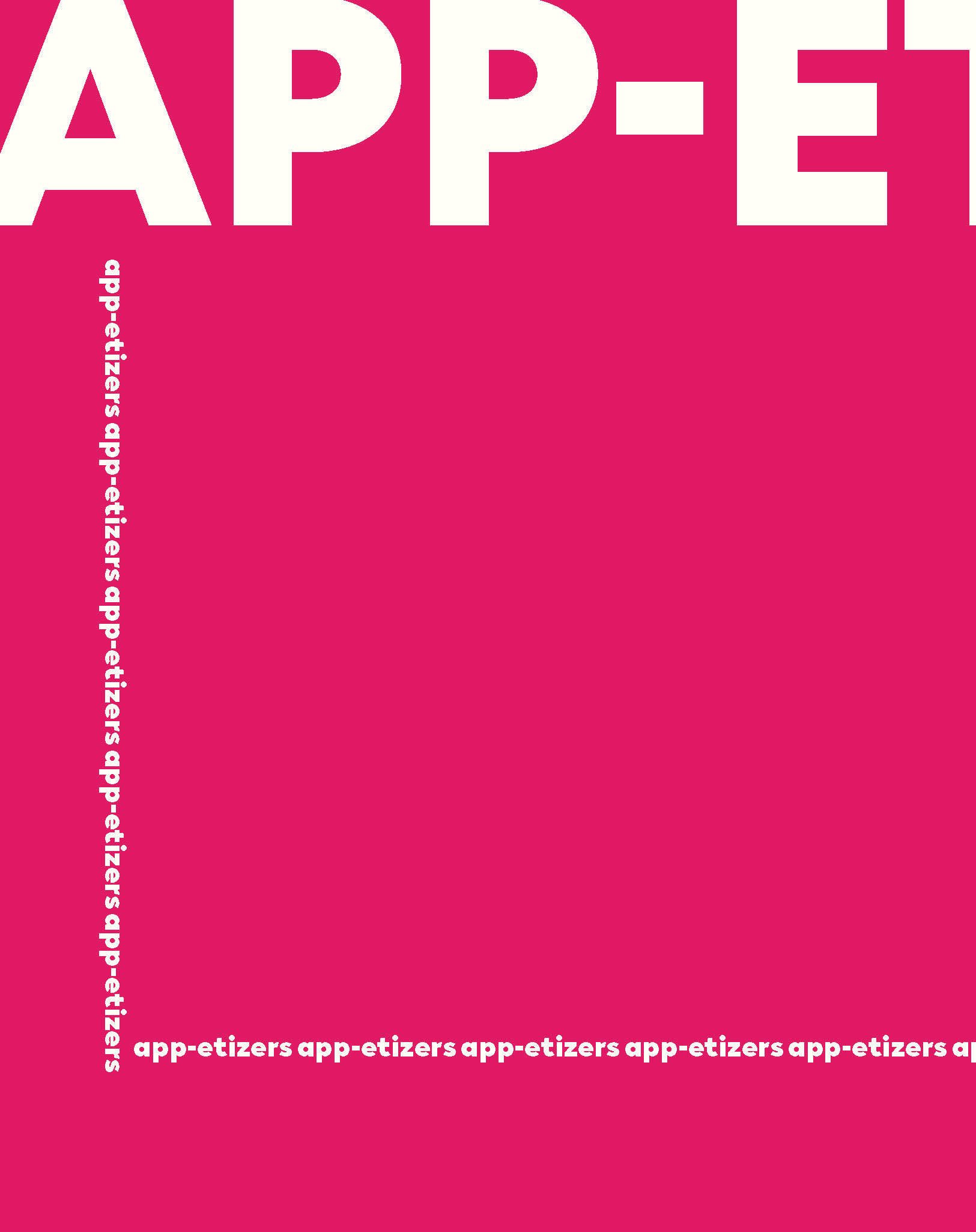
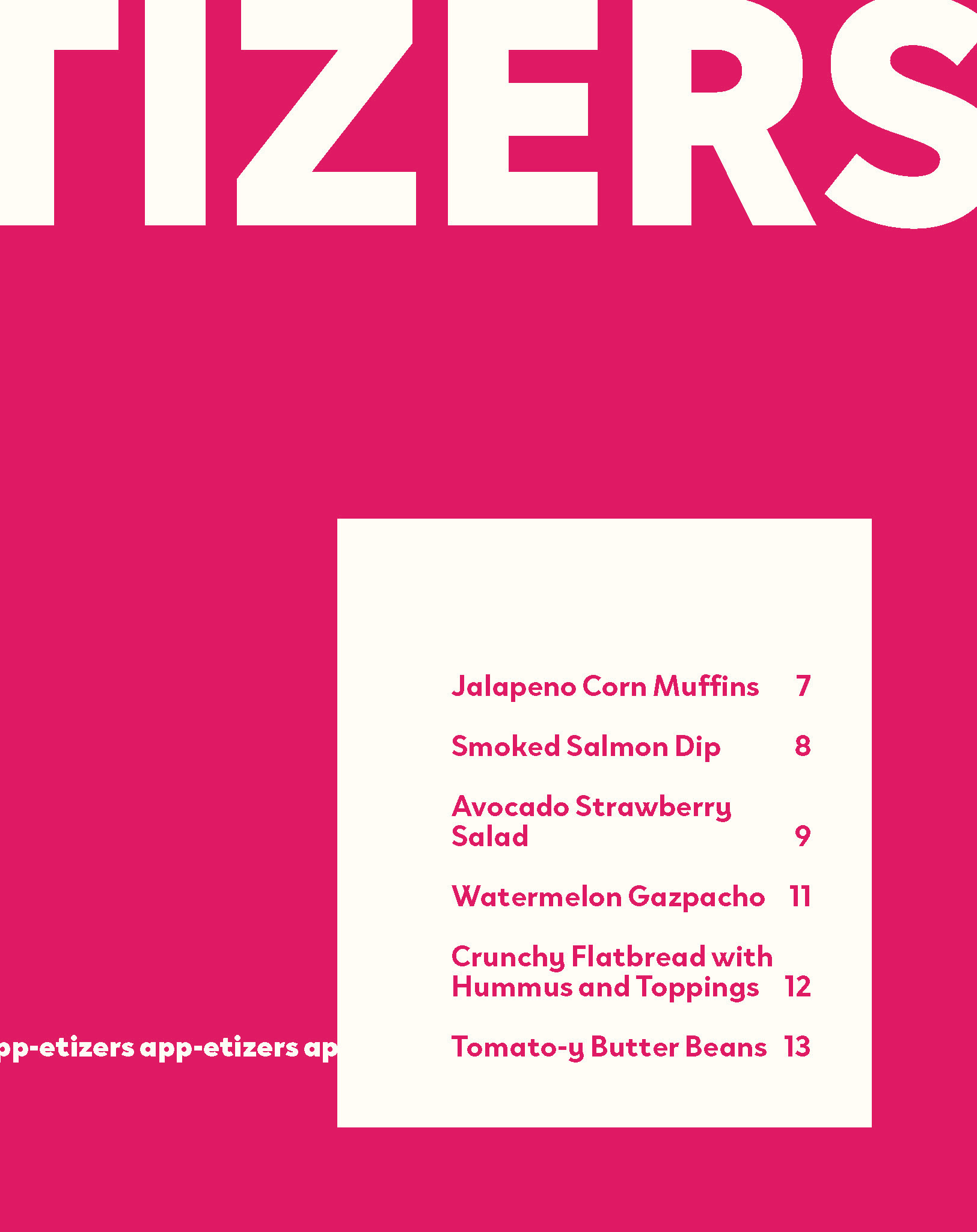
Cover Design
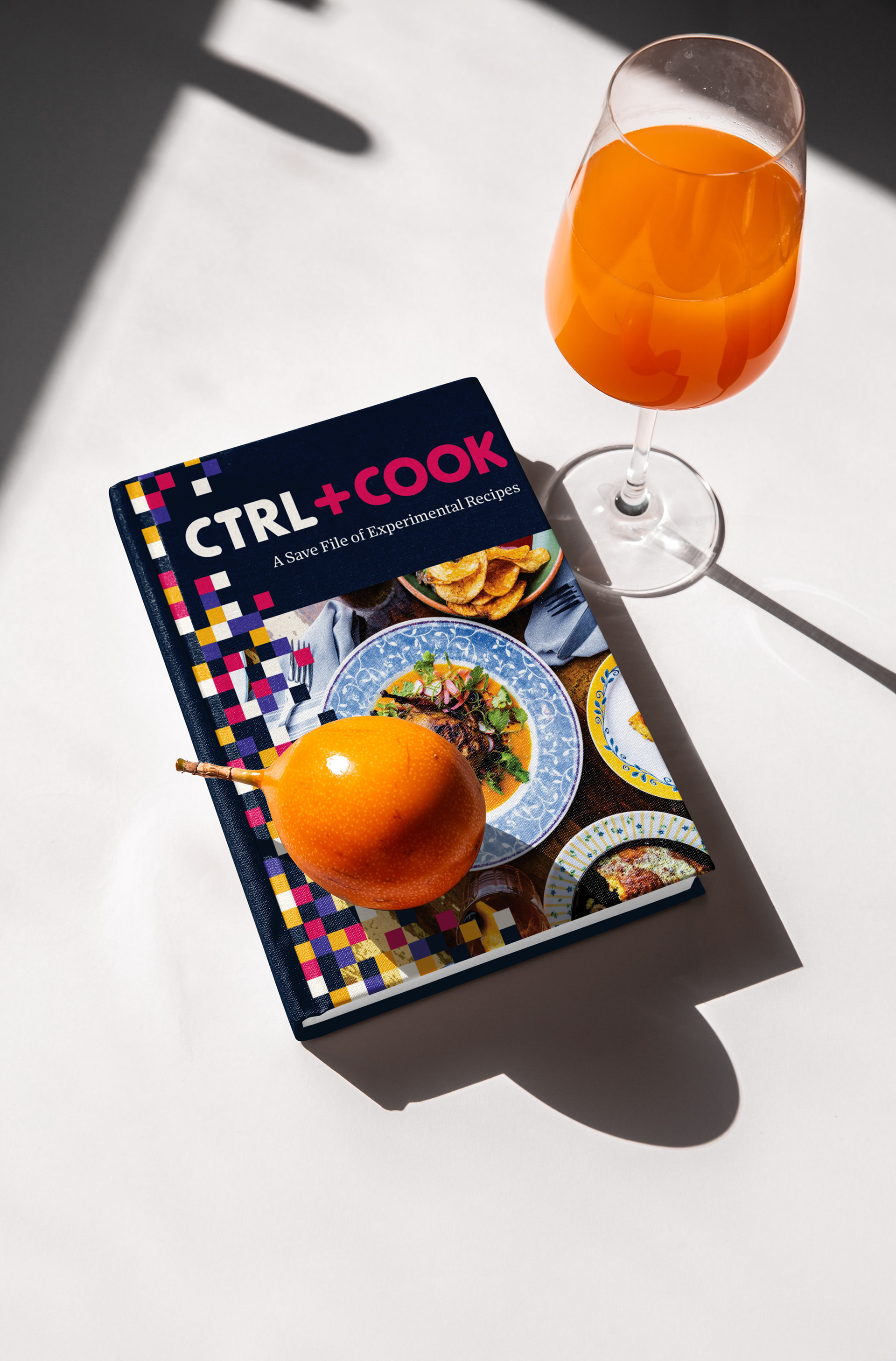
I went back to pencil and paper when I began my cover design to sketch ideas. I wanted food photography on the front to stay in line with it being a cookbook, as well as the book's logo relatively large.
The CTRL+EAT brand was intended to be flexible. In application, it can be separated, such as using +EAT as a short version. The brand can be extended by changing the word after CTRL+, so that's what I did for the cookbook: CTRL+COOK.
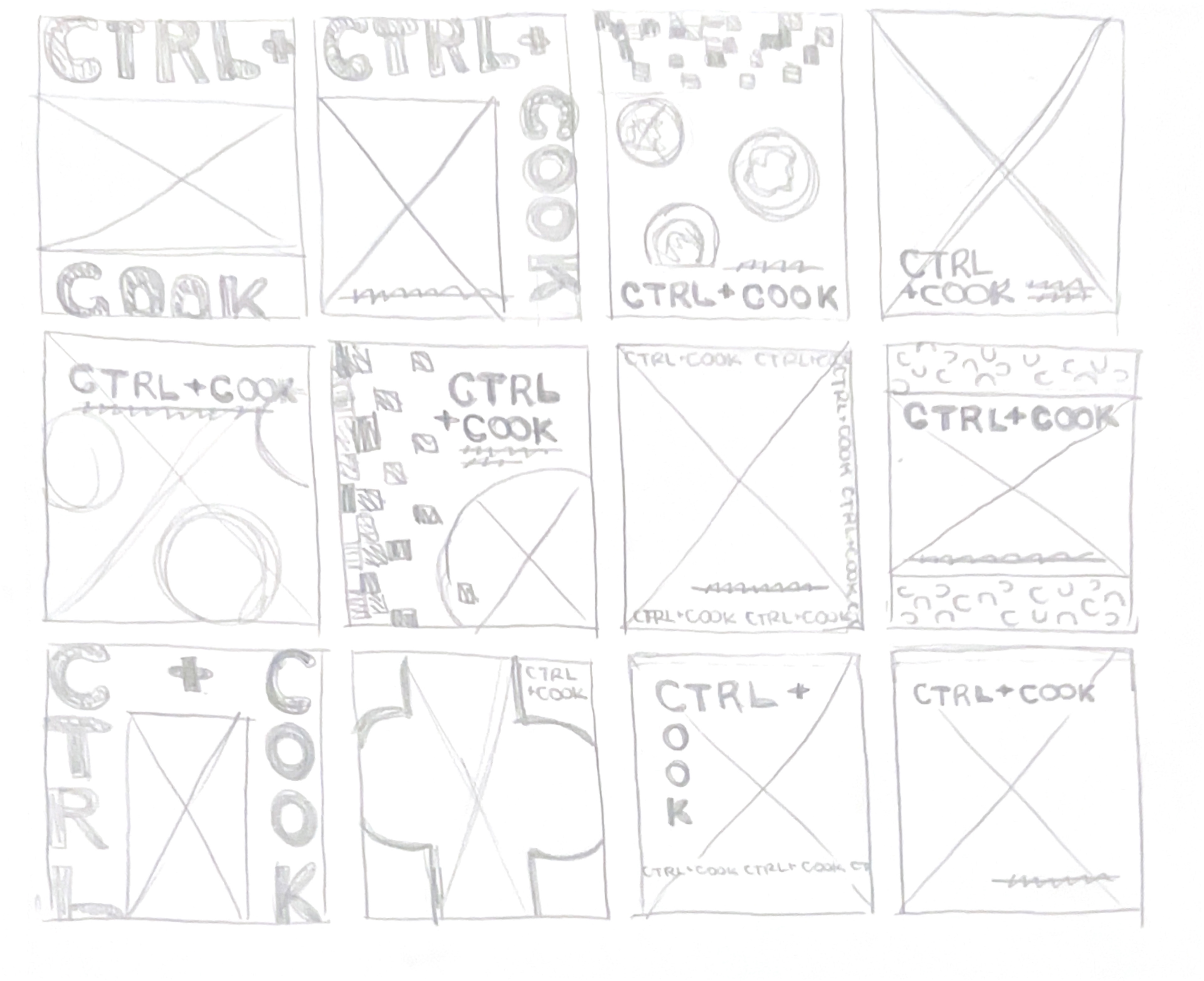
I wanted to incorporate the colorful grid pattern I had developed for the brand to convey energy, that "weirdness," and bring the branding onto the pages. I went back to the table of contents to add it in, and from there, was inspired to use it in the cover.
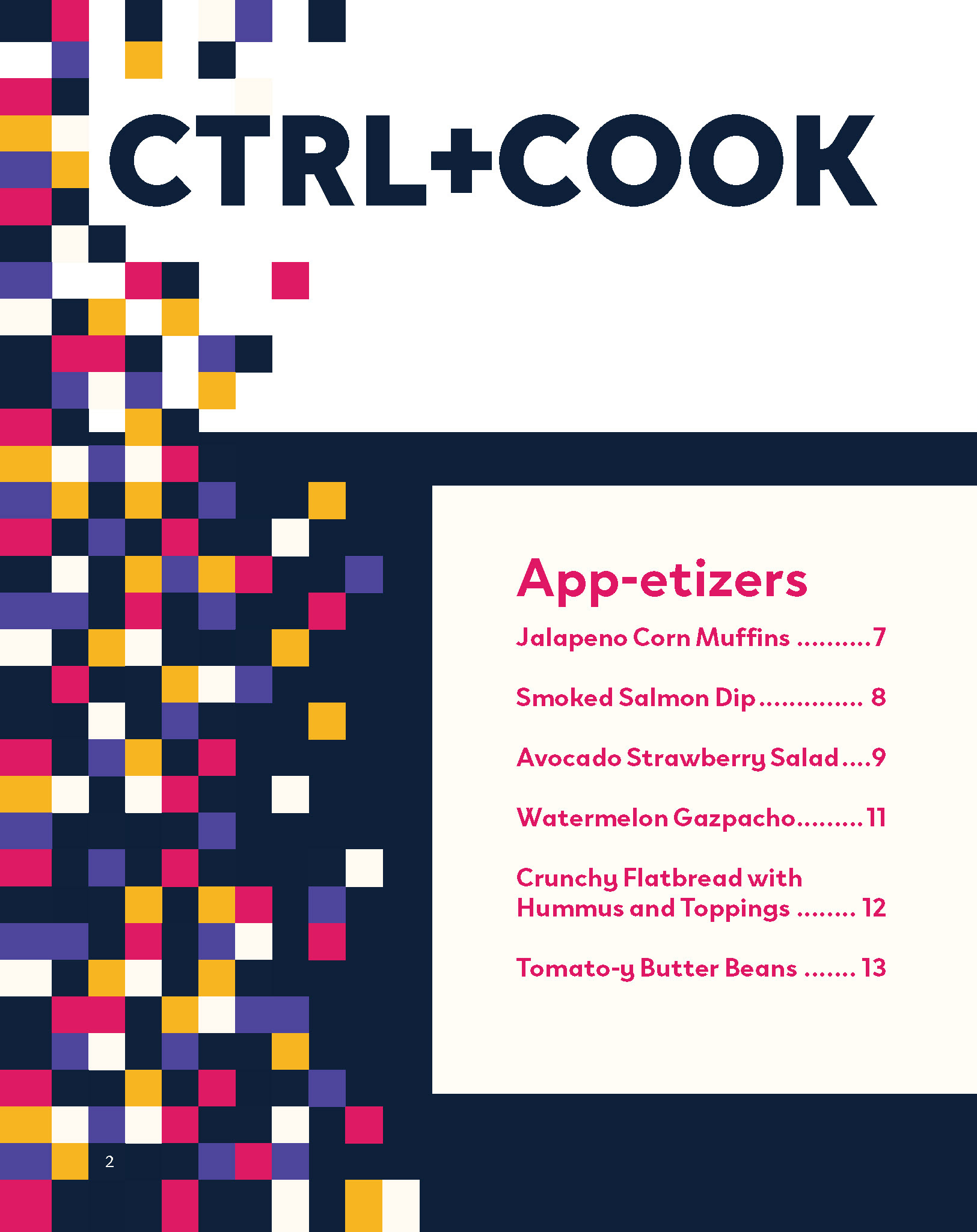
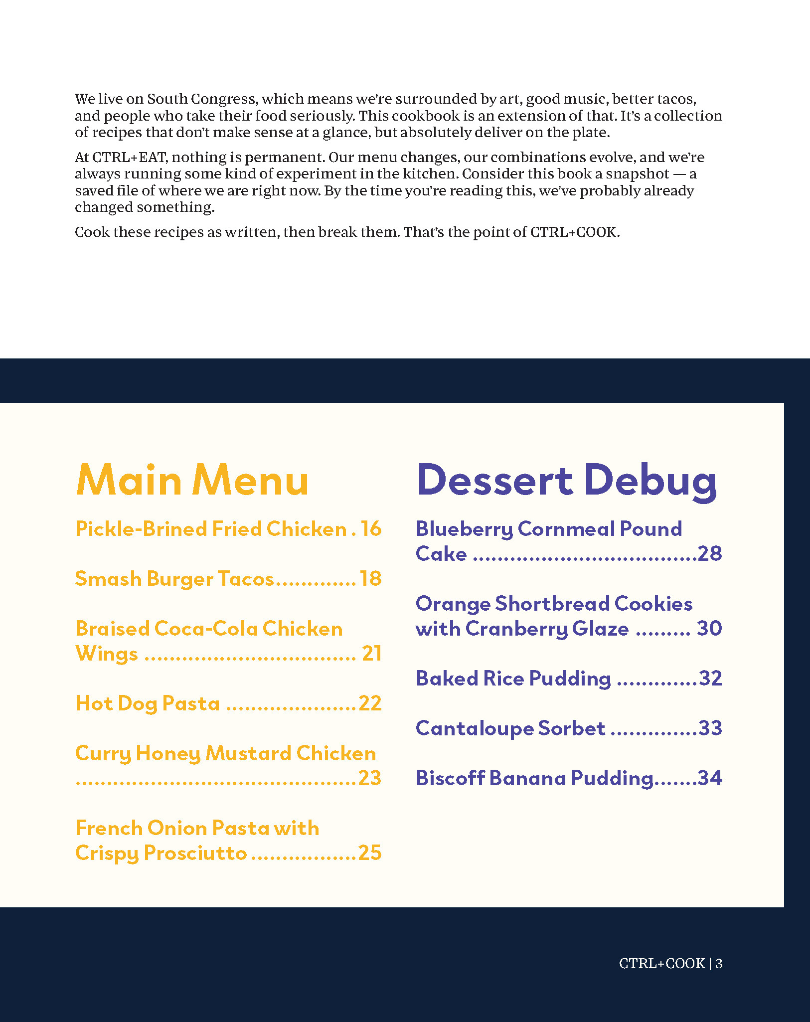
Table of contents with grid pattern.
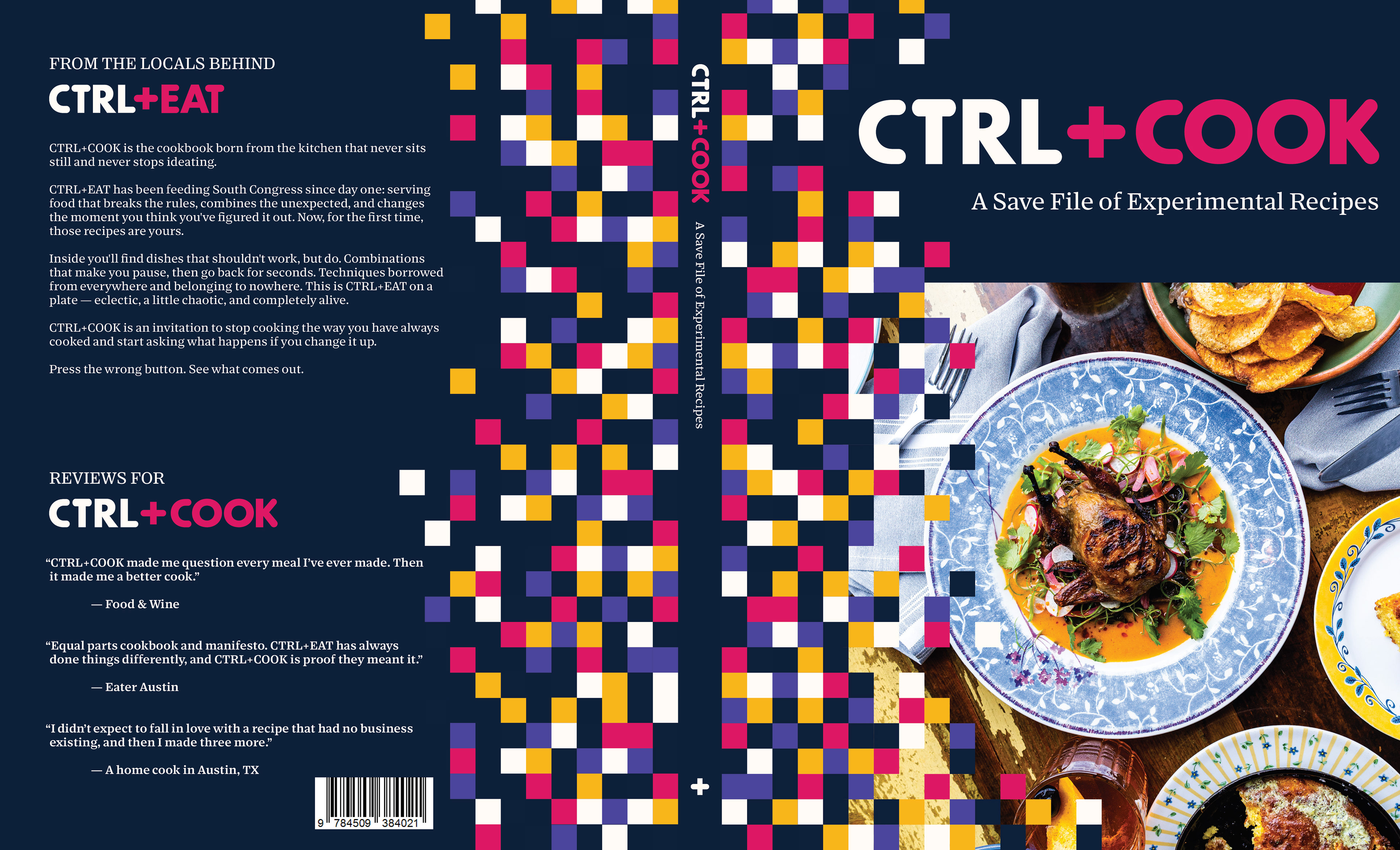
Cover spread.
The final cookbook is bright, energetic, and slightlyunusual - exactly like the CTRL+EAT brand.
AI Disclosure: AI was used to write some body copy in the cookbook and for the brand. It did not come up with ideas for the logo, brand tone, or recipes. It was used to help develop the brand story and experience, as well as for writing the copy on the back cover of the cookbook and the intro blurb on page 3.