
To create effective packaging, you need to understand what's already out there, what works, and what doesn't. I began this project by visiting the grocery store and exploring the soup aisle in-depth. I noted trends within and across brands, as well as what makes a soup line feel higher quality, cheap, authentic, or unique.
Research
Trends in the Soup Aisle
- Nearly all cans have a photo - not illustration - of the product.
- Blue is a popular color choice.
- Cheaper looking brands have packages that are crowded, while the opposite is true for more expensive looking brands.
- Authentic brands lean towards using serif typefaces.
- All packages must include information such as the net weight, nutrition facts, ingredients, and barcode.
- Strong serial design within each brand.
- Product information centered on the can.
- Health claims, e.g. "lots of protein," "organic," are around the main product information.
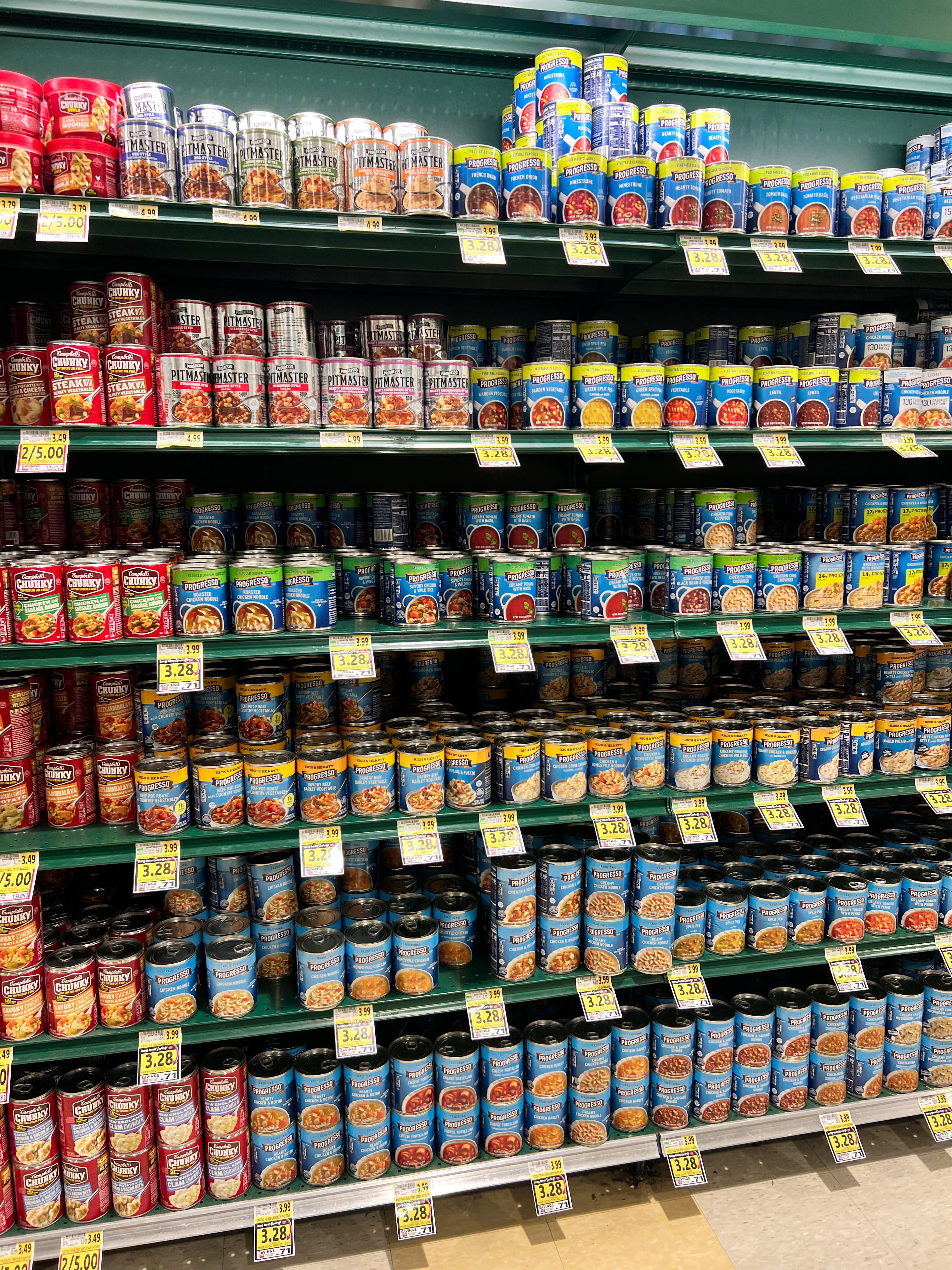
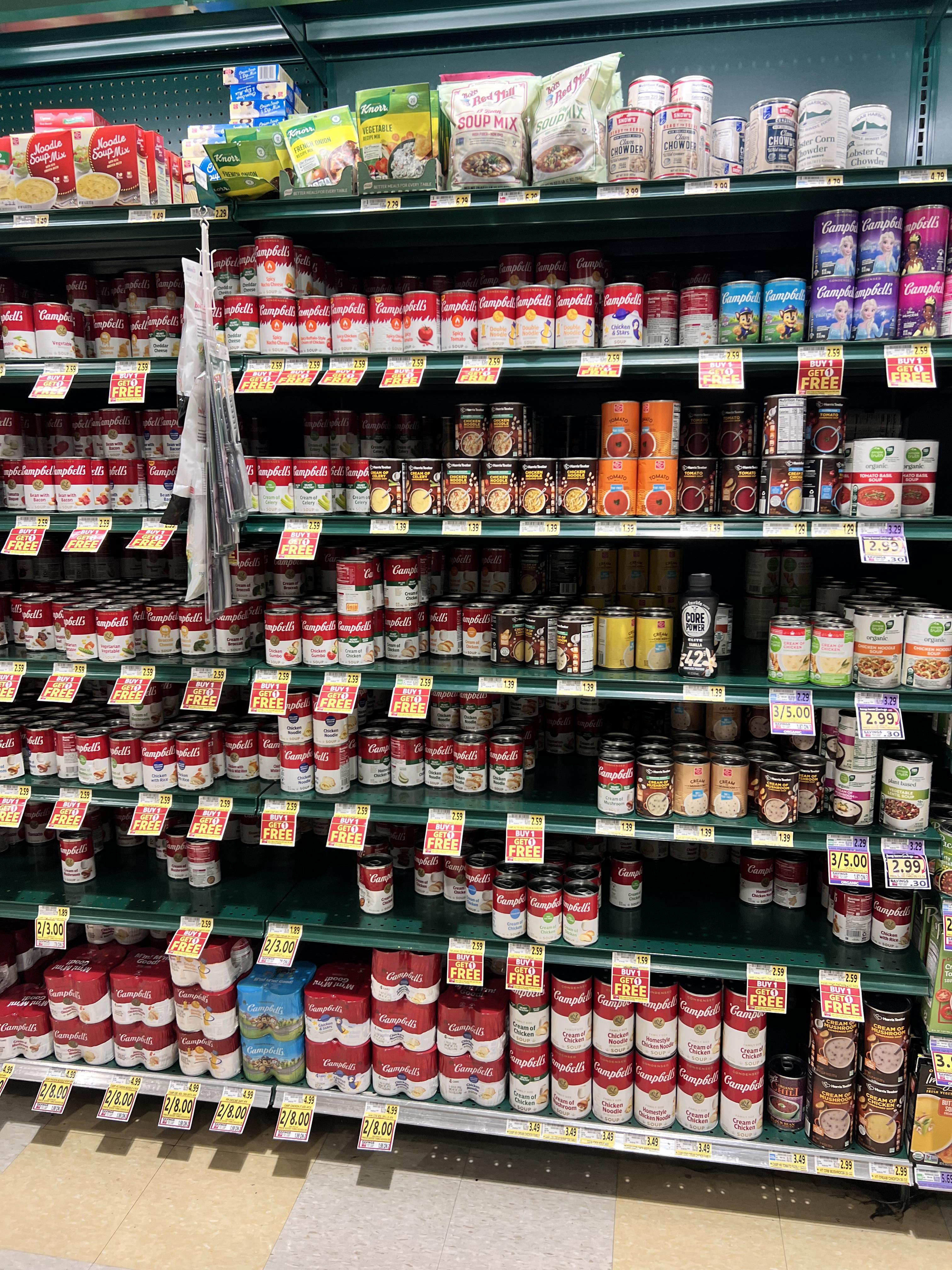
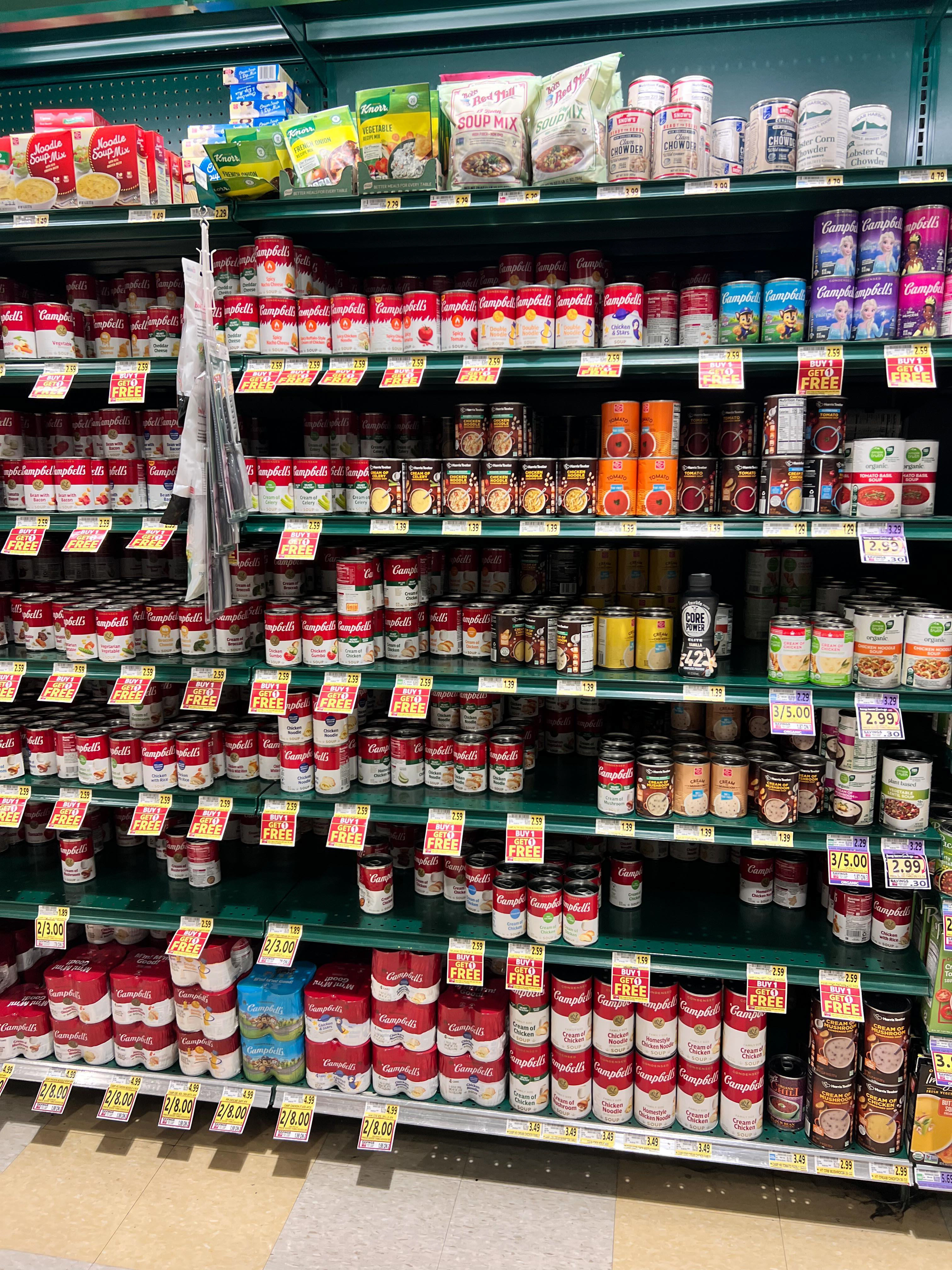
The local Publix soup aisle.
Across soup brands, large text and a photograph are used to describe the type of soup, with other claims related to nutrition in smaller text around it. All cans have 1-2 background colors and nutrition information on the back.
To create something new within the existing aisle, my soup was to be specifically for the summer, which is currently an underserved market. I also wanted to have the soup type - not the brand - be the first thing consumers see.
Sketches
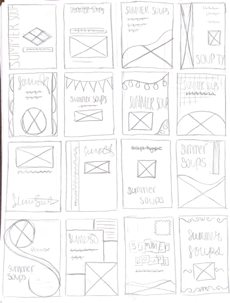
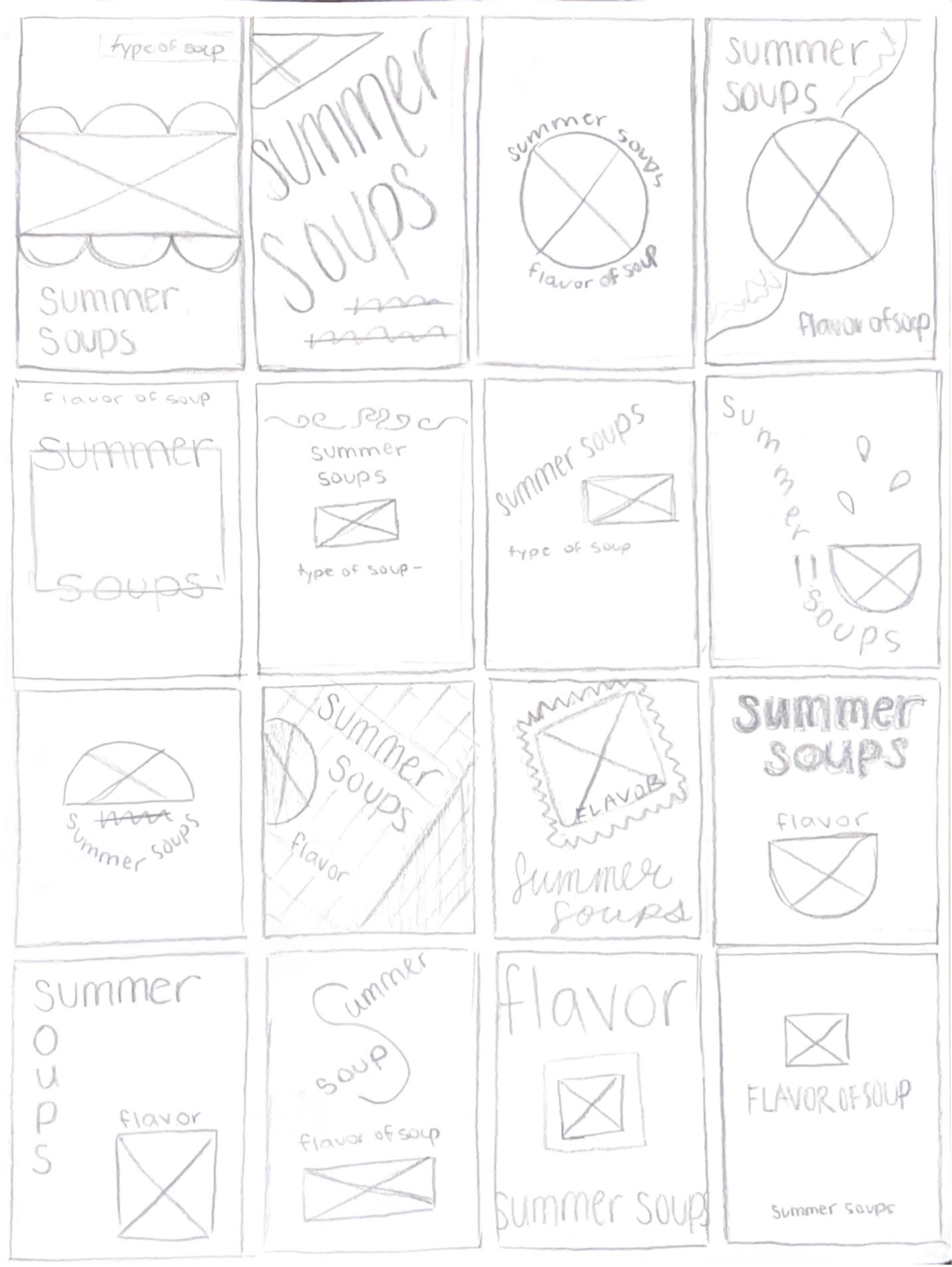
I shifted from wanting to design for a can of soup to using a glass jar so that consumers can see the product without my needing to include a photograph. I chose my favorite designs and modified them to be without an image.
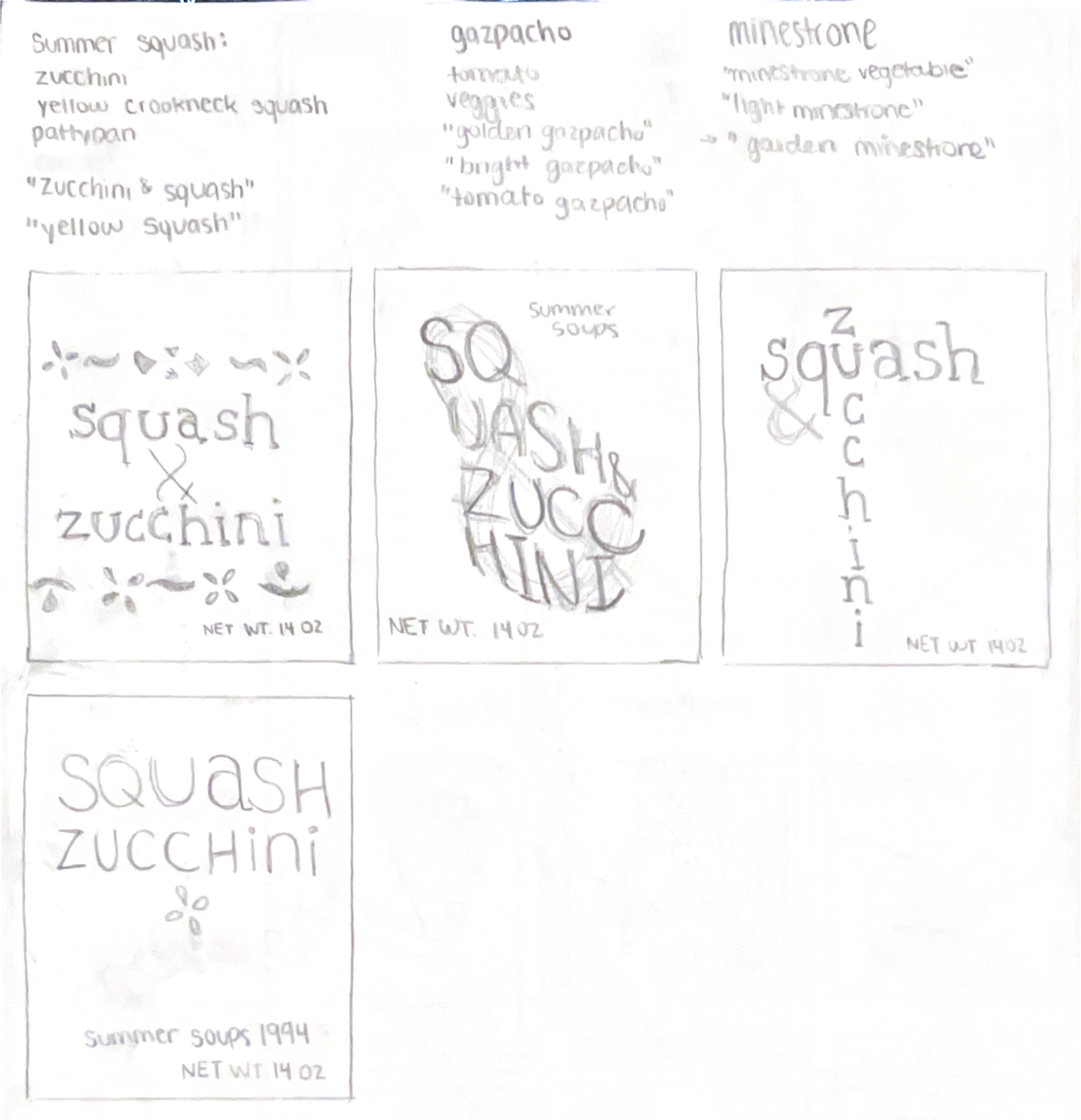
Also some soup variety names on here.
I experimented with various letterforms and serifs to communicate the lively, magical, summer feel I was going for.
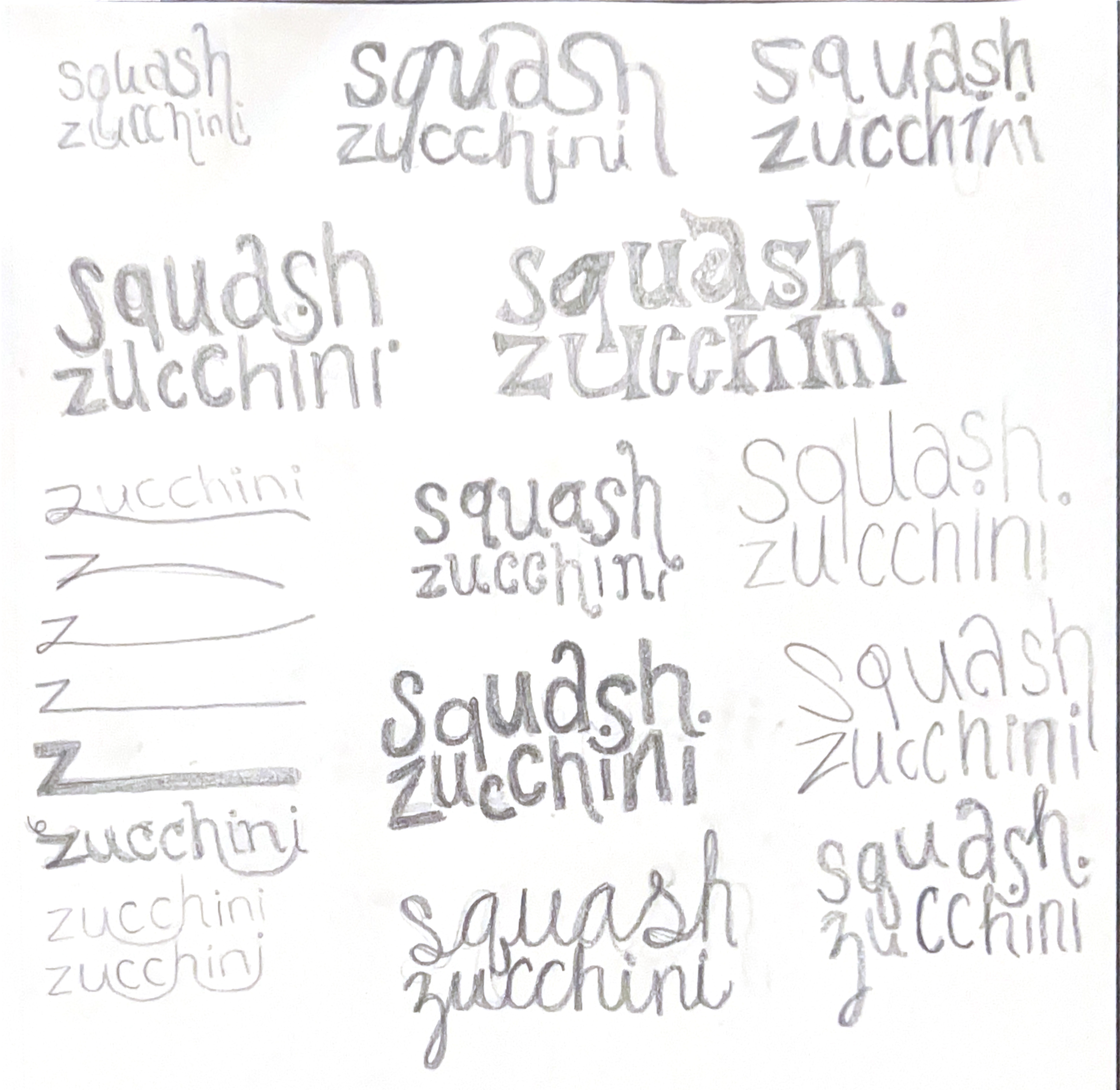
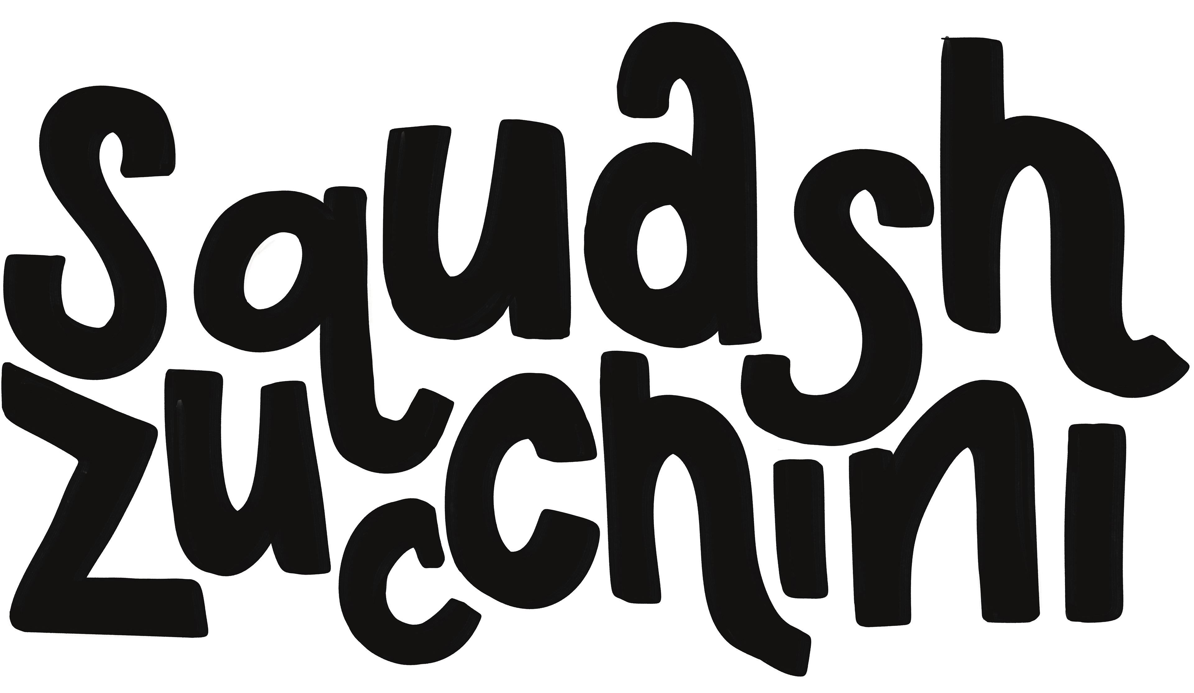
The bottom left thumbnail was my favorite, and I took this one into digital development. To lean into the lively, natural feel, I began sketching some typography for the Squash & Zucchini soup variety.
Dieline
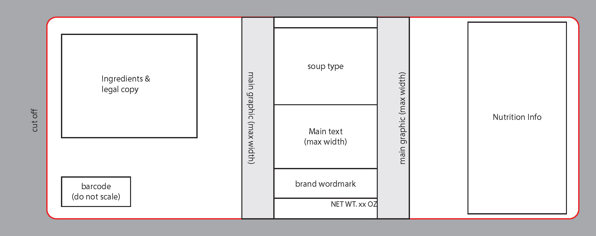
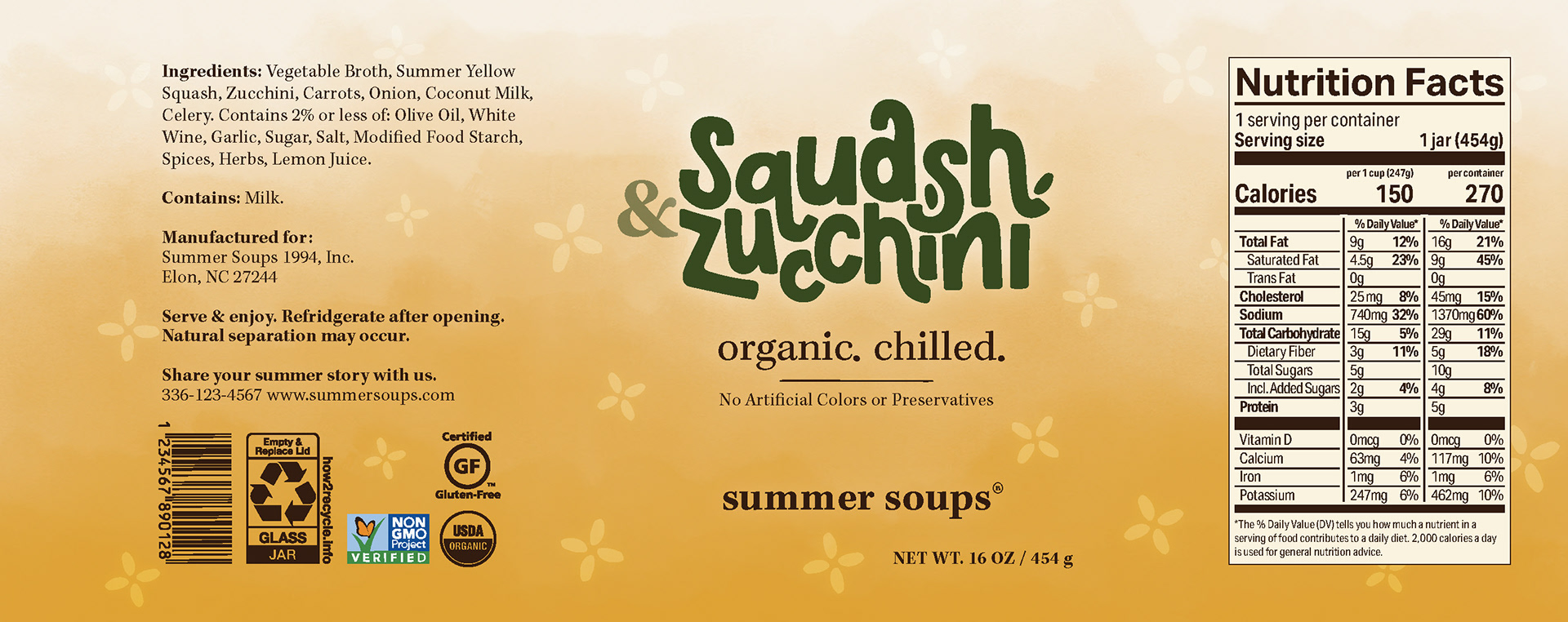
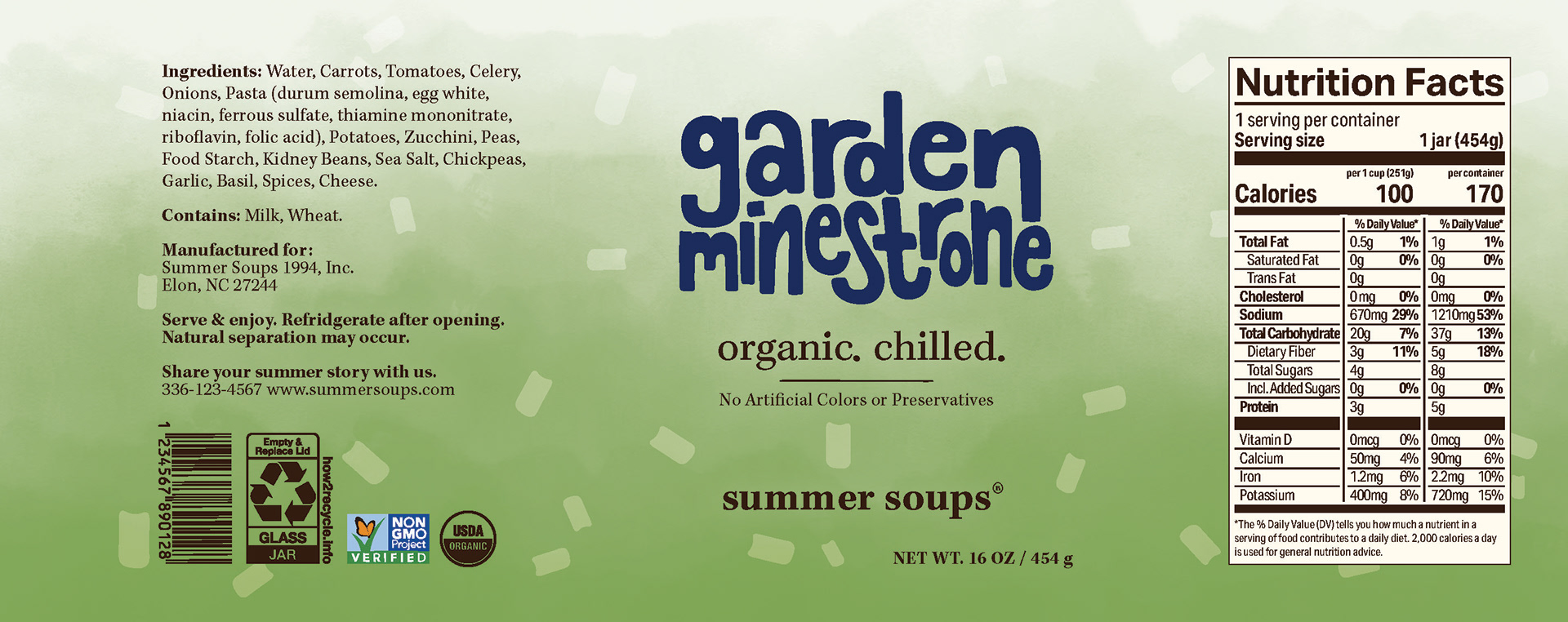
I built the dieline with inspiration from how established brands lay out their soup containers. It was important to my vision to ensure that when you are looking at the front of the container, you cannot see any of the nutrition info/ingredient information on the side, as I wanted to ensure a clean look on the front of the product.
I printed and cut out the dieline, prototyping it on my physical soup jar to ensure the measurements were accurate.
In Progress & Early Versions
I began digitally designing in Adobe Illustrator. I started in black and white so I could understand the feel of the layout without being distracted by color choices.
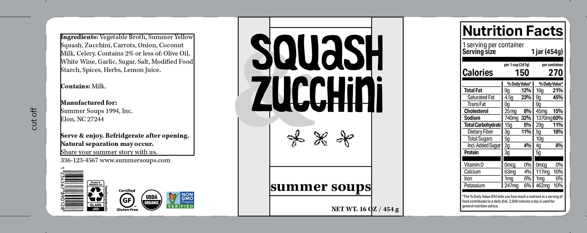
Version 1. This brings in the flower texture I had previously acquired from texture hunting.
I received feedback that the typography in this first version felt too rigid. As I thought back to some of the original inspiration words, like airy, joyful, and magical, I realized this standardized x-height approach was working against the brand’s intentions. I loosened the letterforms and introduced more variation in the baseline. The result felt much more handmade and alive, which is what Summer Soups is all about.
Further, the flower texture did not feel quite right. I recreated it using elements of the hand-drawn typography for later designs.
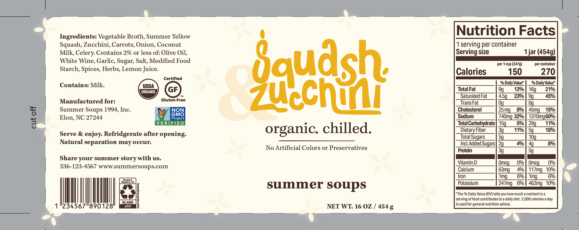
Version 2. Playing with the letterforms and beginning to introduce some color.
From the start, I knew I wanted the body copy on the label to be a serif typeface. In my research, I saw that authentic feeling brands leaned towards doing this, and I felt this was an appropriate choice for my design.
I further developed the typography, drawing in Procreate and using Adobe Illustrator for final touches.
Typography created in Procreate, before refining in Illustrator.
Version 3. Letterforms for the soup variety are pretty much finalized, and primary colors have been chosen.
At this point, my design was almost done. However, I felt that although the serial design was evident, the labels were lacking a common element. I had always loved the leaf I used as a tittle for the i in Squash & Zucchini, as I felt it encapsulates the lively, summer feeling, so I brought this into the other labels as an accent.
Another detail that evolved through the process was the background elements on each label. The softly glowing shapes are made to mimic the feeling of string lights glowing on a summer night. I started by using the flower texture I had gathered from texture hunting on the Squash & Zucchini soup, but the vectorized object did not fit with the rest of the design. Instead of using generic shapes, I ended up created each symbol from the letterforms of that soup's name, making them specific to each variety while still feeling cohesive across the trio.
Physical Construction
An important aspect of this project was not just designing, but taking it a step further and physically constructing the product. As the designs were close to finalized, I began printing out the labels on regular paper and taping them to the soup jars to understand how each design choice translated into the real world.
Samples with almost finished designs.
It was at this point I realized it was difficult to read the net weight, so I changed it to be centered. I also experimented with square vs rounded edges on the label, and went with rounded edges because of the refined feeling.
A gap was left between each side of the label to give customers sufficient space to see the product.
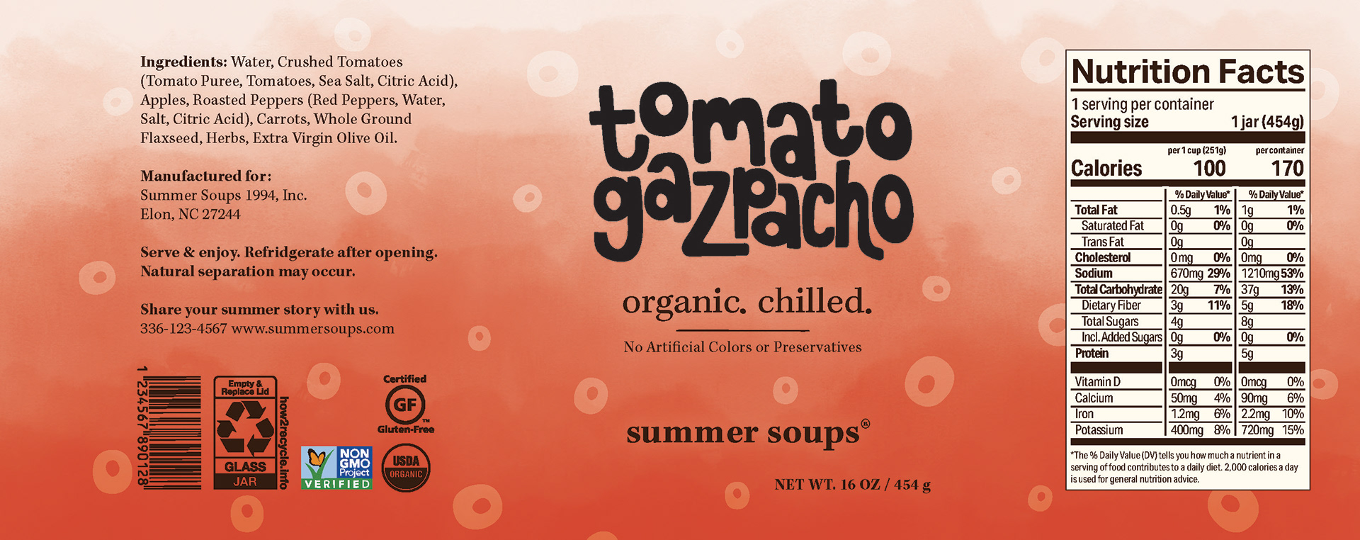
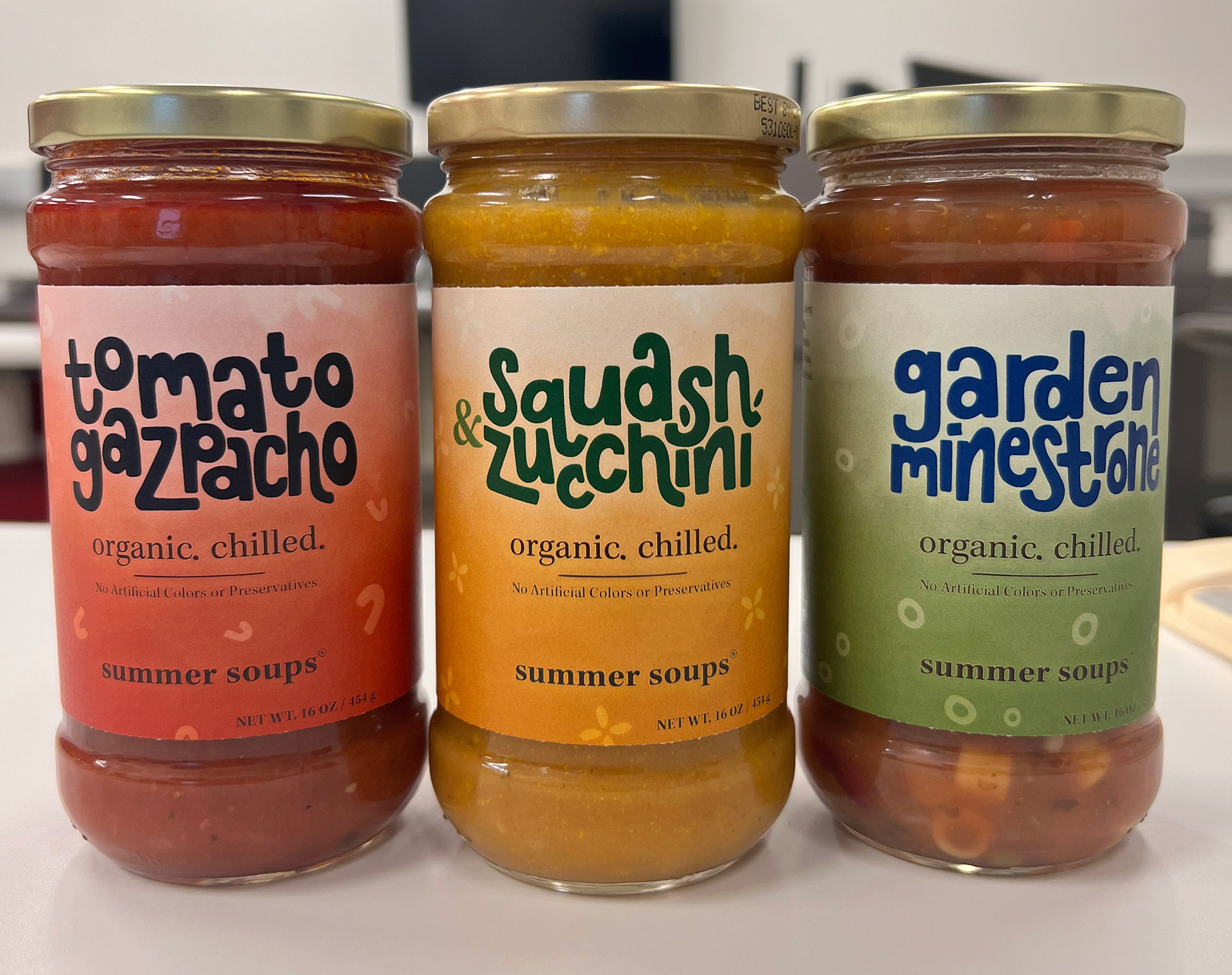
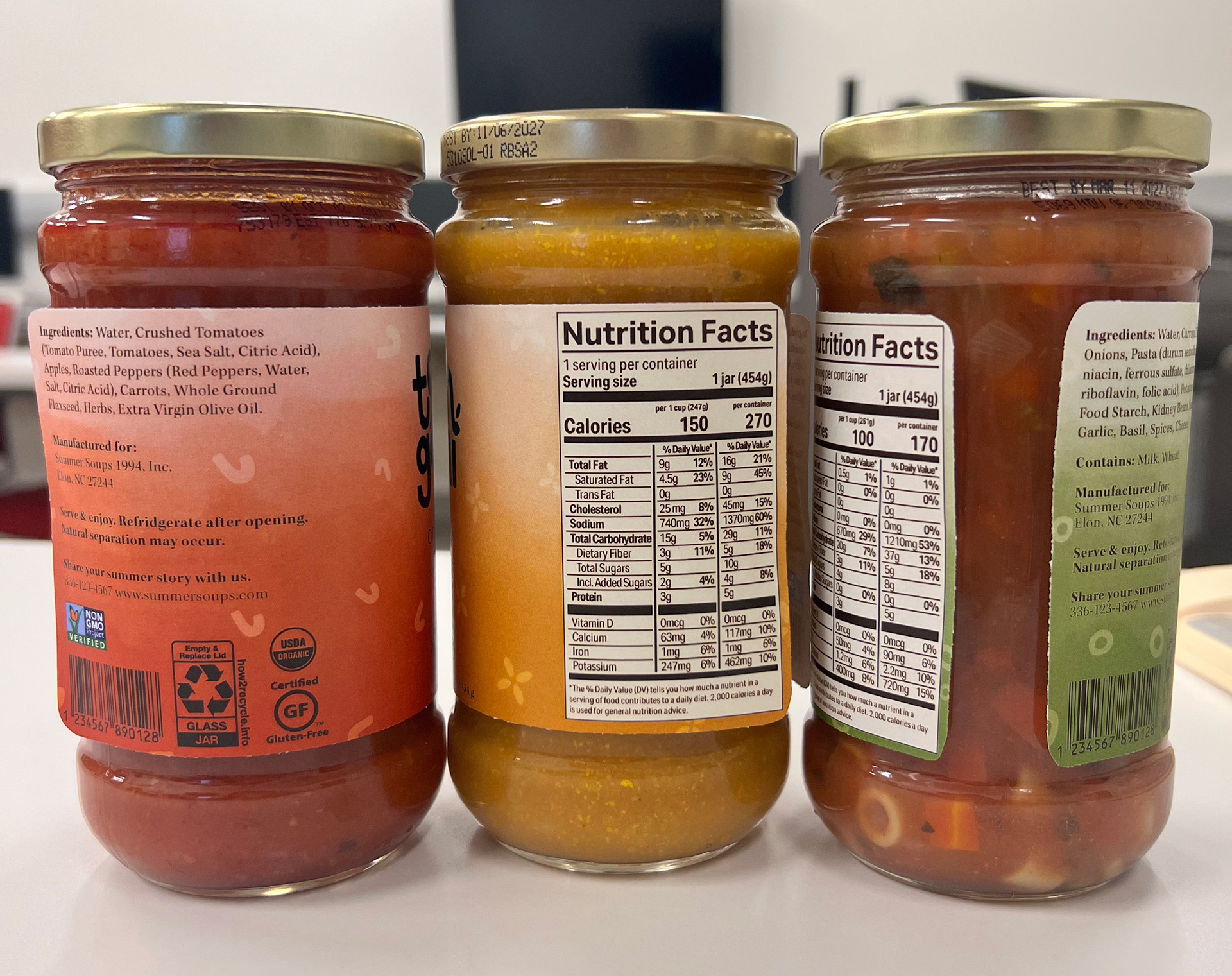
Final Designs
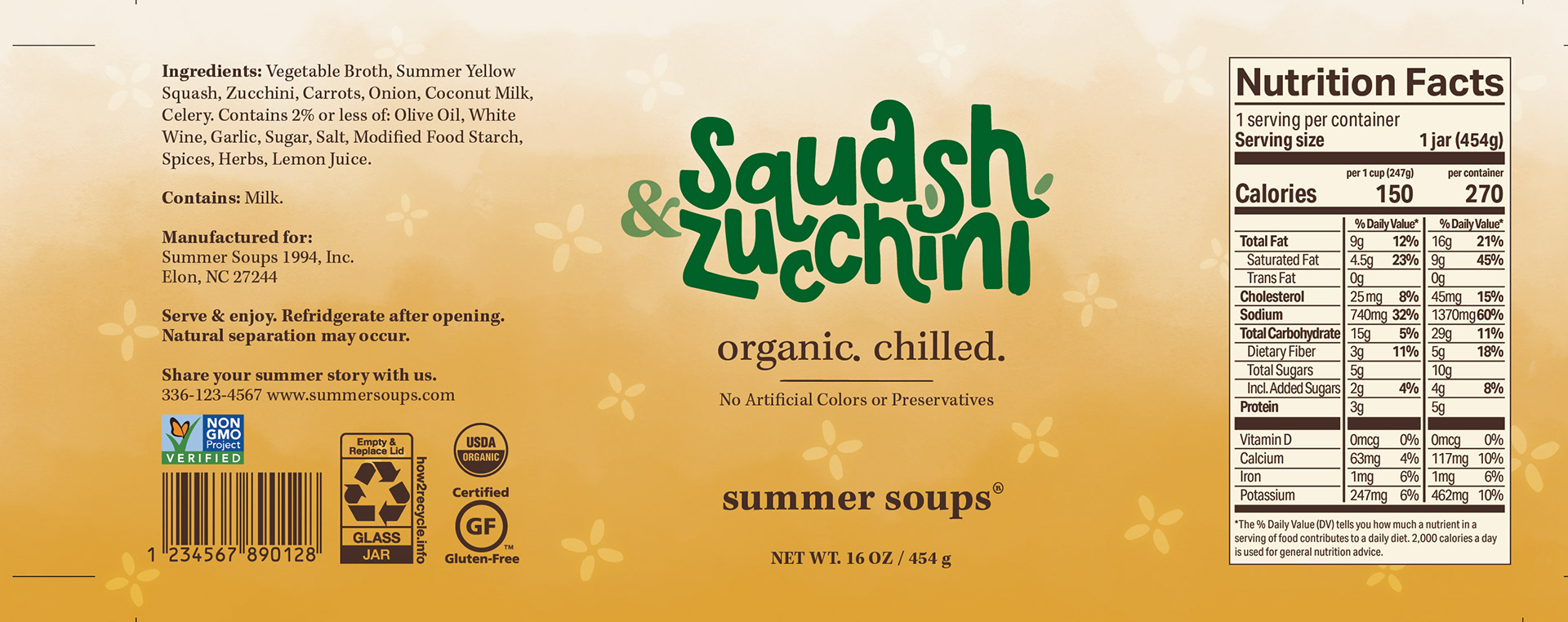
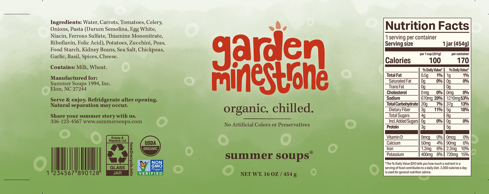
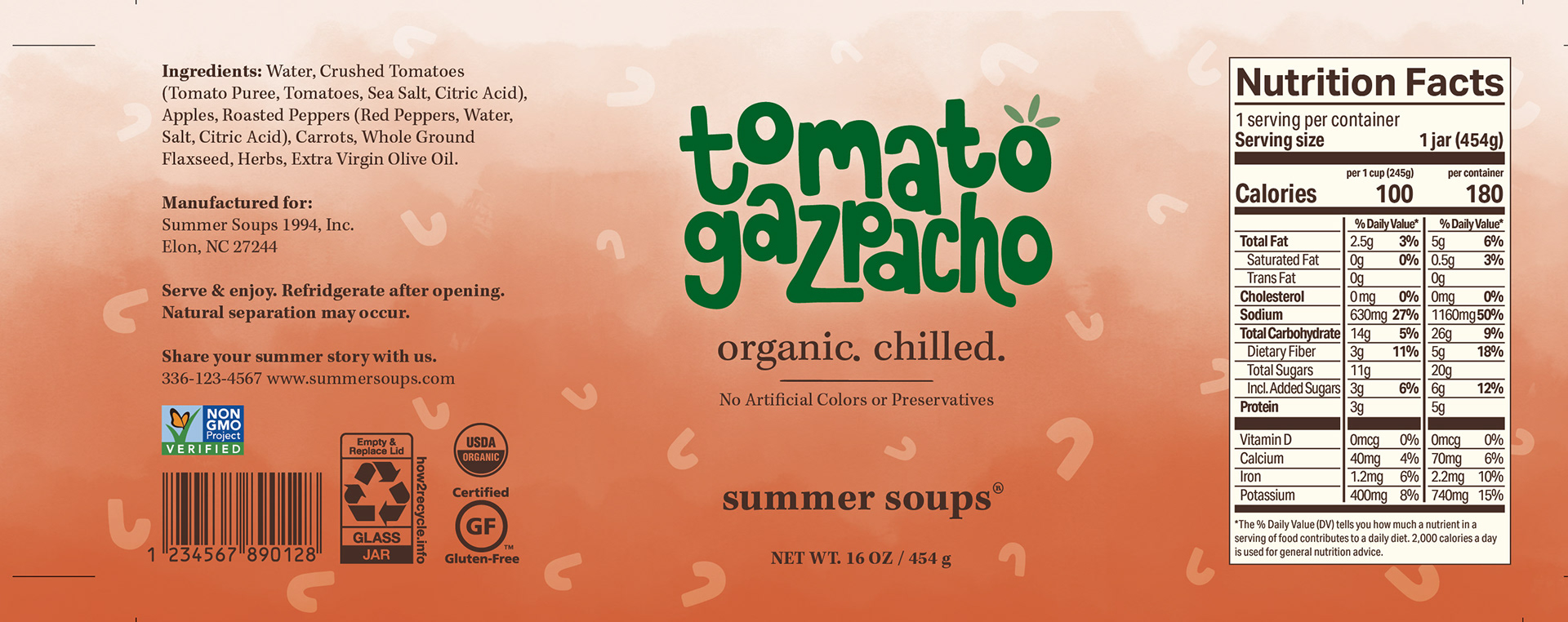
Final designs with crop marks for printing and cutting.
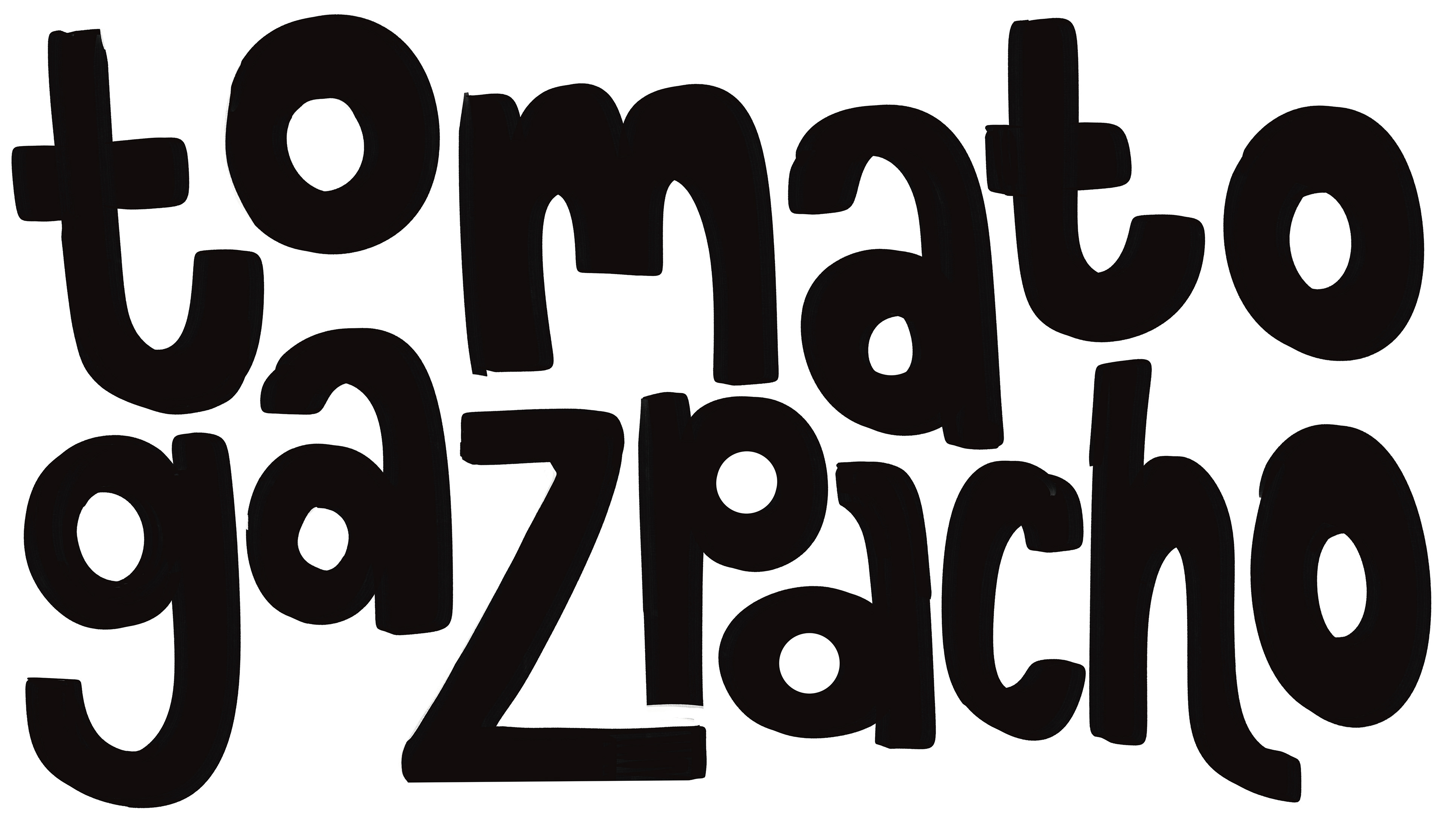
I changed the color of the Garden Minestrone and Tomato Gazpacho soup varieties because the darker blue and black did not fit in the brand of Summer Soups. Blue is also a color our brains associate with poison - not great for a food!
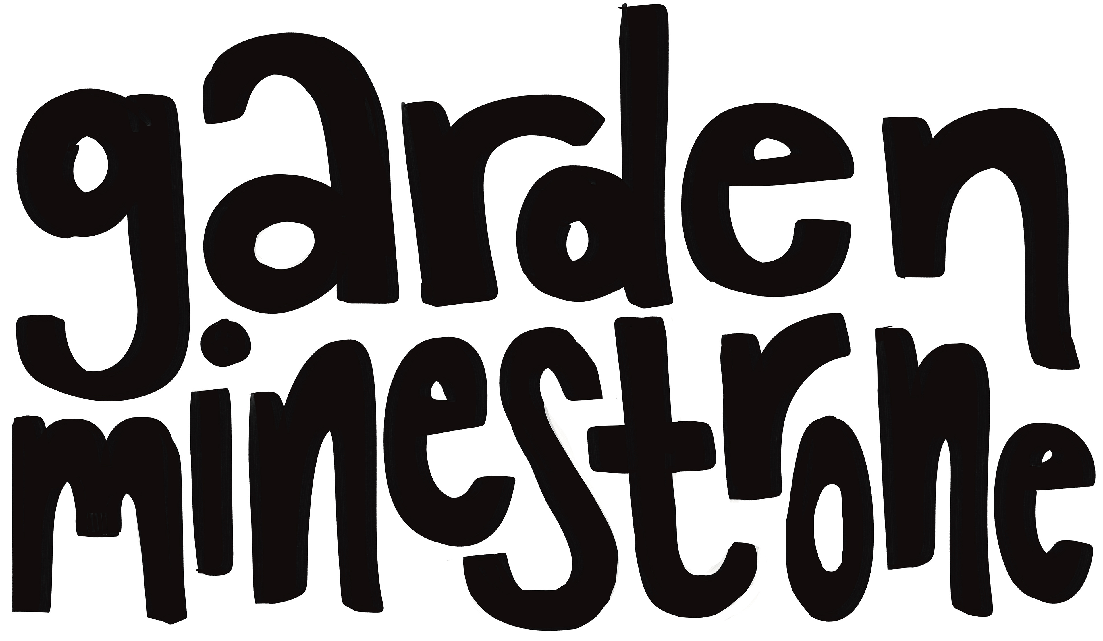
The final background symbols on each soup reflect an element of the soup or its label. The flower on Squash & Zucchini pulls from the tittles on the i. The circle outlines on Garden Minestrone use the O shapes and allude to the pasta shape that is in the actual soup. The Tomato Gazpacho soup uses a modified version of the "t" letterform to subconsciously emphasize the tomato aspect of the soup.
At this point, I printed the designs on sticker paper, prepared the final product, and photographed the soup jars both in and out of the studio.