

Research & Initial ideas
To begin my process, I researched Tibor Kalman: who was he? What work was he known for? What did he believe in? What distinguished his style?
- Born in Hungary, raised in New York. Self taught
- Established multidisciplinary design firm M & Co. in 1979, where he sought to challenge mundane design and aspired to create unpredictable work
- Founding editor-in-chief of Colors, "a magazine about the rest of the world"
- "Undesign" that embraced the vernacular became a way for him to protest the corporate International Style
- Wanted to use design as a language that communicates something meaningful
- "No matter what your cultural sophistication or what language you speak, everyone can understand images"
- Often utilized humor, found image, and brash typography
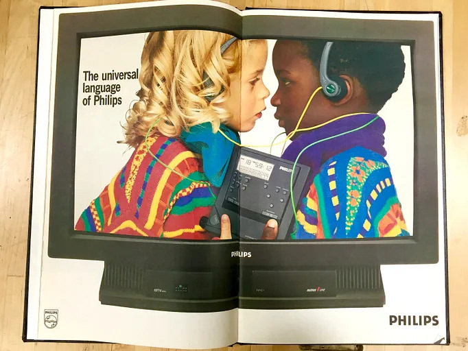

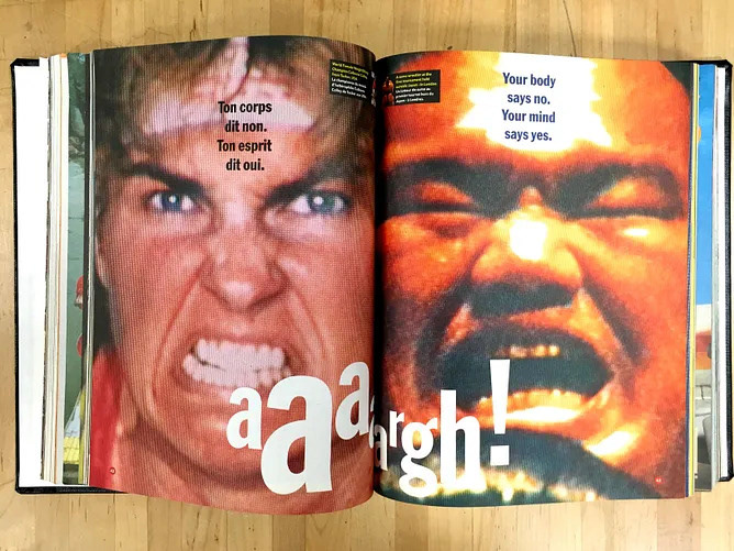
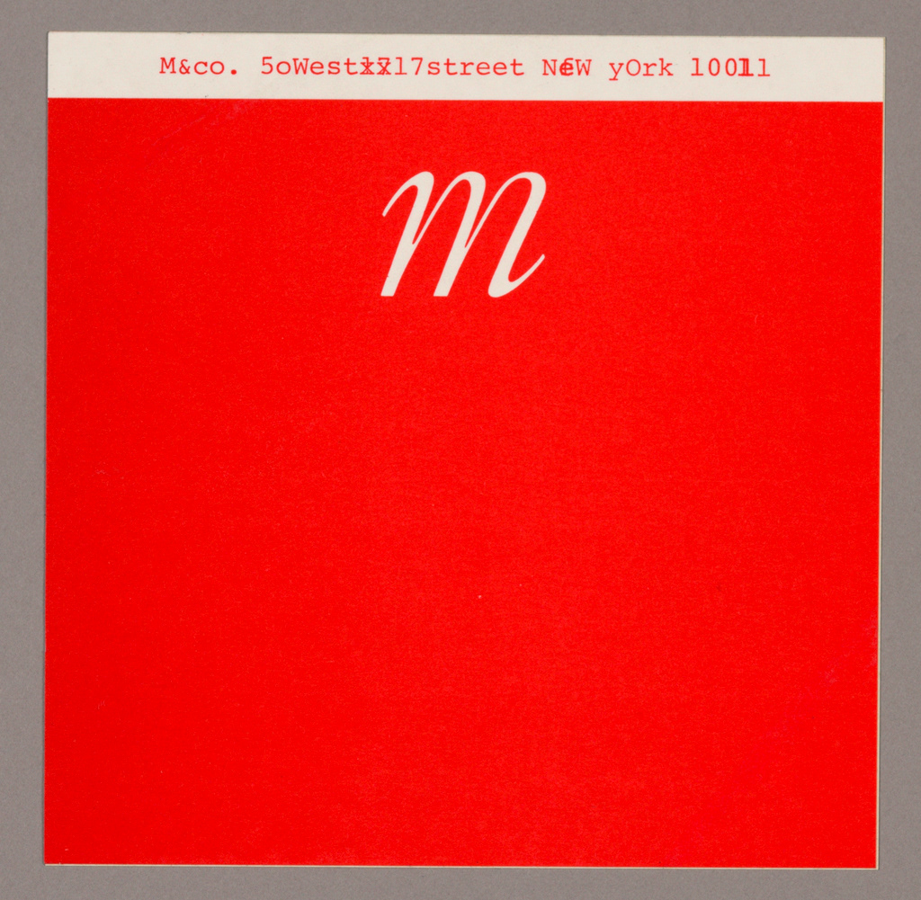
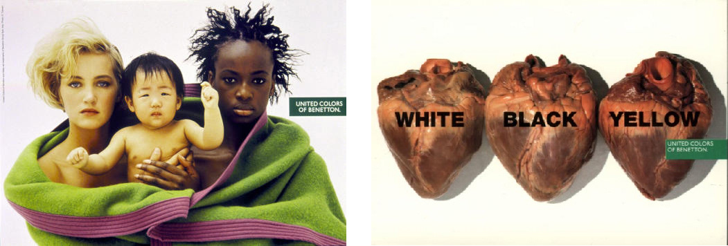
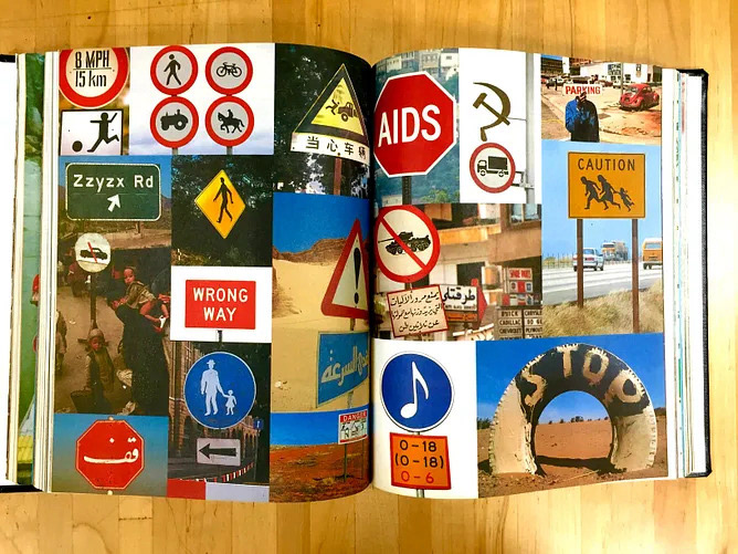
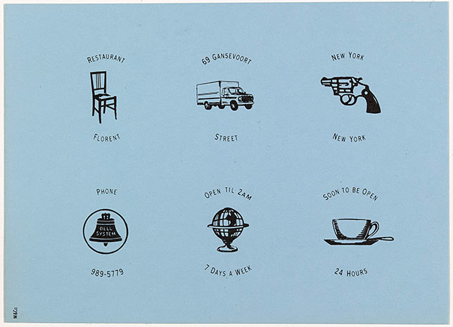
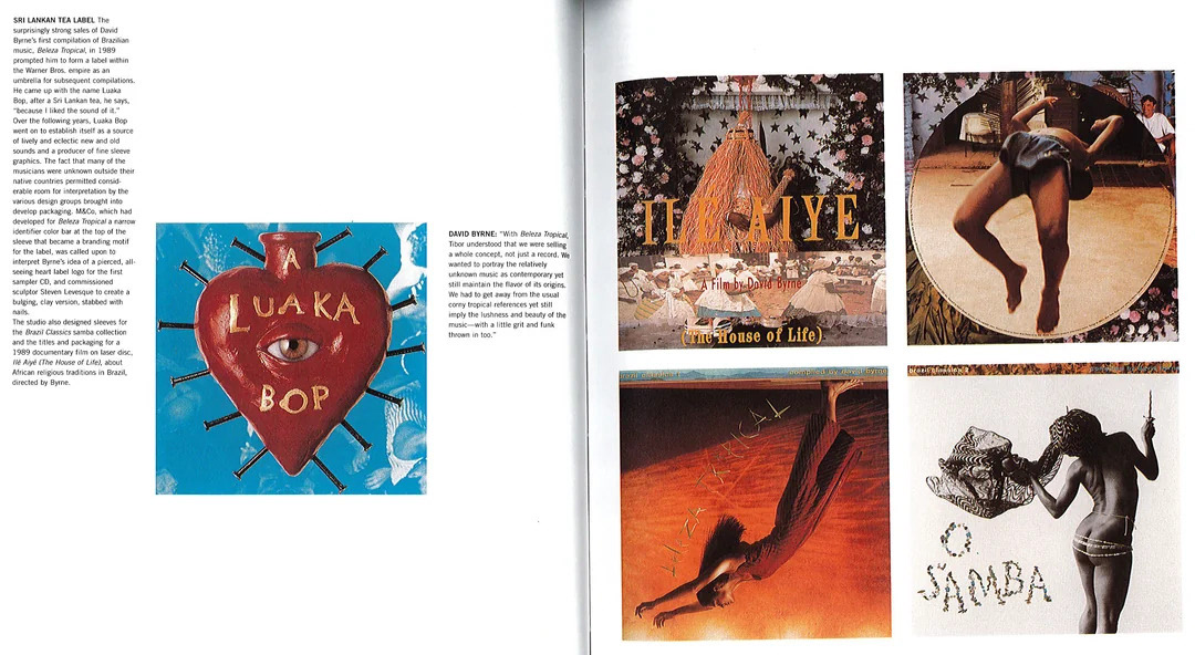
Examples of Kalman's work that I drew inspiration from.
I sketched some initial layout ideas. I was inspired by his work and experimented with ways to incorporate it into the design, further than just images.
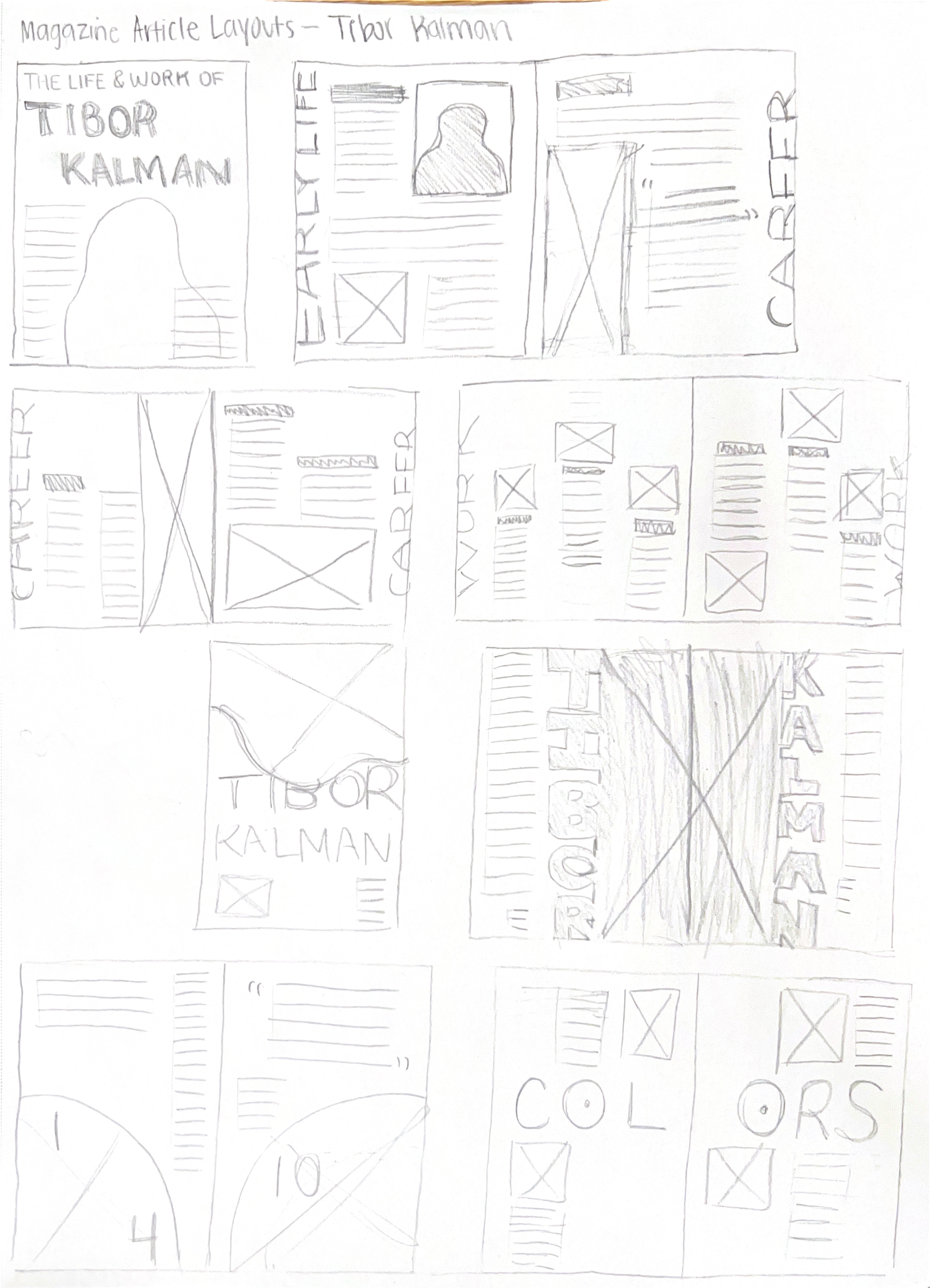
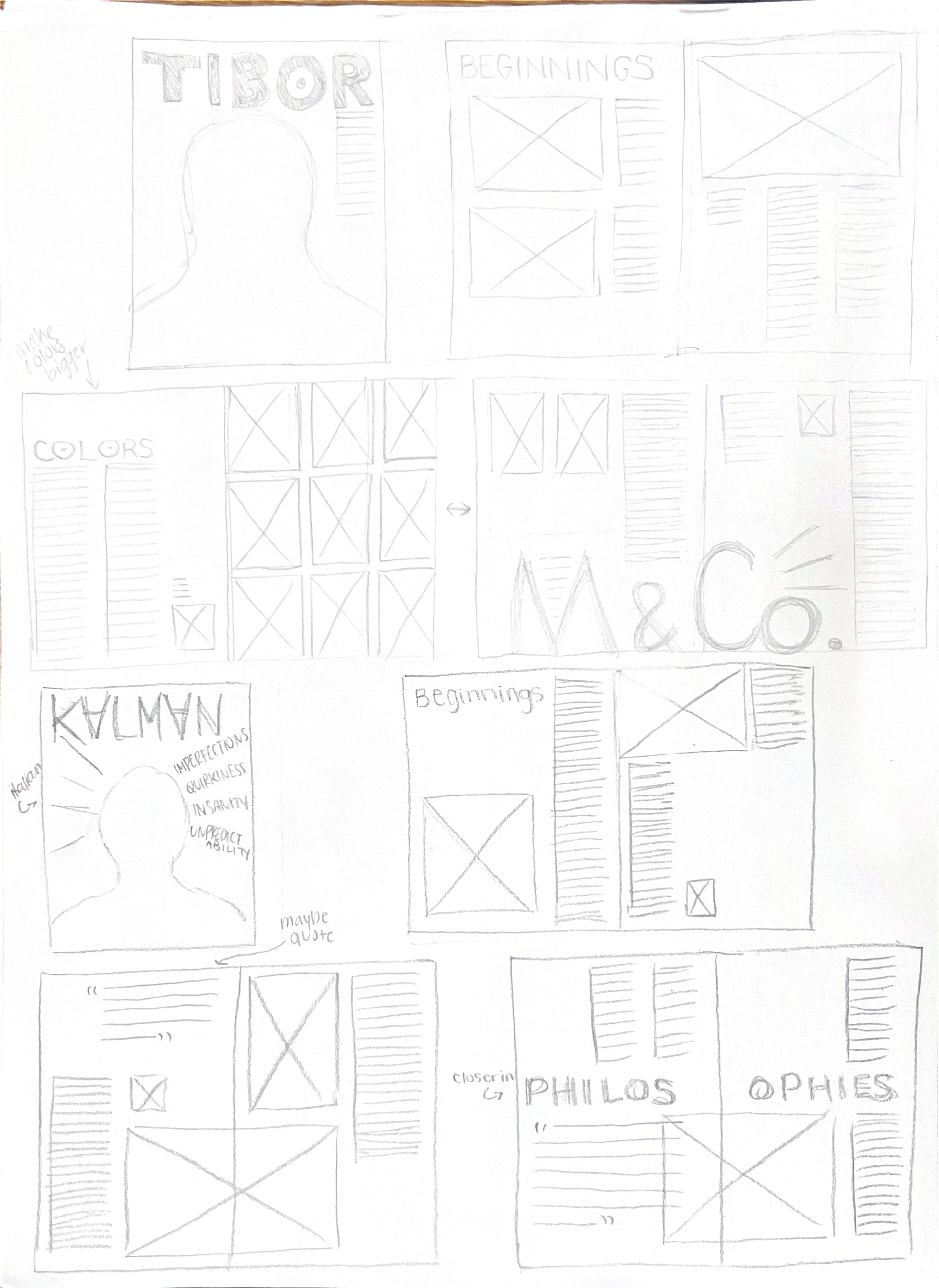
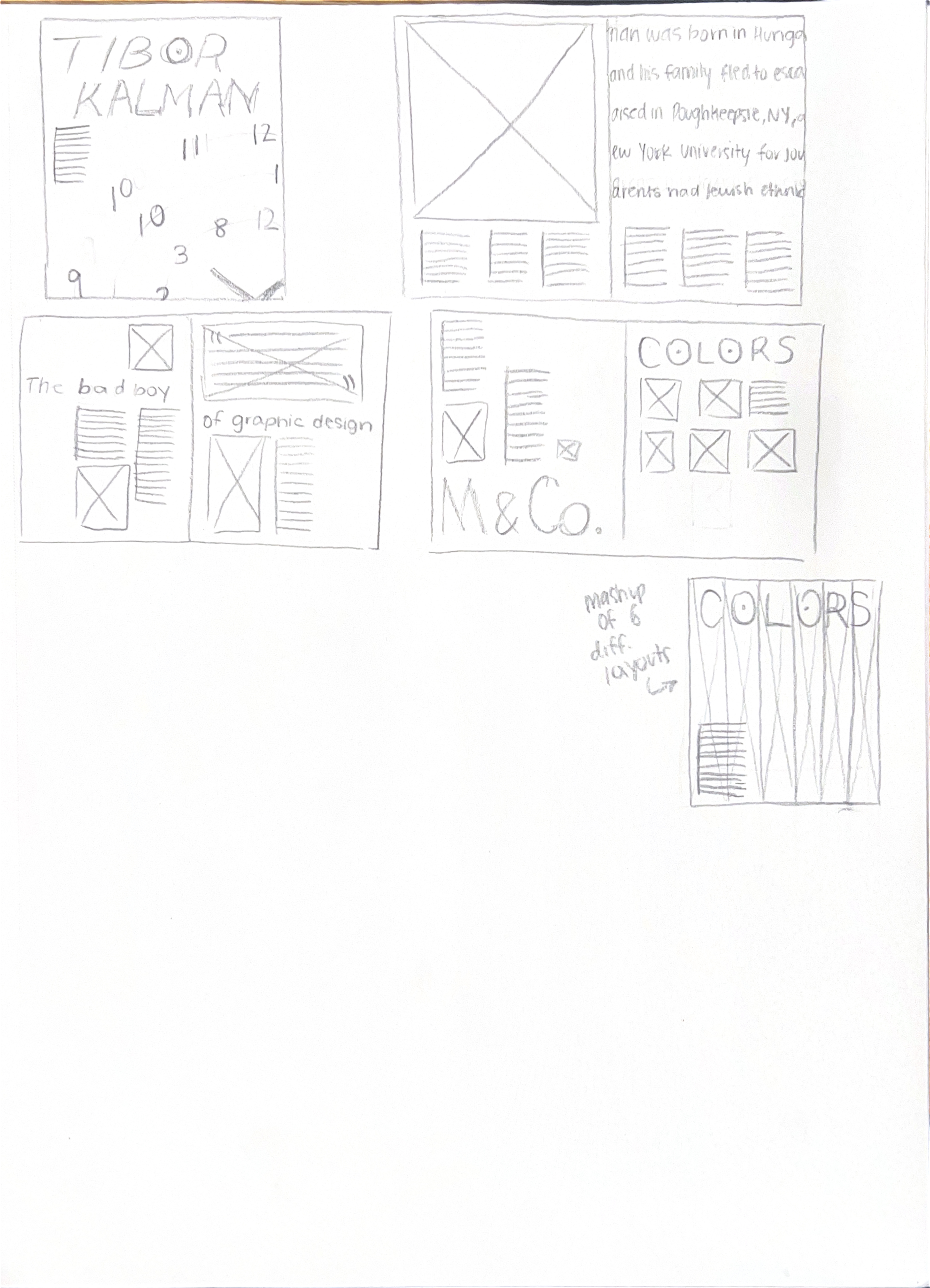
From there, I selected the layouts that had an appealing balance of text, images, and unique graphic elements and began designing in Adobe InDesign.
Drafts
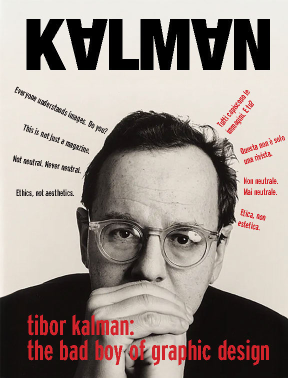
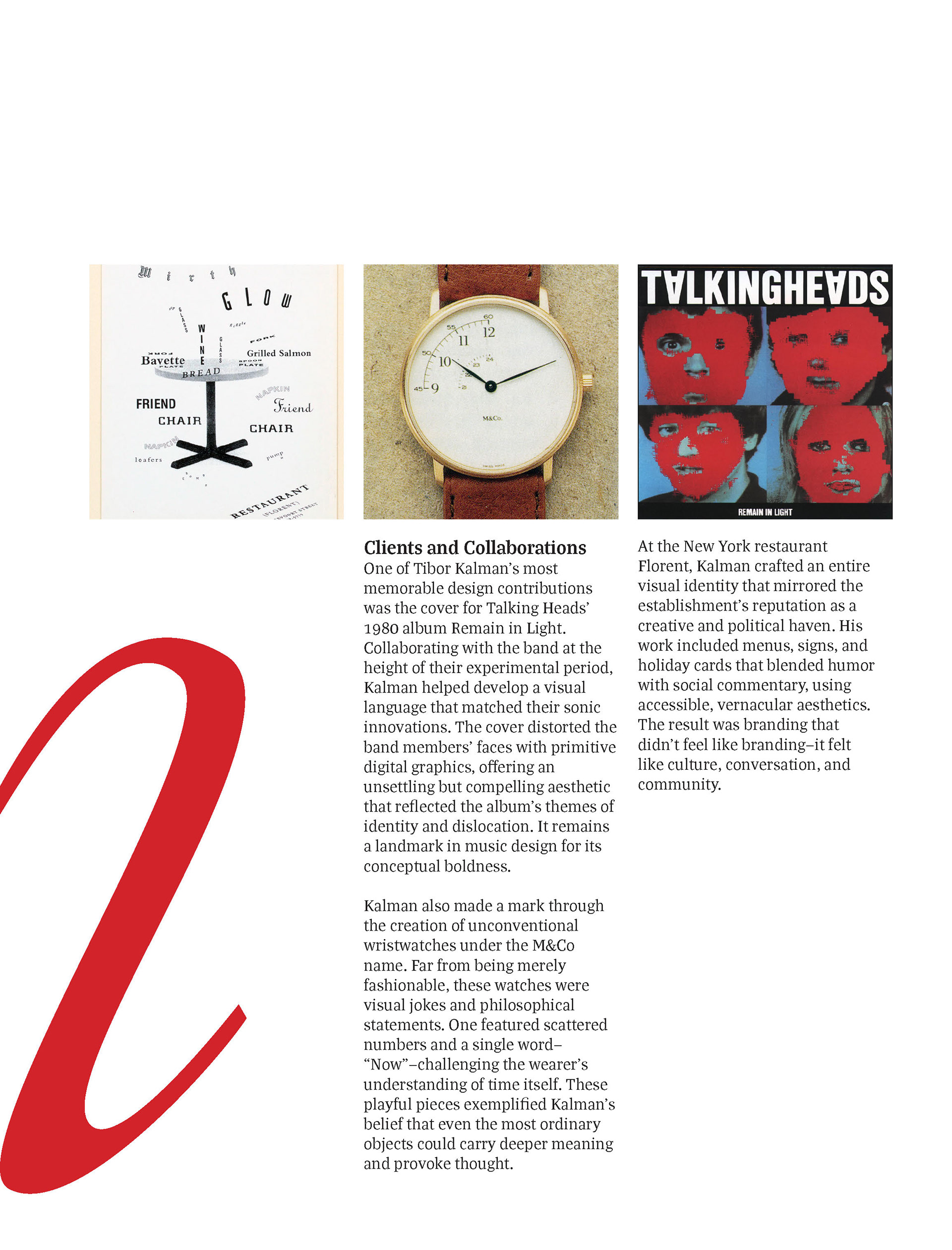
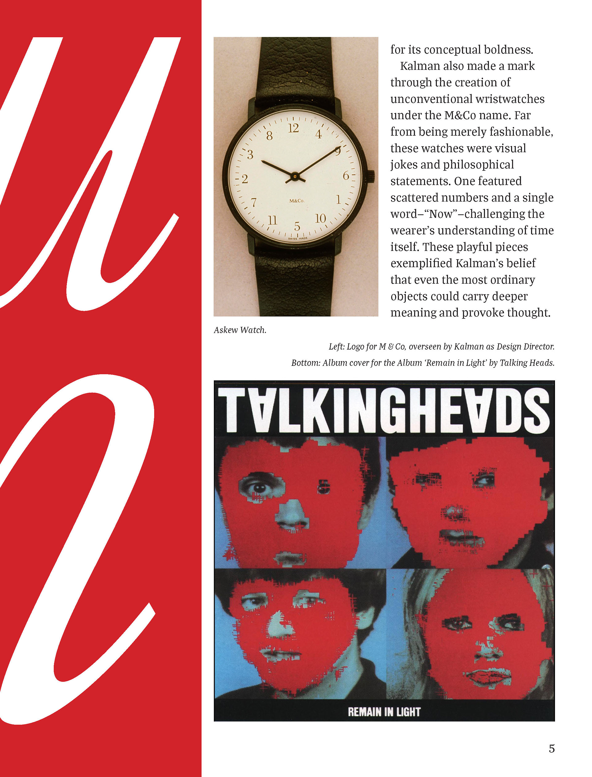
The cover page nods to Kalman's work designing album covers for Talking Heads by flipping the A's in his name upside down.
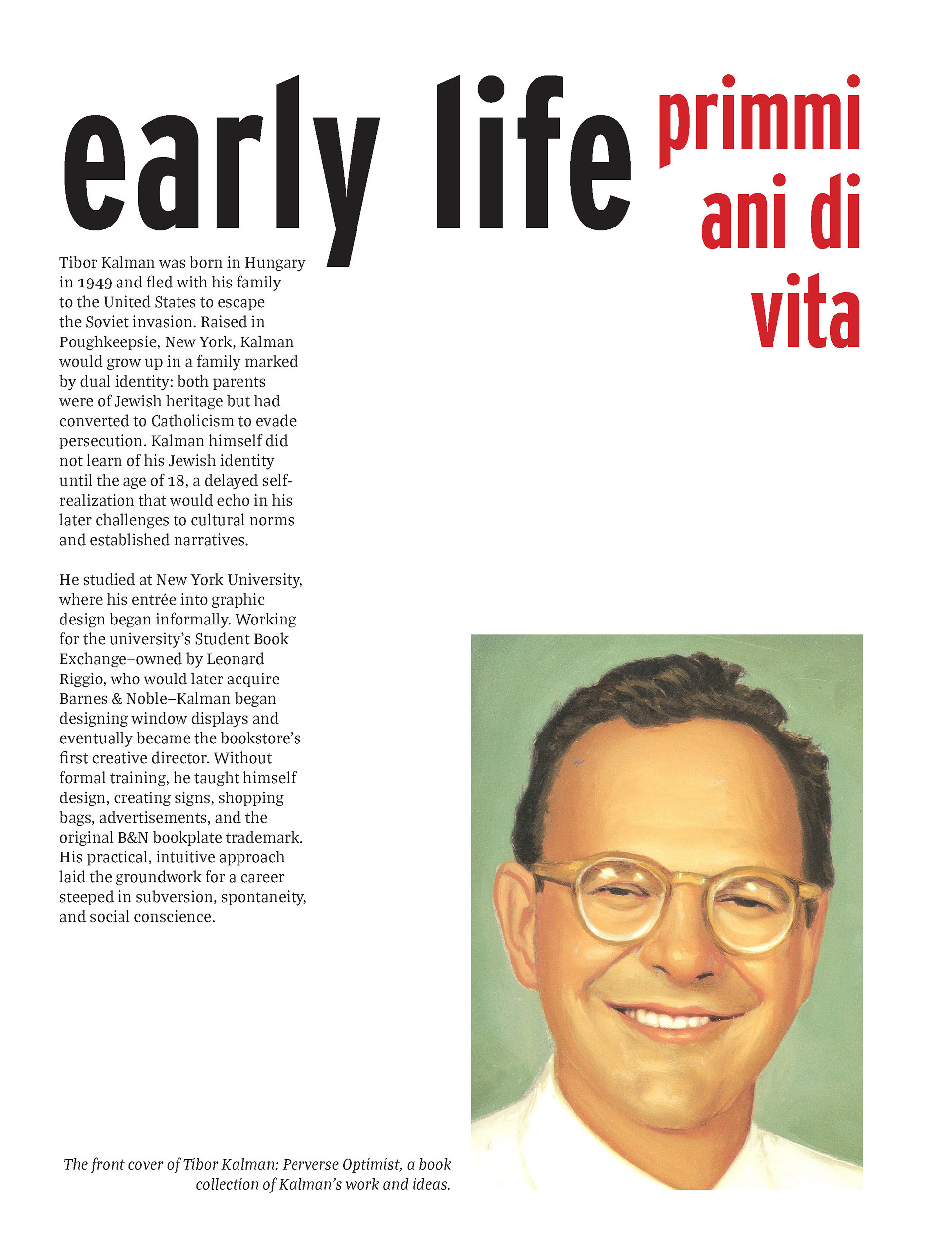
I included the title in Italian as well as English, but in this first version the Italian felt unbalanced.
I used Adobe Illustrator to vectorize the "M", a logotype used in M & Co. products, and played around with how to use it as a primary design element of the spread. In this initial version, focus was on how it changed fill from one page to the next, but I moved away from this idea because it felt disjointed.
The "M" was placed precisely to take up the equivalent space of one column of text.
The title is a close match to those of Kalman's magazine.
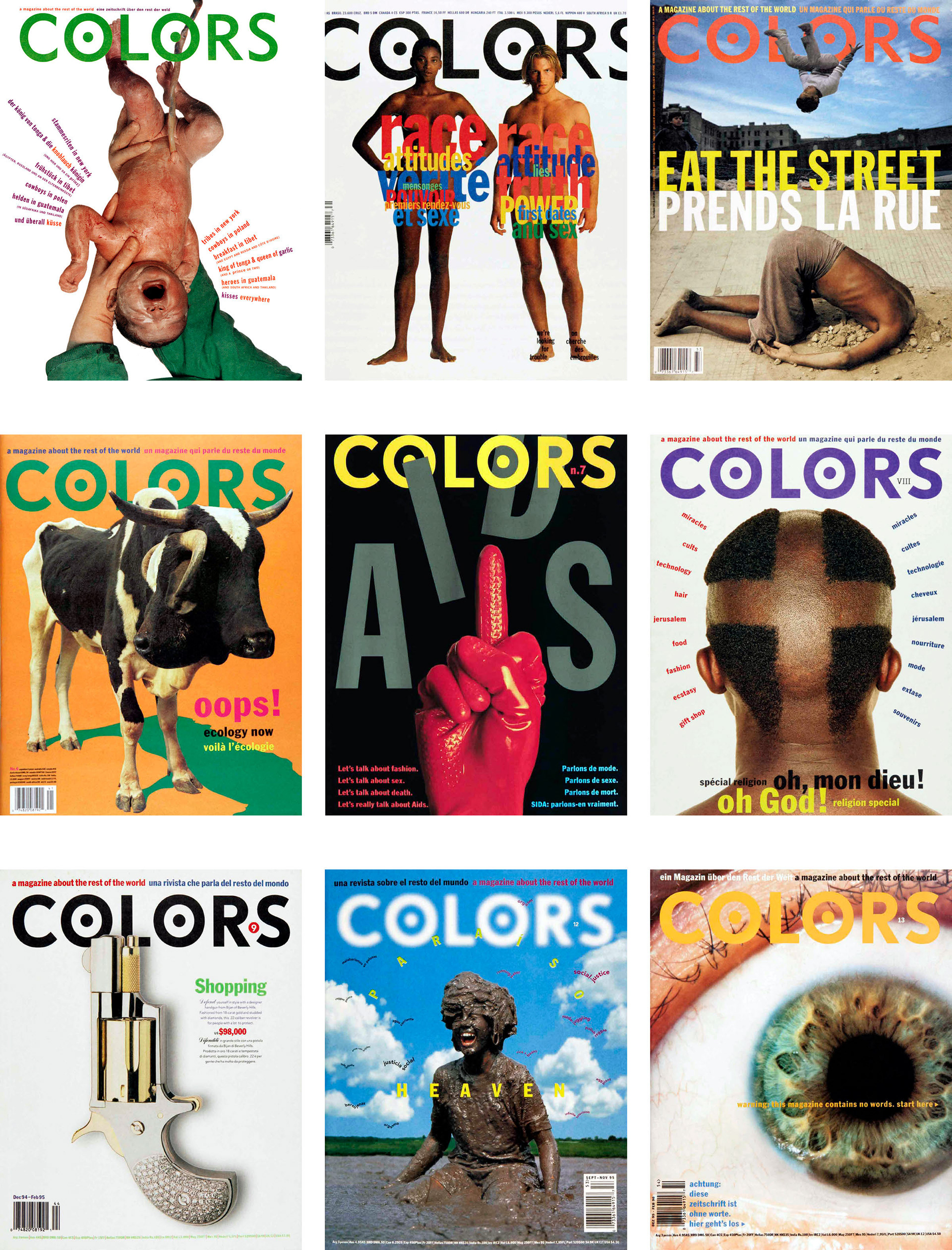
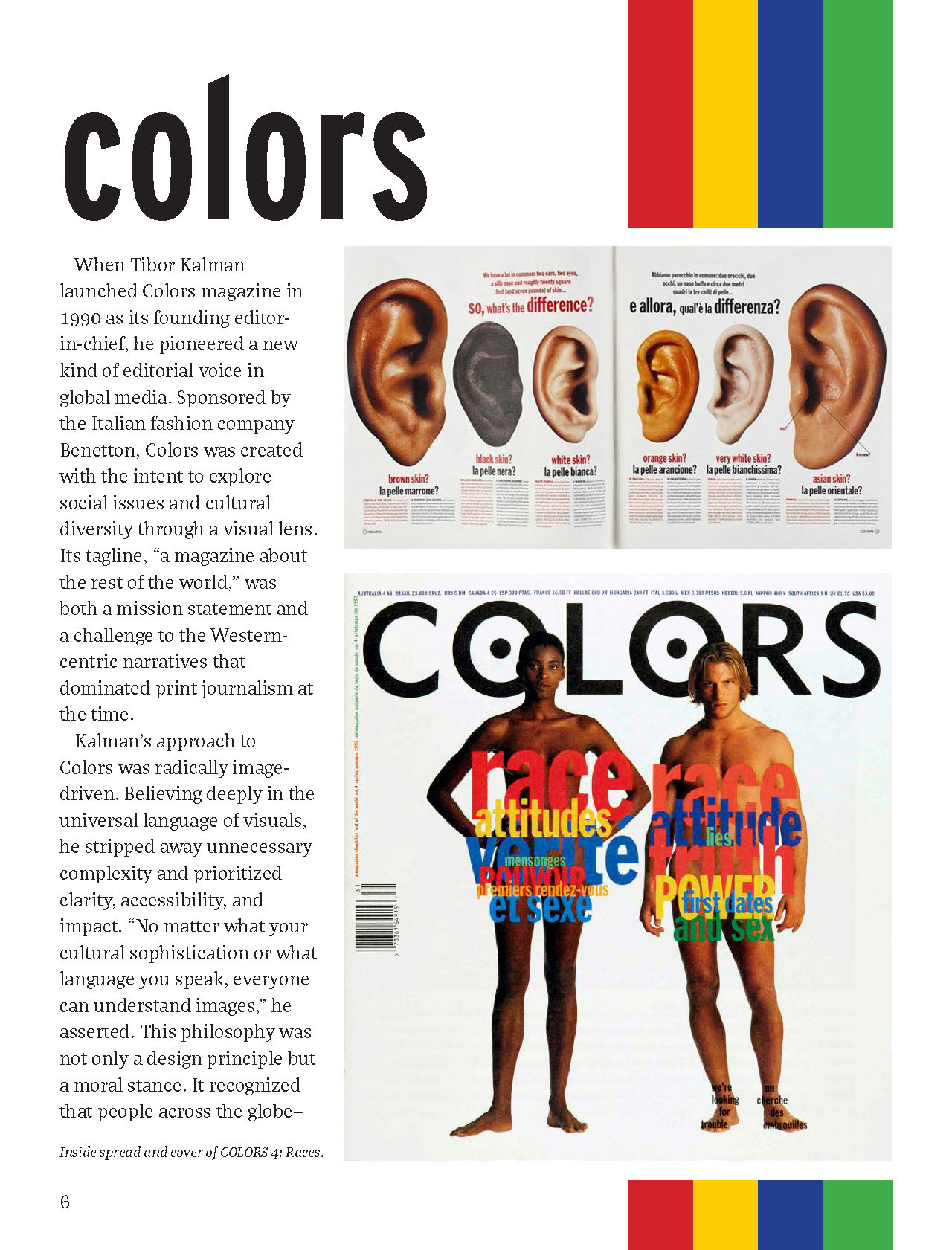
To exhibit the serial design of the Colors magazine, I displayed a selection of covers in a 3x3 grid.
Image captions have more details on specific design choices.
The initial drafts featured intentional white space as its own element of the layout. The primary colors of white, red, and black, as well as the inclusion of some secondary text in Italian, were inspired by Kalman's own work, especially in the Colors magazine.
After receiving feedback from peers and professor, I iterated on the layout designs for each section. Critique led me to the final version below.
Final Layout
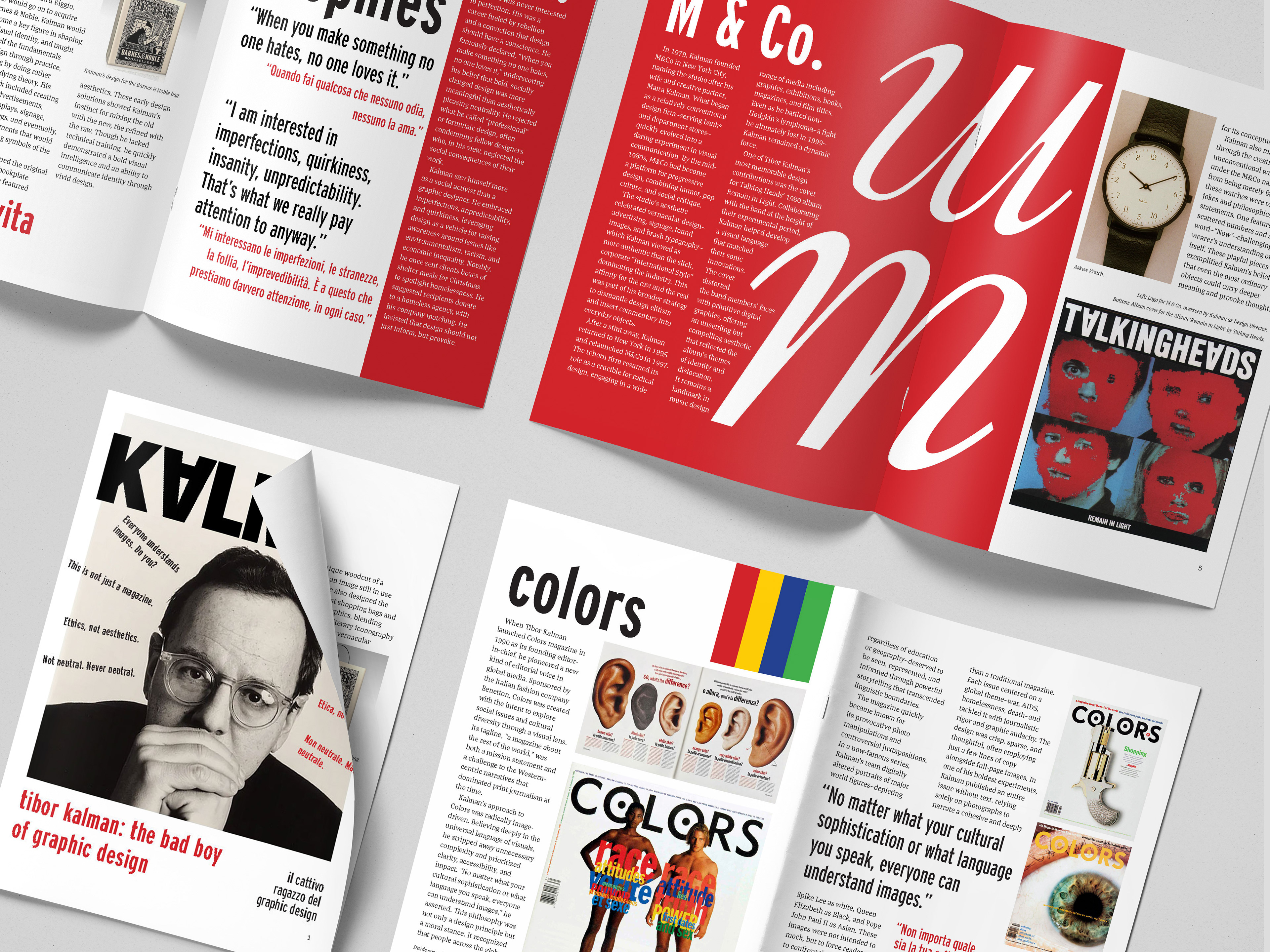
Mockup showing all pages of the final layout.
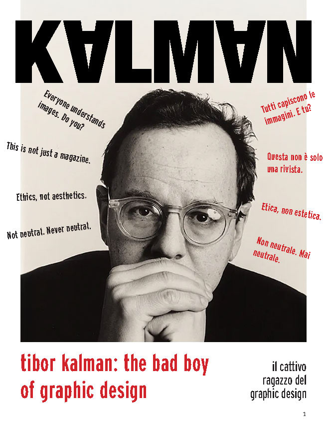
The photo of Kalman is shrunk slightly to enhance readability of the title.
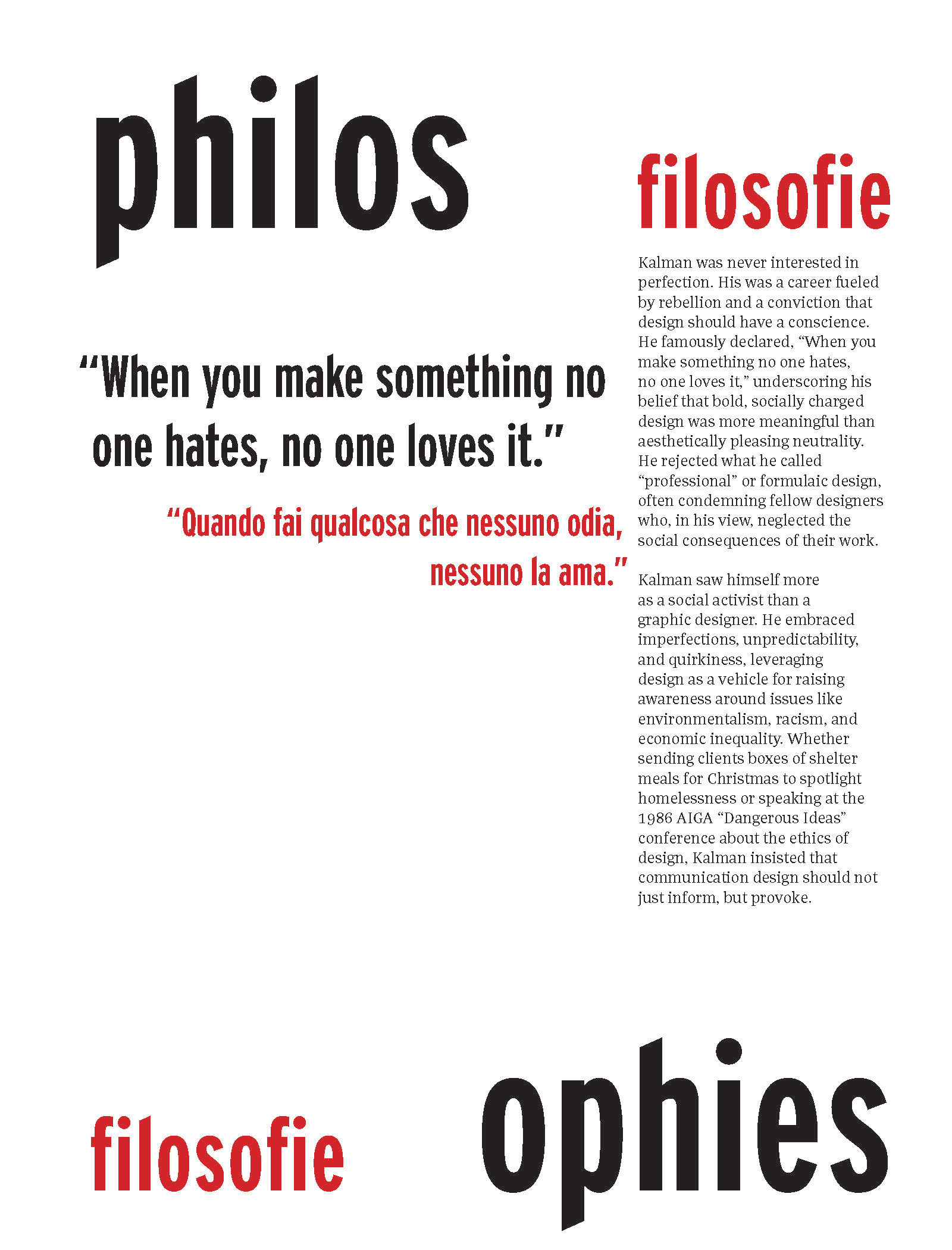
This spread includes the header in both English and Italian, a nod to
I chose to prominently feature quotes by Kalman to help the reader easily understand the perspective he takes to his work. The red background behind the body text is added to add rhythm to the page and seamlessly incorporate it into the next spread.
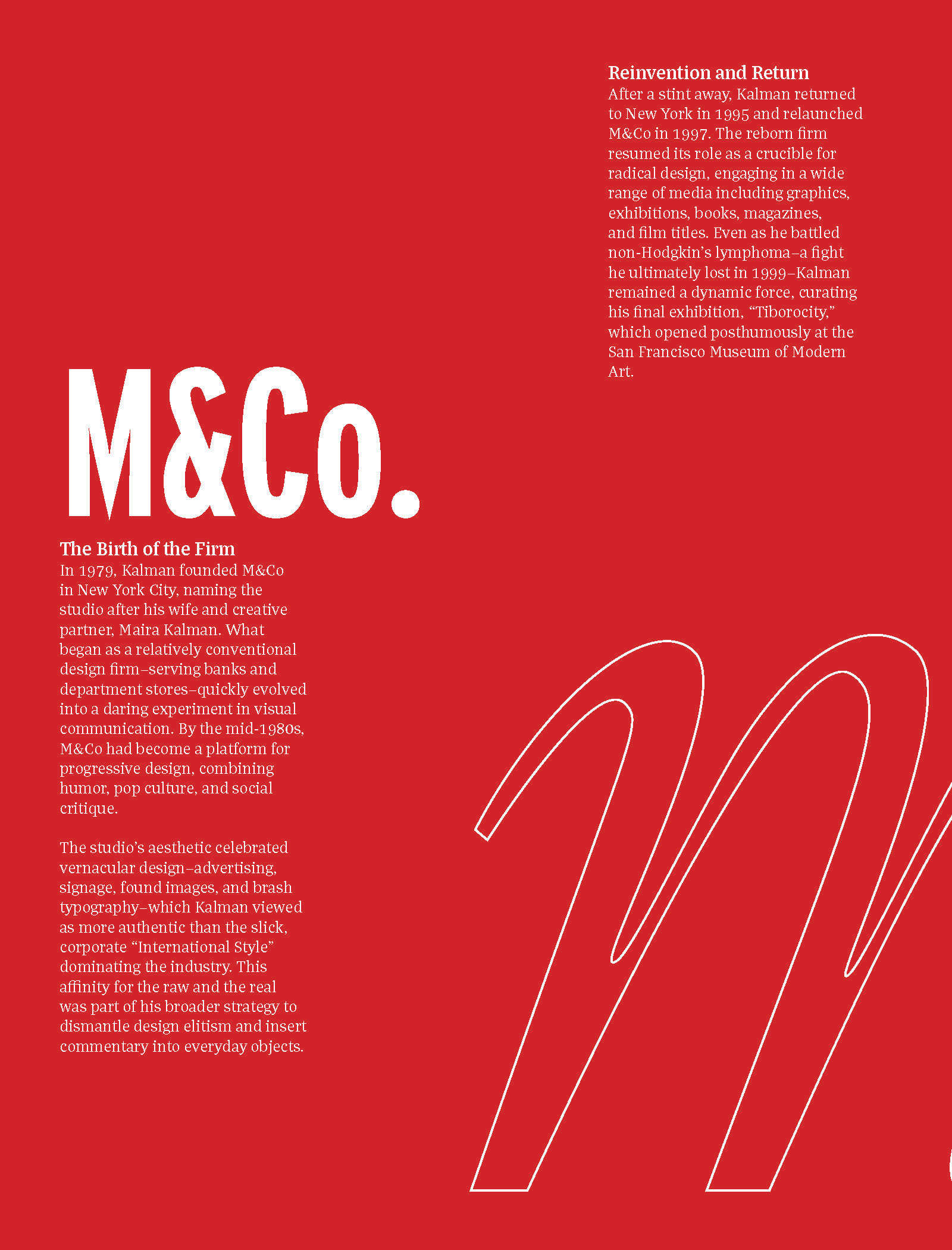
I used the curvature of the "M" on the M & Co. spread, placed across both pages, to inform the shape of the text around it and break up the long paragraphs.
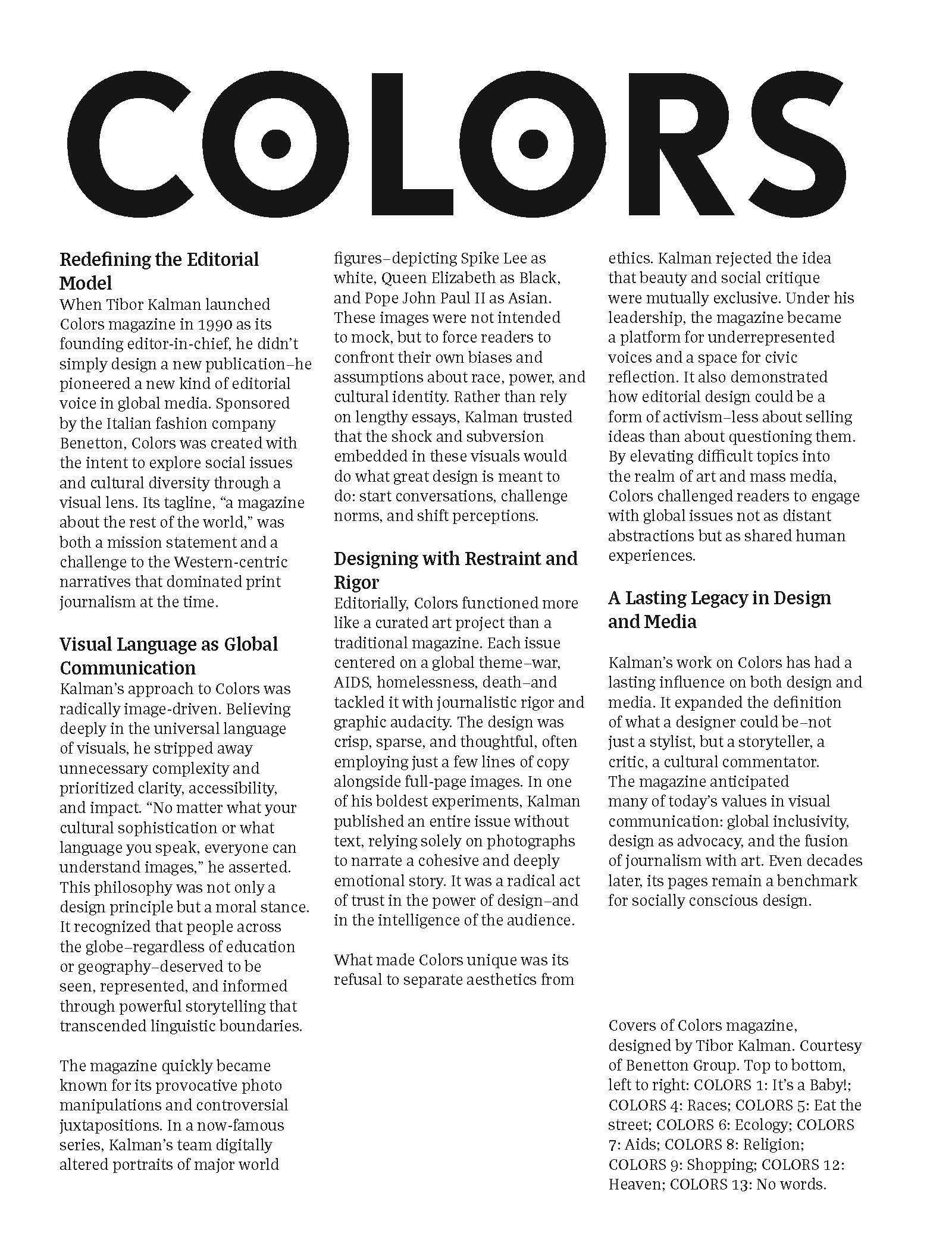
I moved away from the header of this page designed like the Colors magazine to keep consistency in my design. I added the colorful stripes, a reference to the content of the page, to break up the white space visually.
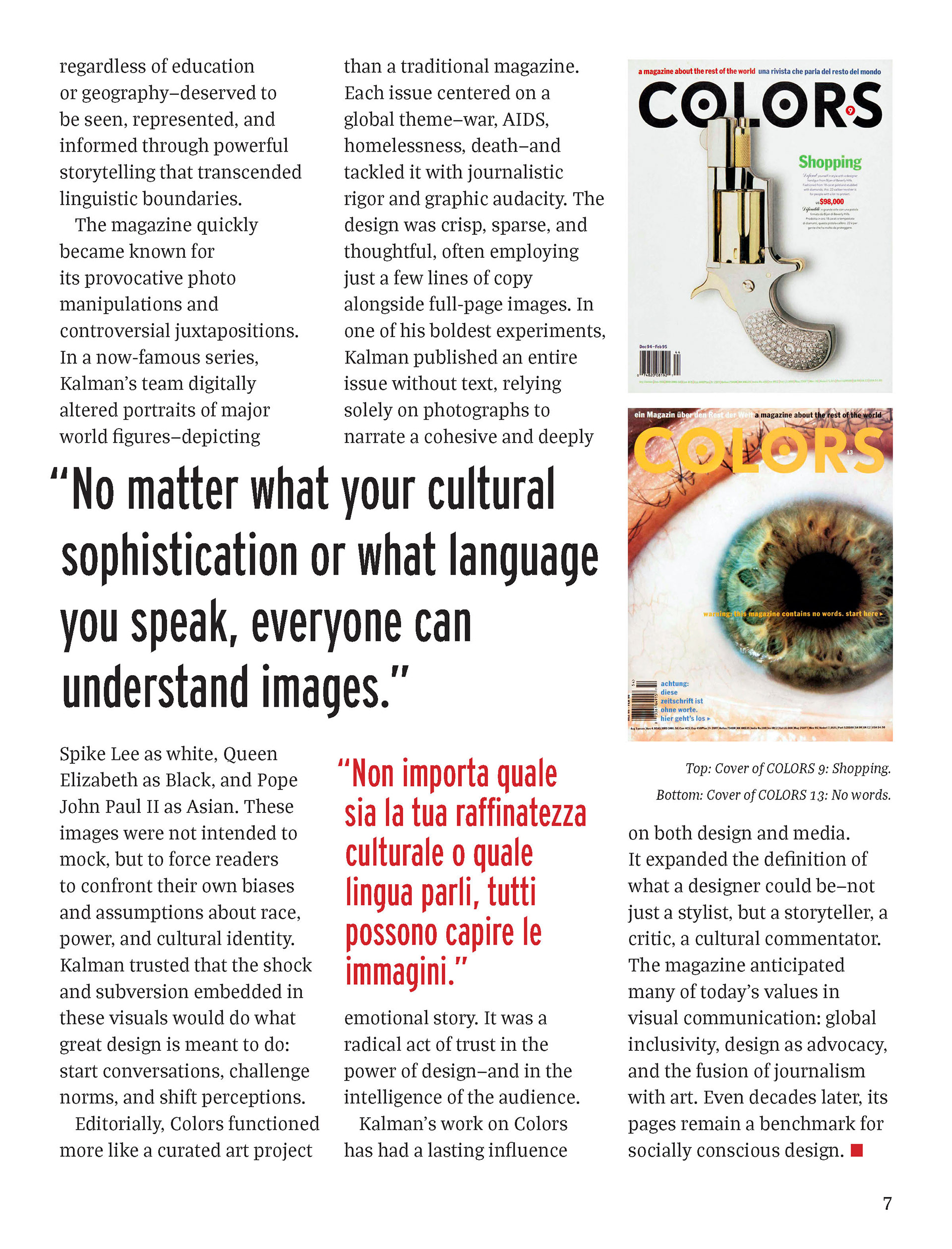
I pivoted from the slightly overwhelming grid of Colors covers to featuring a select few impactful ones.
Image captions have more details on specific design choices.
The final version of the magazine article.
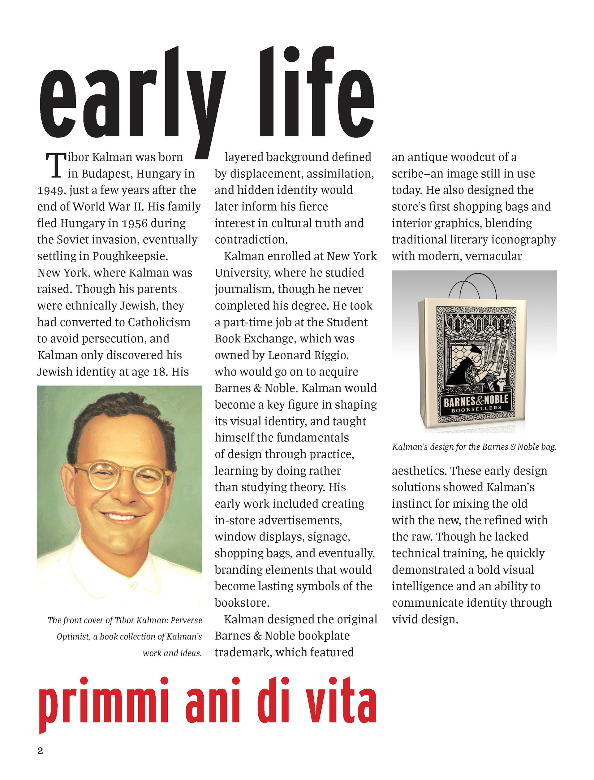
The body text is slightly enlarged for readability. It has minor edits, including the removal of subheadings, as I felt each section was concise enough where they were not necessary.
AI disclosure: generative AI was used to write the body copy, as writing was not the focus of this project. I provided it with my research on Kalman and asked it to write body copy for each of the sections I had. All quotes are attributed to Kalman.
Style Guide
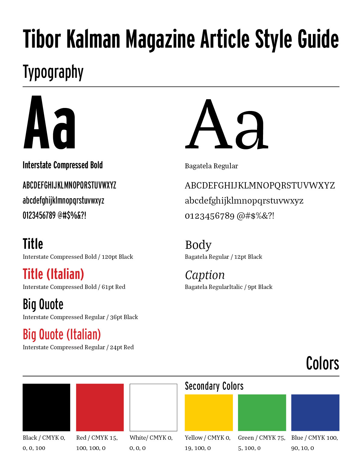
I chose Interstate Compressed Bold as the header font because of its strength and unique slant on the tops and bottoms of letters. Bagatela Regular was chosen for its legibility as a serif font and the slight playfulness in the terminals of letters.
I developed this style guide to ensure that typography and color were consistent across spreads. It should also be noted that the three column structure was an intentional choice throughout the article.