This restaurant concept was created from scratch by me, with feedback from an art director along the way.
After I came up with the idea for a Danish restaurant, I began by brainstorming words to describe the brand. I used selected words to create a mood board to visually describe the brand.
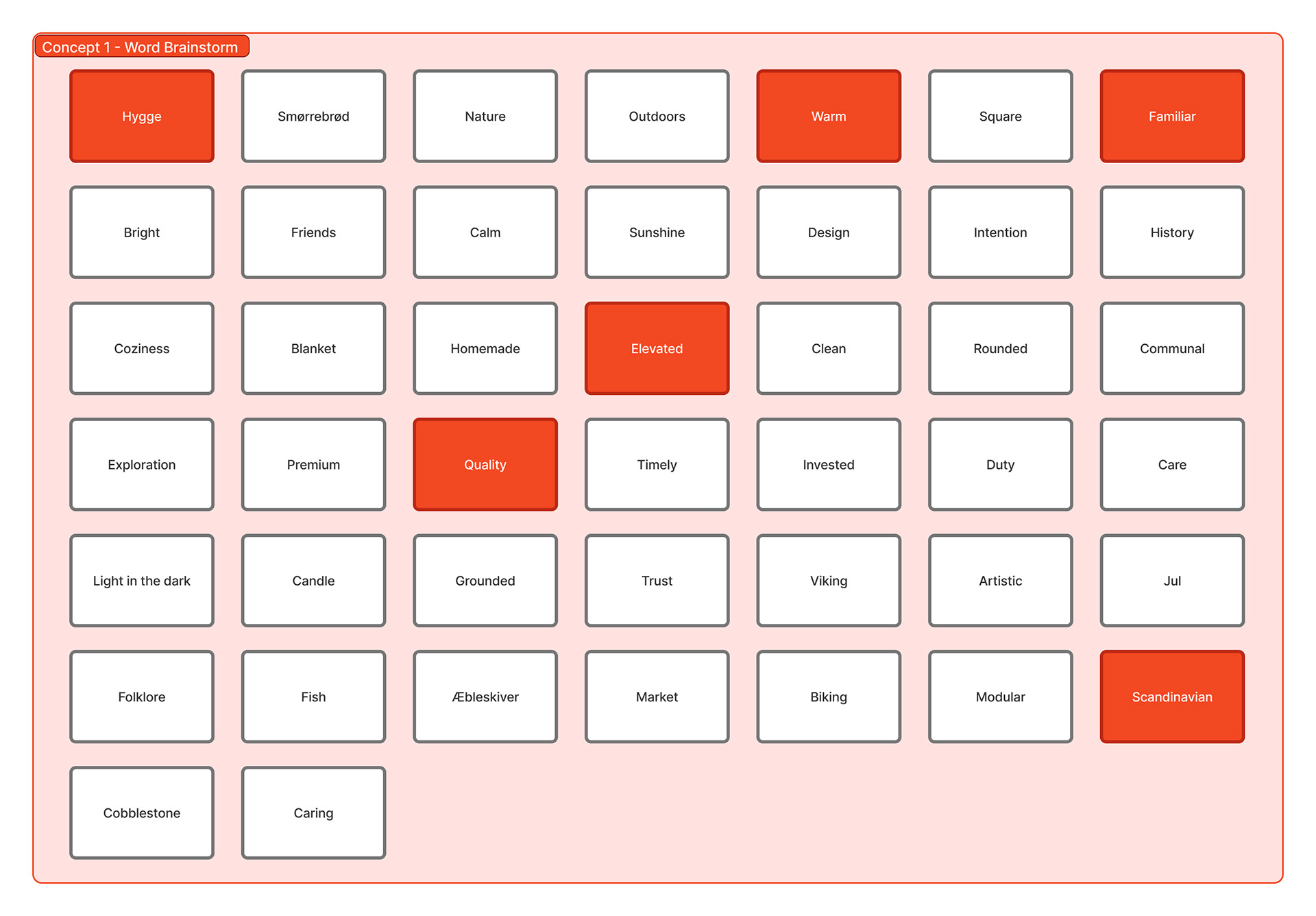
Word brainstorming
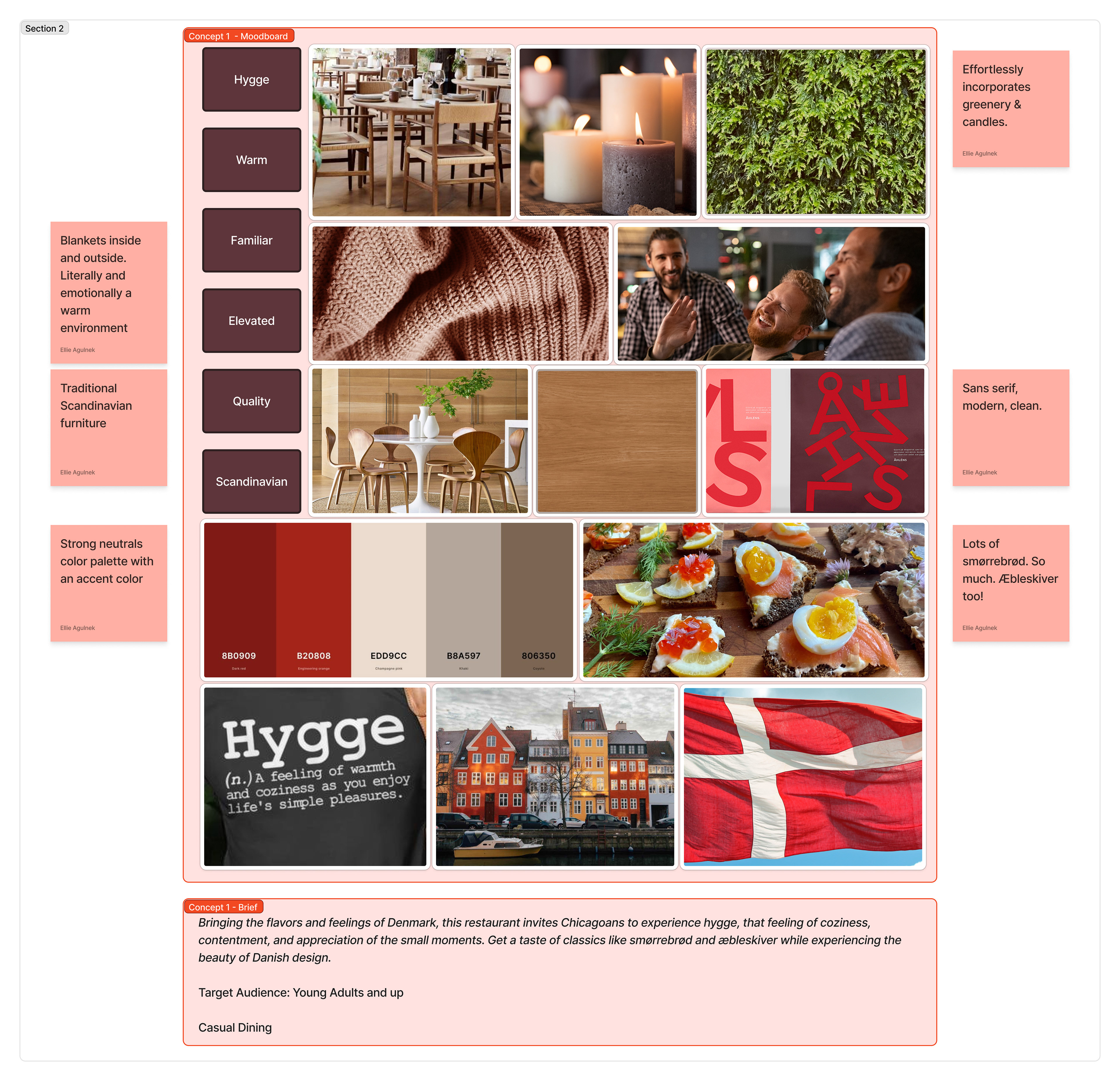
Moodboard
Click to enlarge
I knew I wanted to incorporate the Danish language into the restaurant's name, but Danish is a difficult language to pronounce. The name had to be accessible to Americans, otherwise it would be a barrier in growing the restaurant's reputation.
As I positioned the restaurant as being open from the morning to the evening, I found the word Aften. It means evening in Danish and starts with the letter A: it literally goes from the start of the alphabet to the end of the day, bridging the gap between the Danish food and the American location.
Logo
Once I had the name, I sketched a number of different logos.
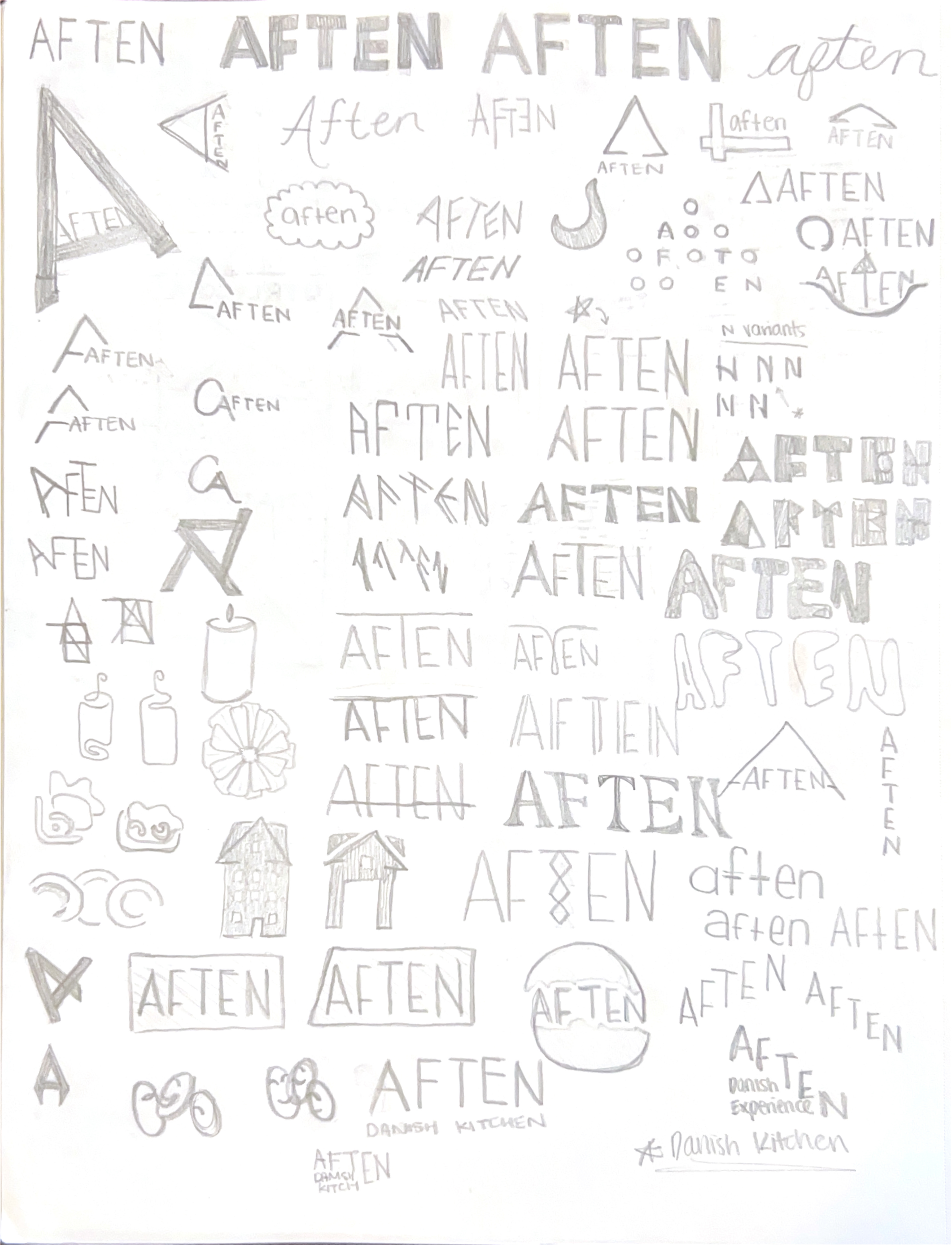
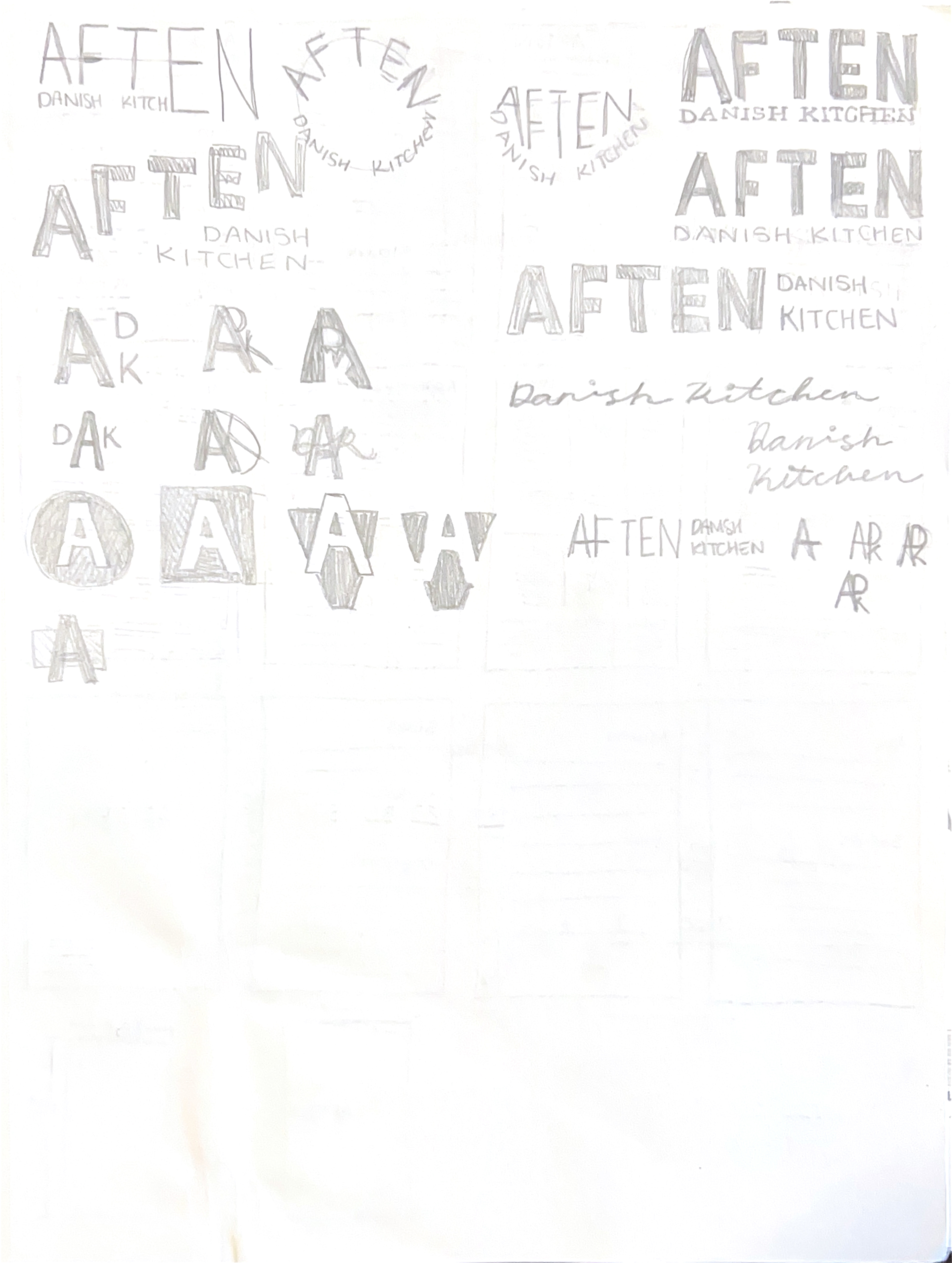
I chose to move forward in the direction of a sans serif, all caps logo because I wanted to bring in Scandinavian characteristics of clean typography and functional minimalism.
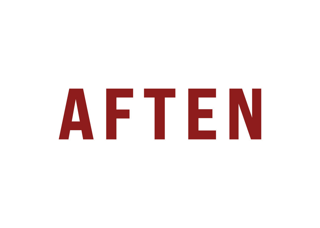
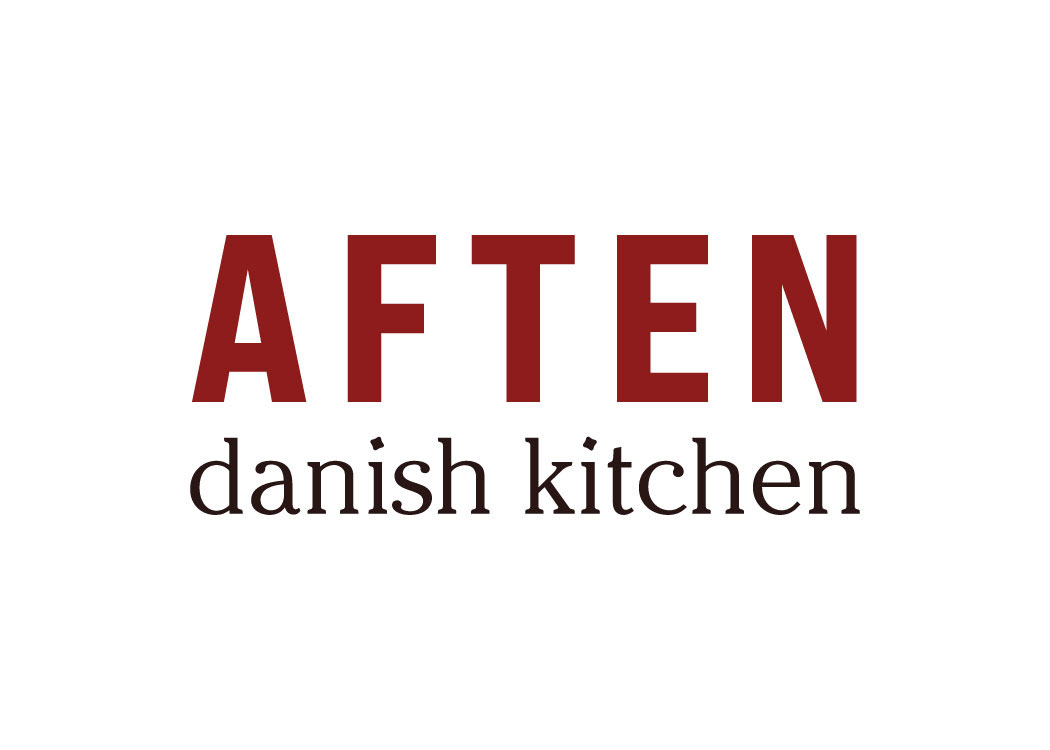
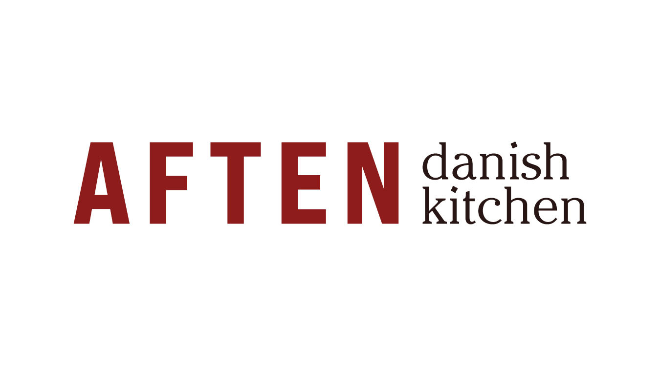
The tittle on the i's is a custom, unique element that I used throughout the brand to create lines and patterns.
Menus
Every dish was carefully researched to encompass both traditional Danish food and modern favorites. I also drew on my experience living in Copenhagen and the locals I got to know in order to craft the menus.
After I decided on the food, I began puzzling together the menu layout.
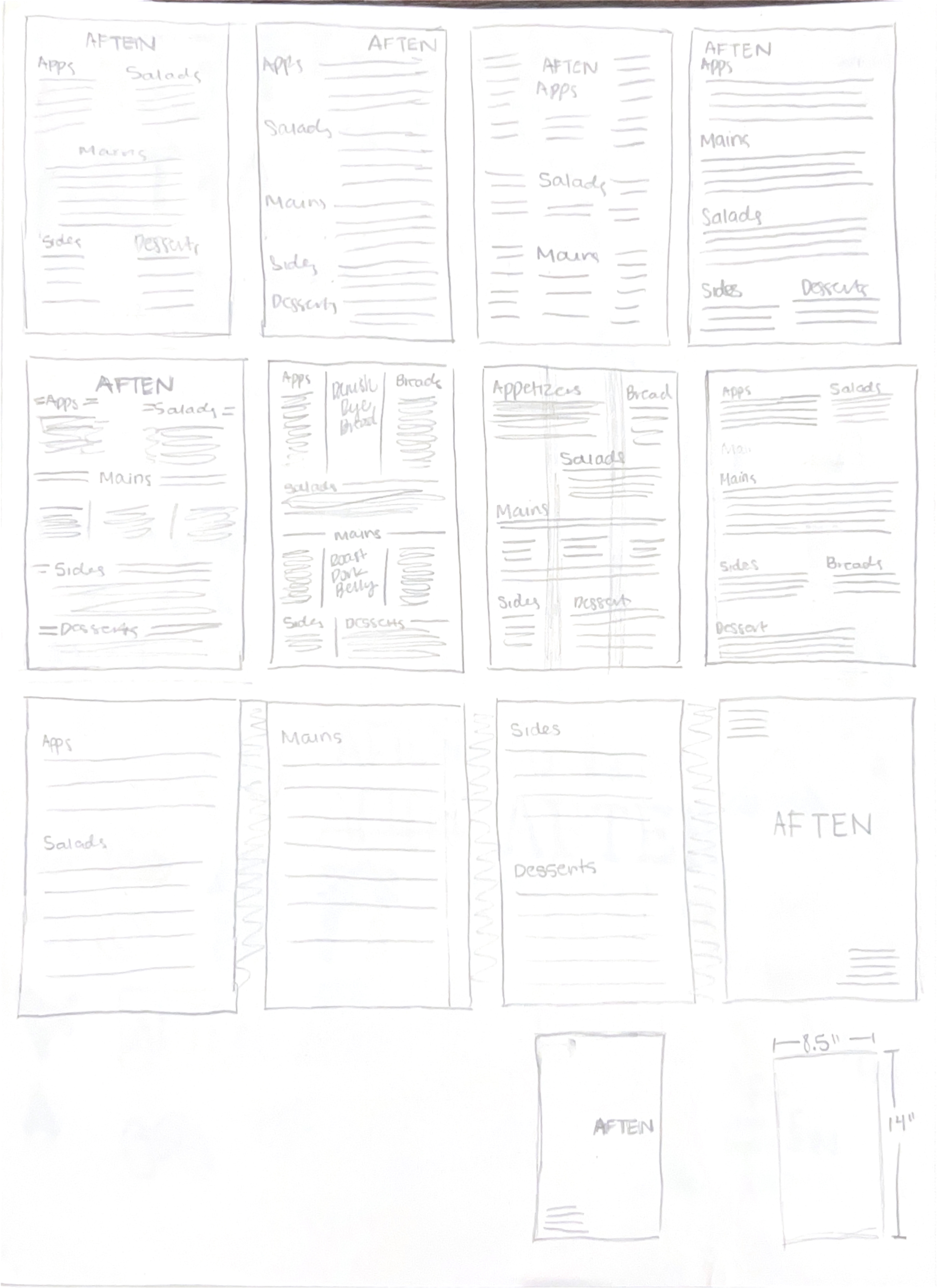
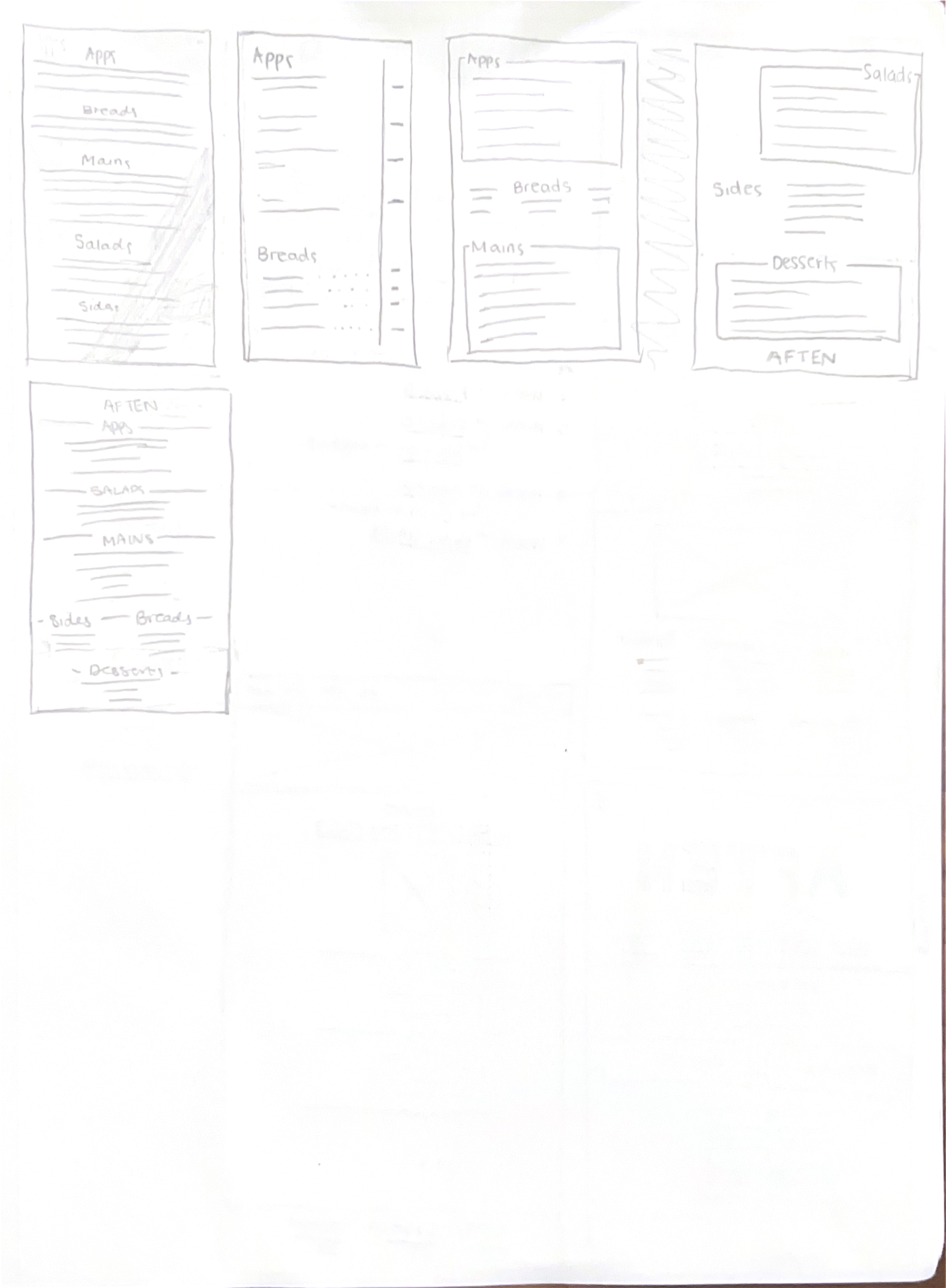
I decided to make each menu 1-2 pages after speaking with an art director, as I learned that having less menu pages can be a better experience for customers. Less pages reduces decision fatigue and minimizes the paradox of choice (where too many choices leads to anxiety & dissatisfaction).
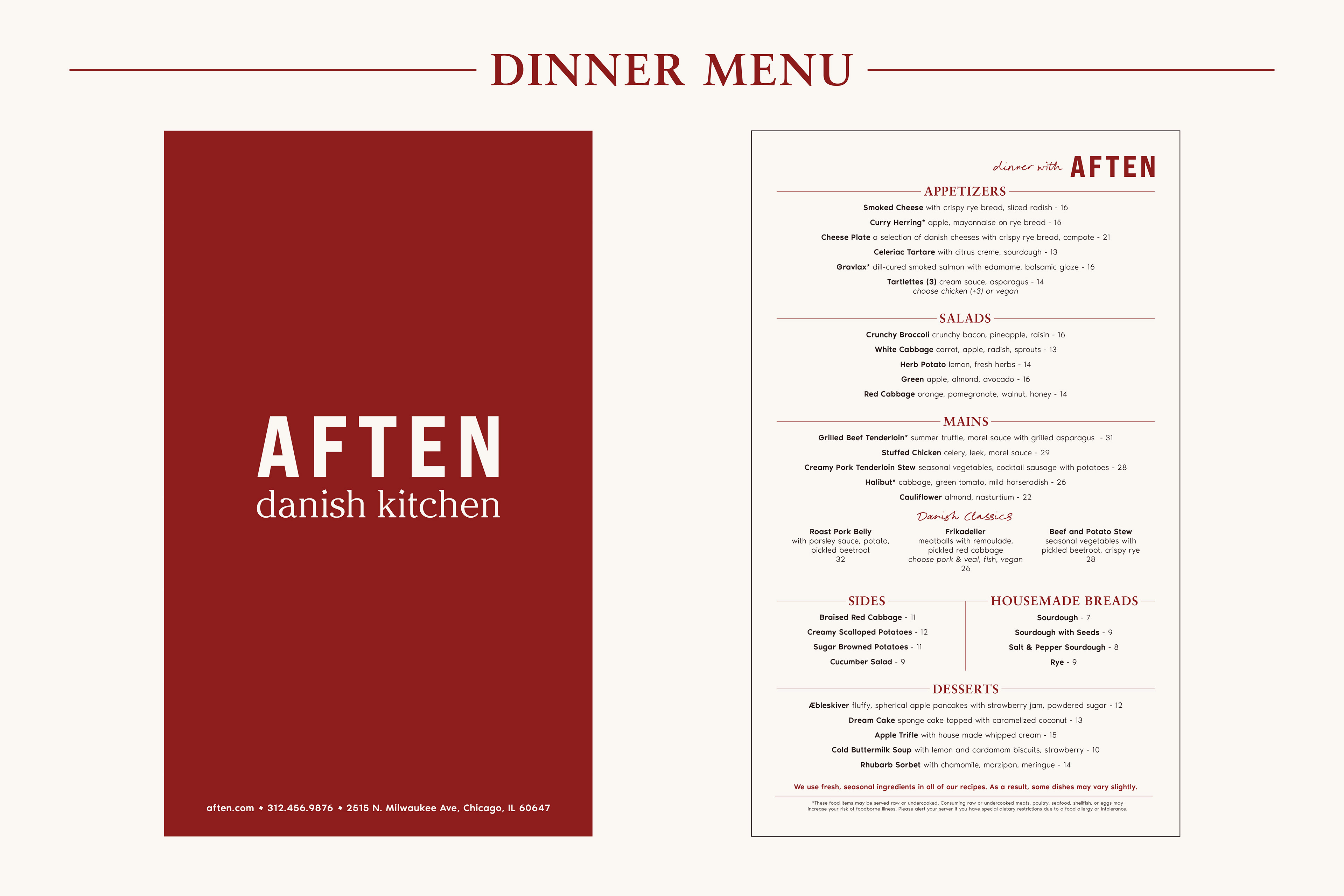
Dinner menu
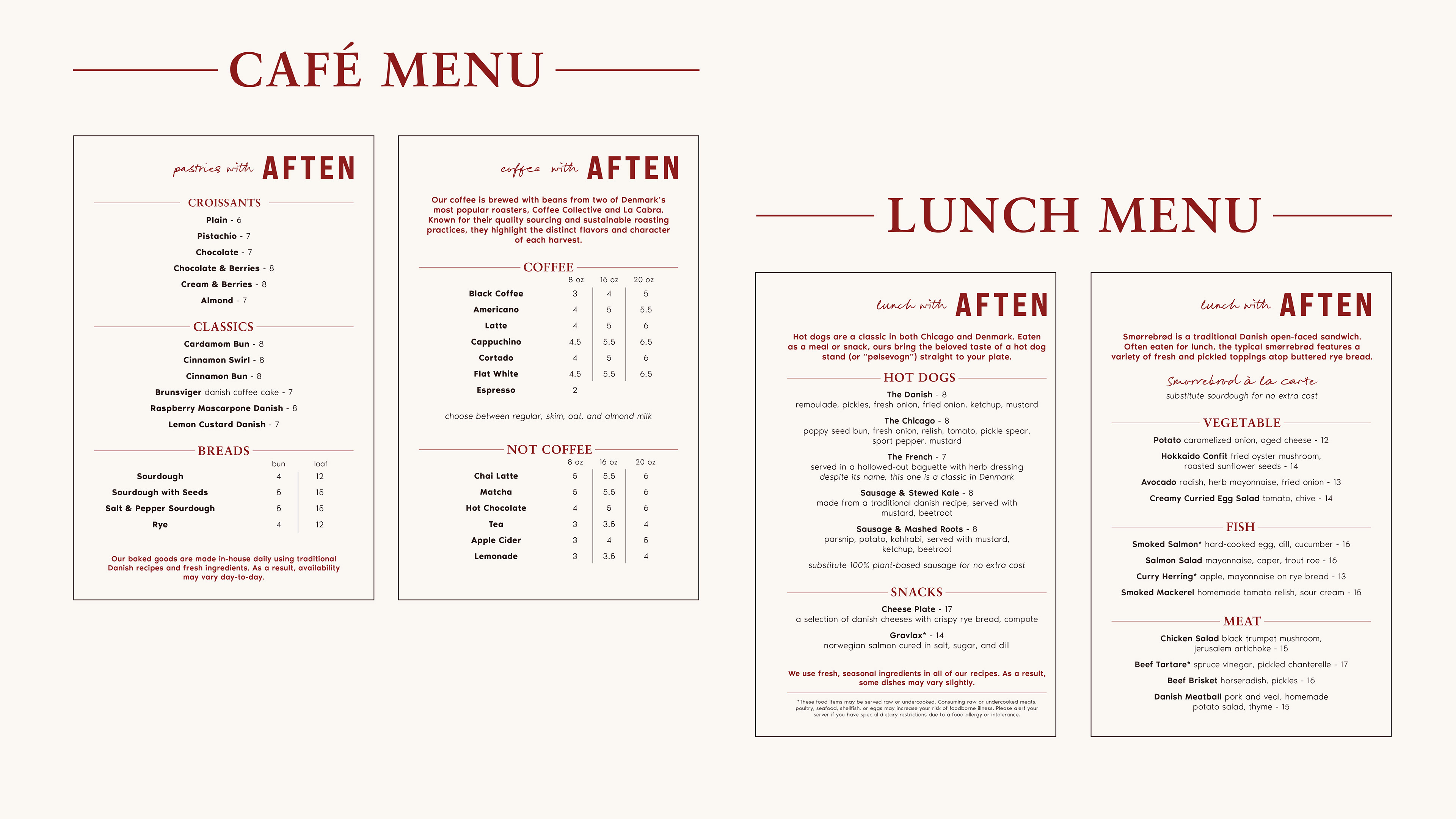
Cafe and Lunch menus
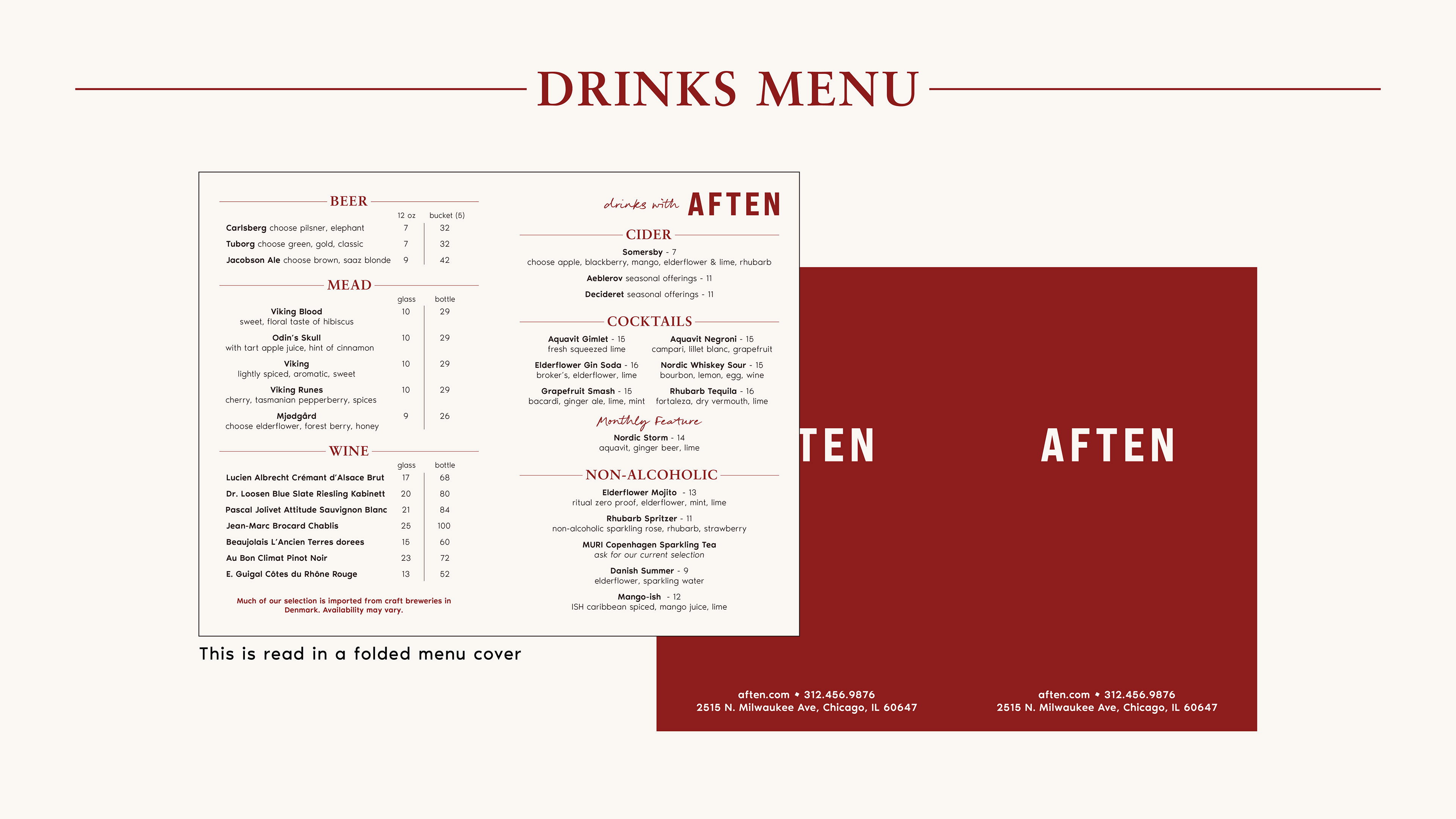
Drinks menu
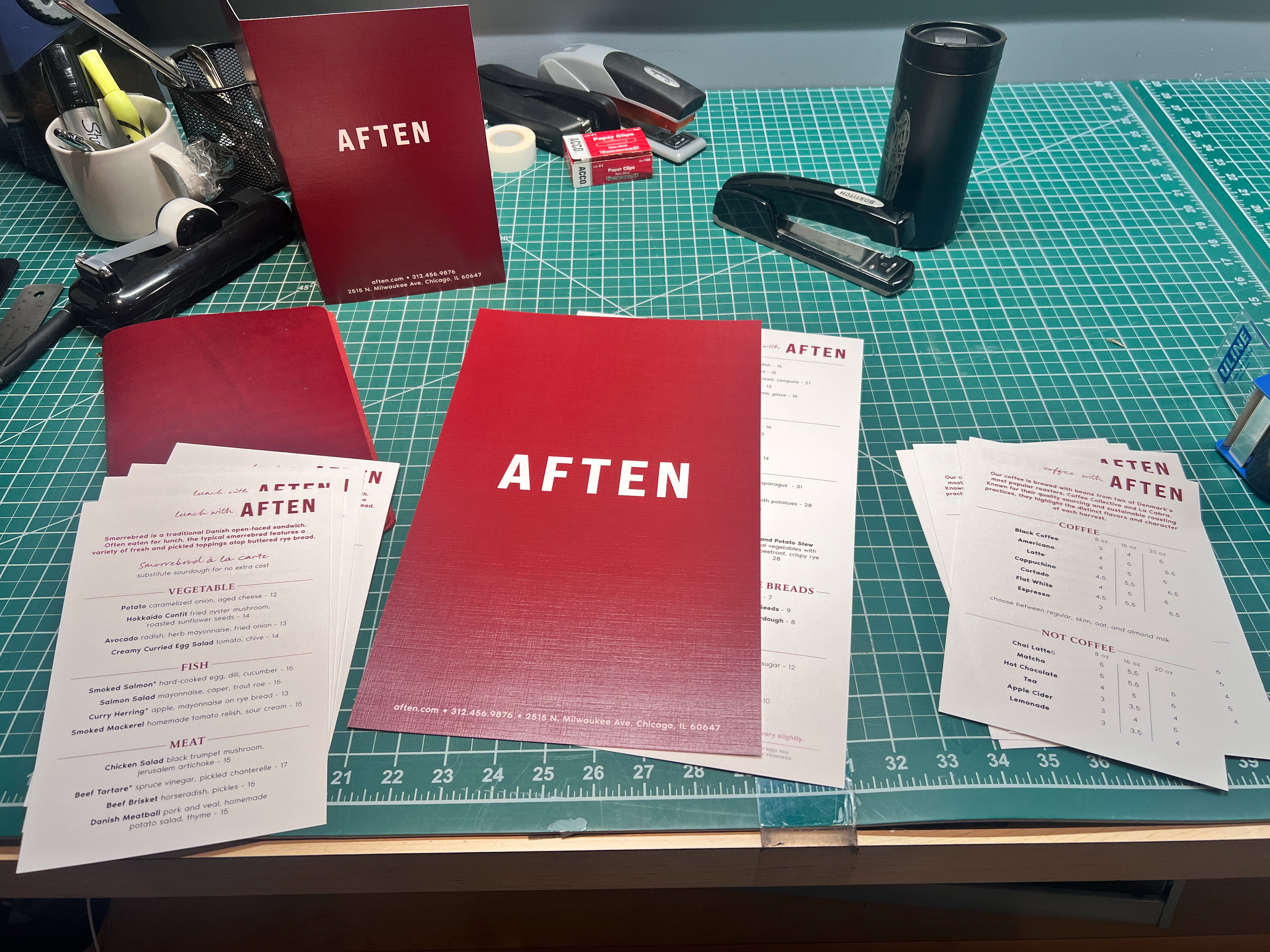
The menus printed and cut. I later reprinted the dinner menu to use the logo with "Aften danish kitchen"
Click to enlarge
Each menu was printed on 80C Linen paper, giving them a soft texture and adding a distinct touch to the customer's experience.
Merchandise
Hygge, a Danish word describing the feeling of coziness and contentment, is a big part of Danish culture. Candles are everywhere in Denmark, and contribute to a place feeling hygge, so it was natural that Aften's merch would be candles and collectible matchboxes.
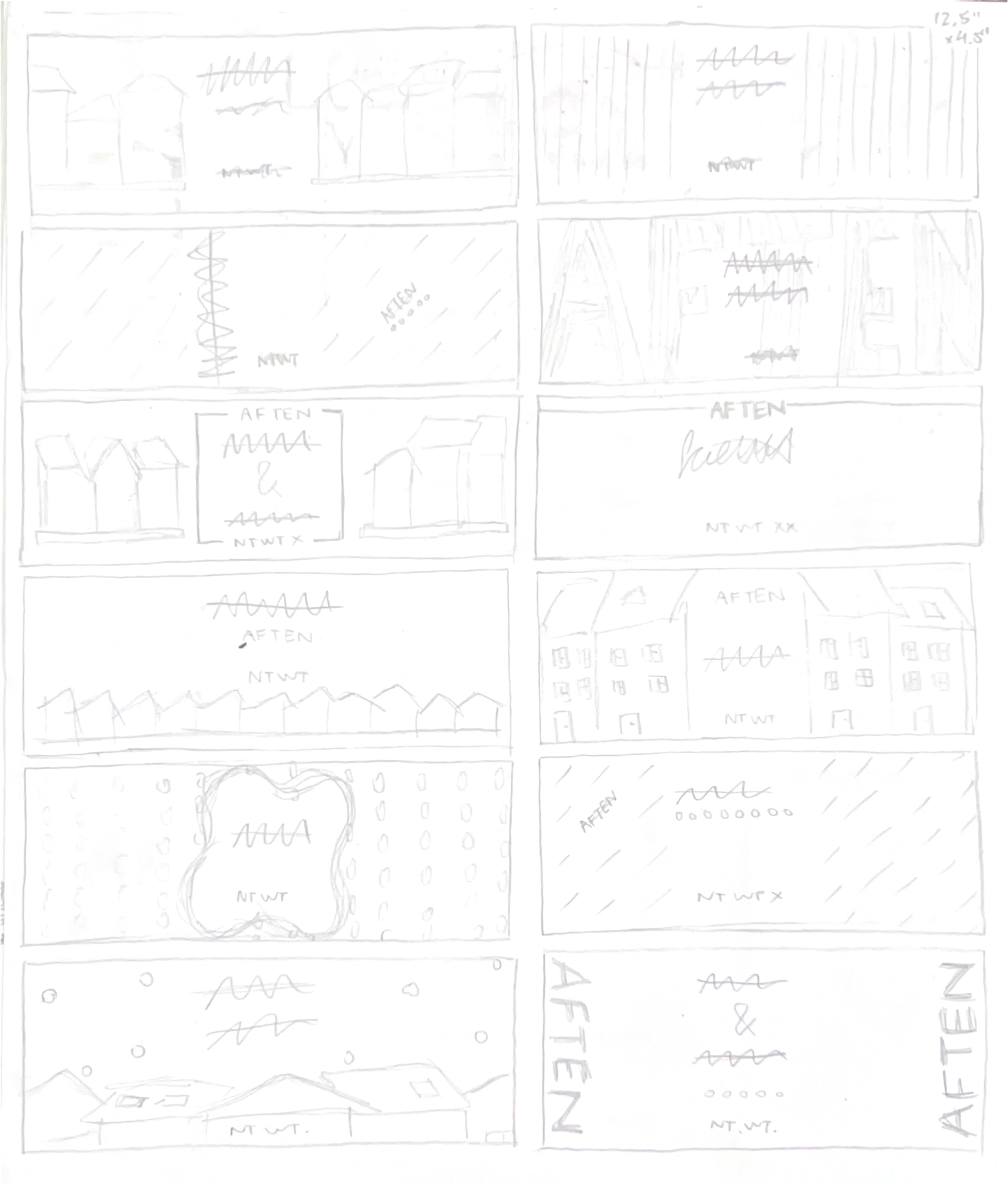
Candle label sketches
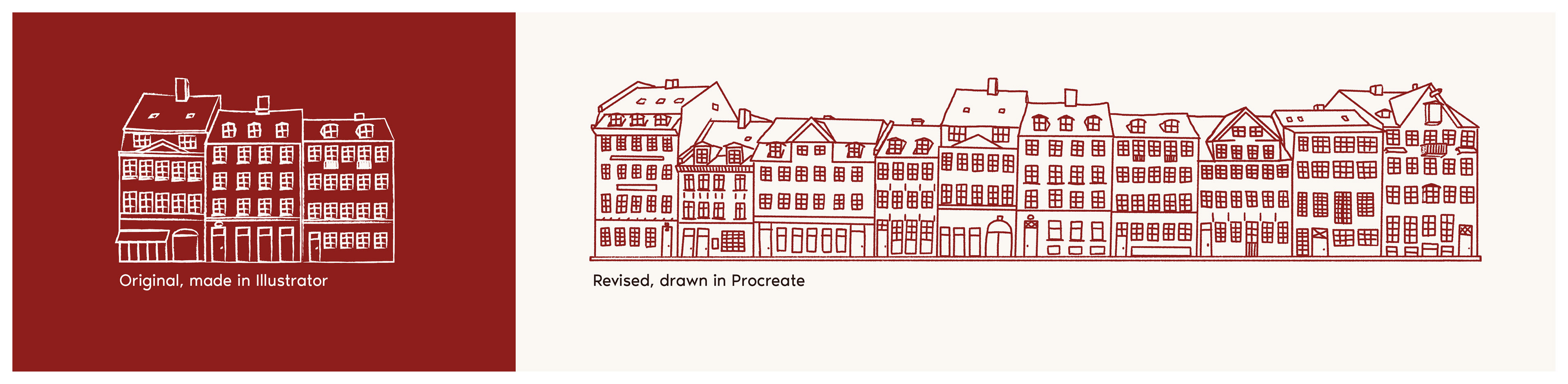
I wanted to include an illustrative element because I felt this gave more depth and story to the items. I chose to outline the buildings because I have found that this image of four story, tightly packed buildings with many windows is immediately connected to Copenhagen.
I first tried to create this in Illustrator, but the lines felt too prescribed and mechanical, so I switched to drawing in Procreate.
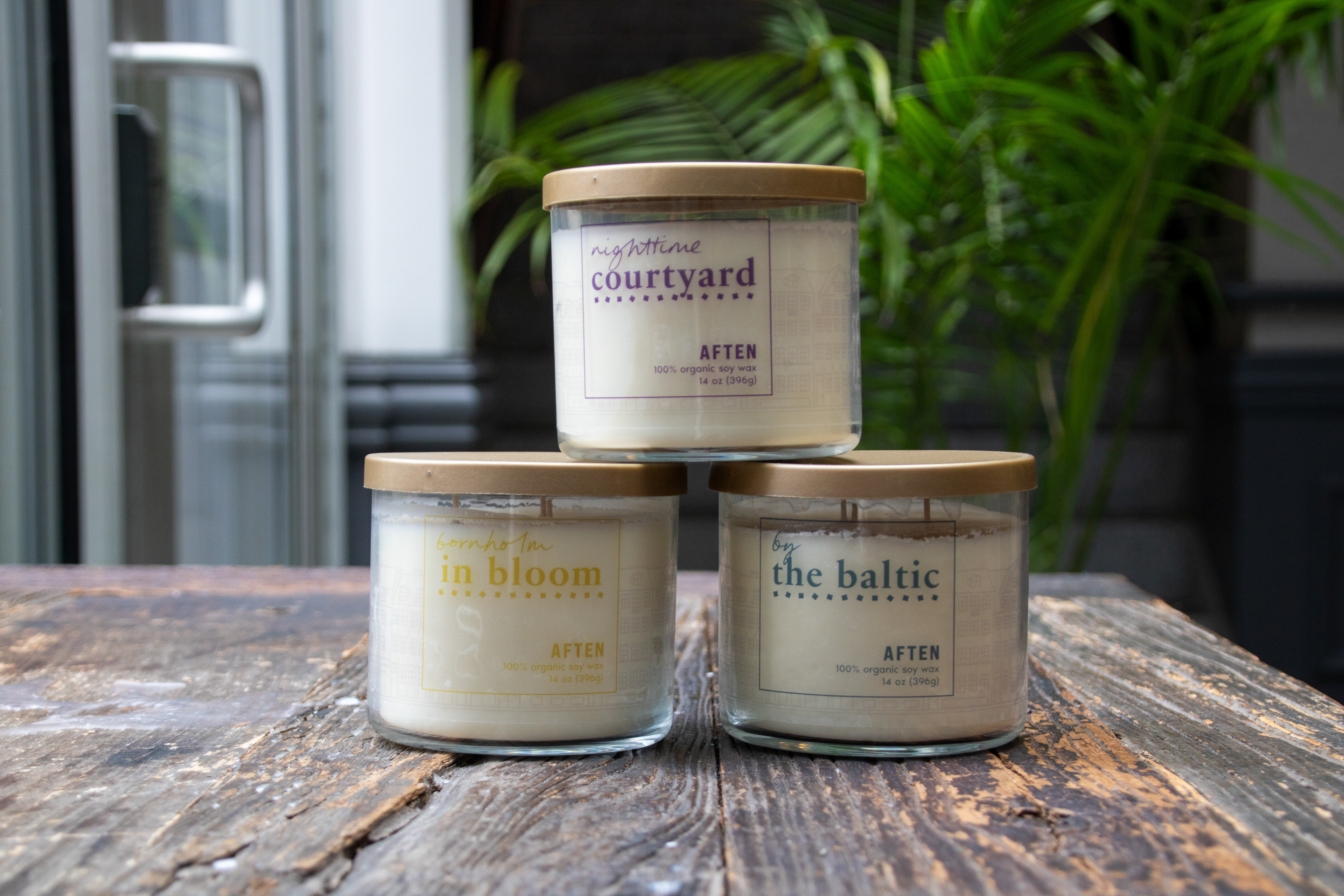
Front view
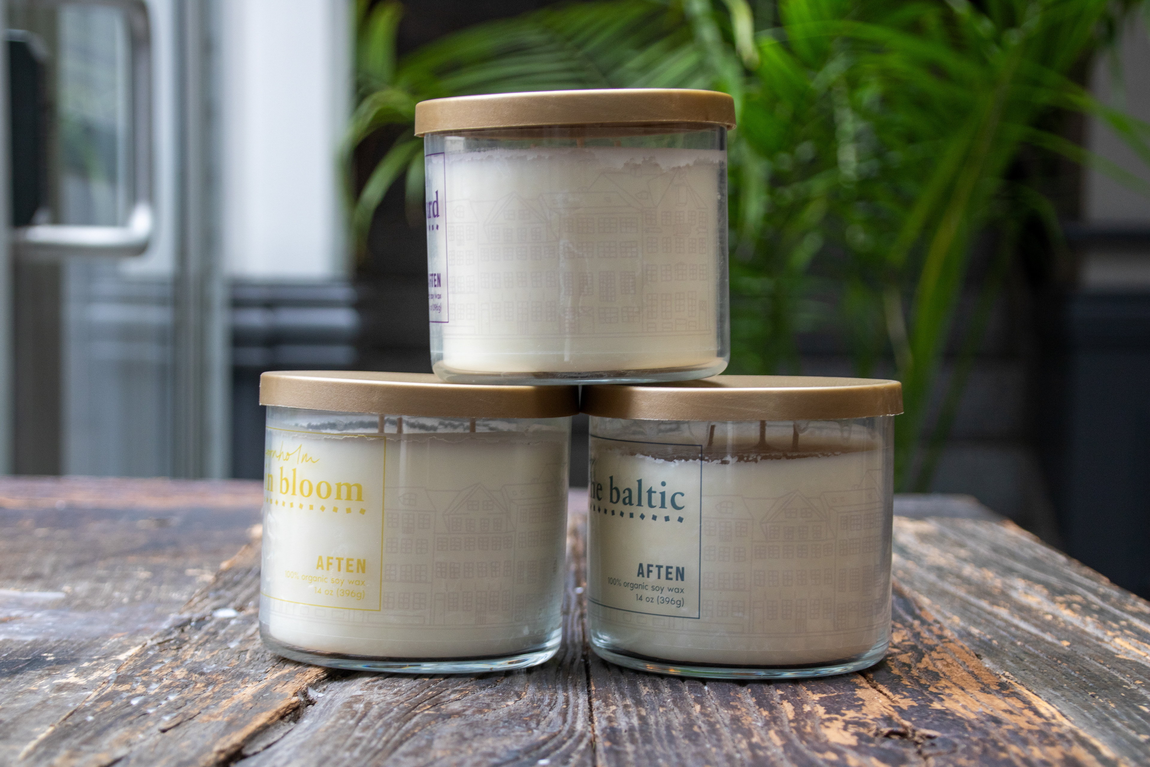
Side view - notice the illustration
I applied the same illustration to the match boxes and created a dieline. I failed the first time, as the dieline I used was incorrect. I remade it with the correct die line, printed it, and cut and taped it by hand to create the final match boxes.
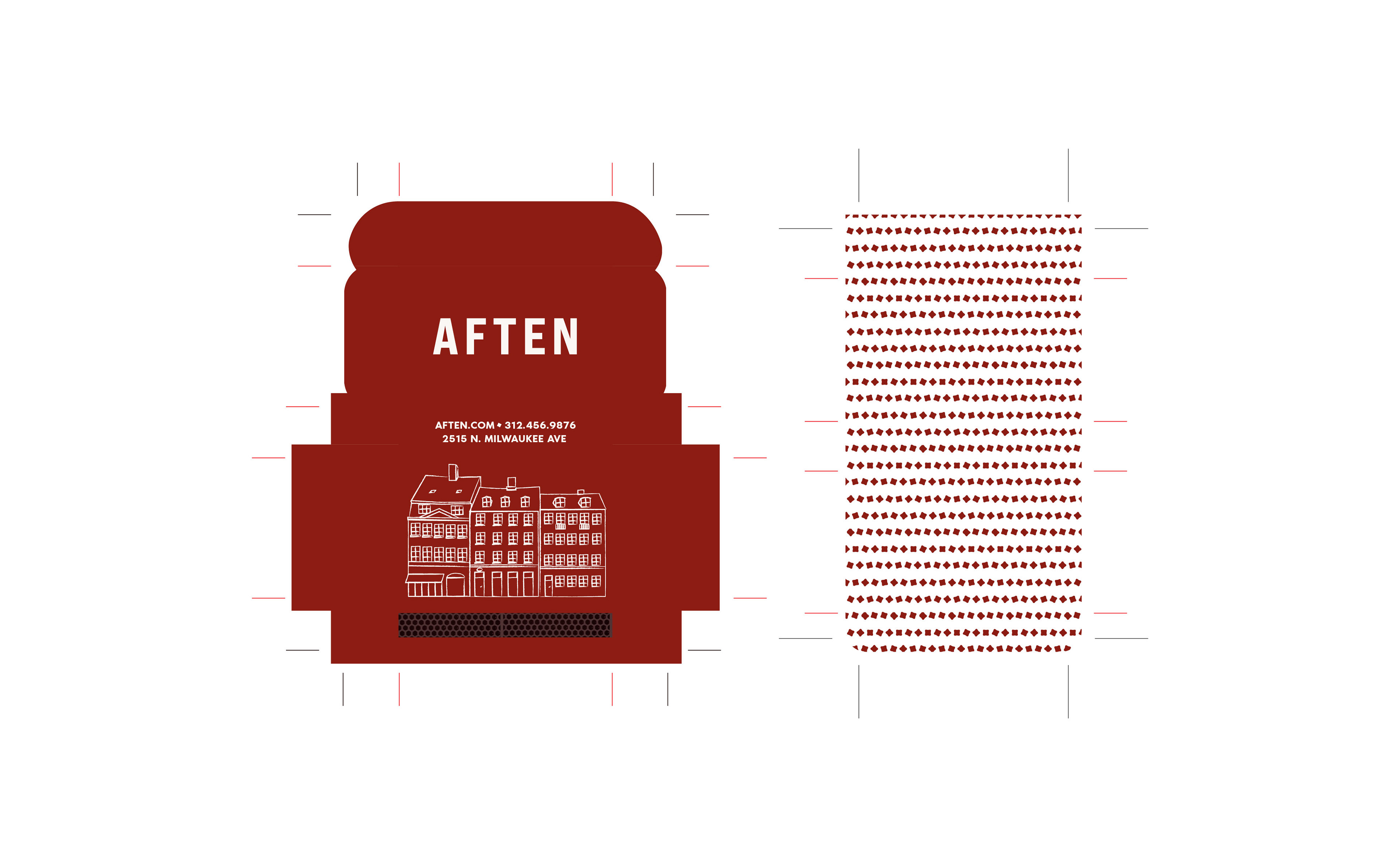
Original dieline - did not work
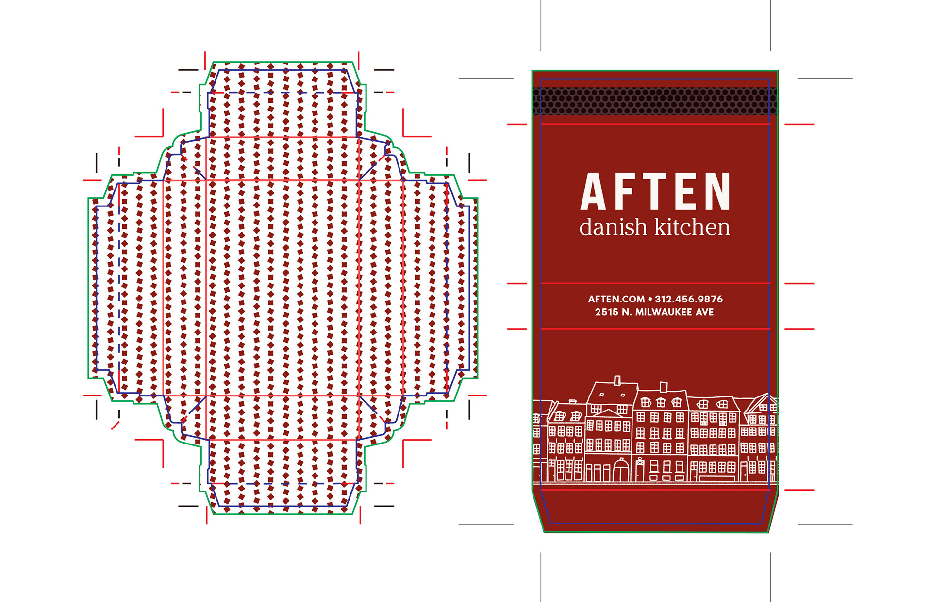
Revised, final dieline
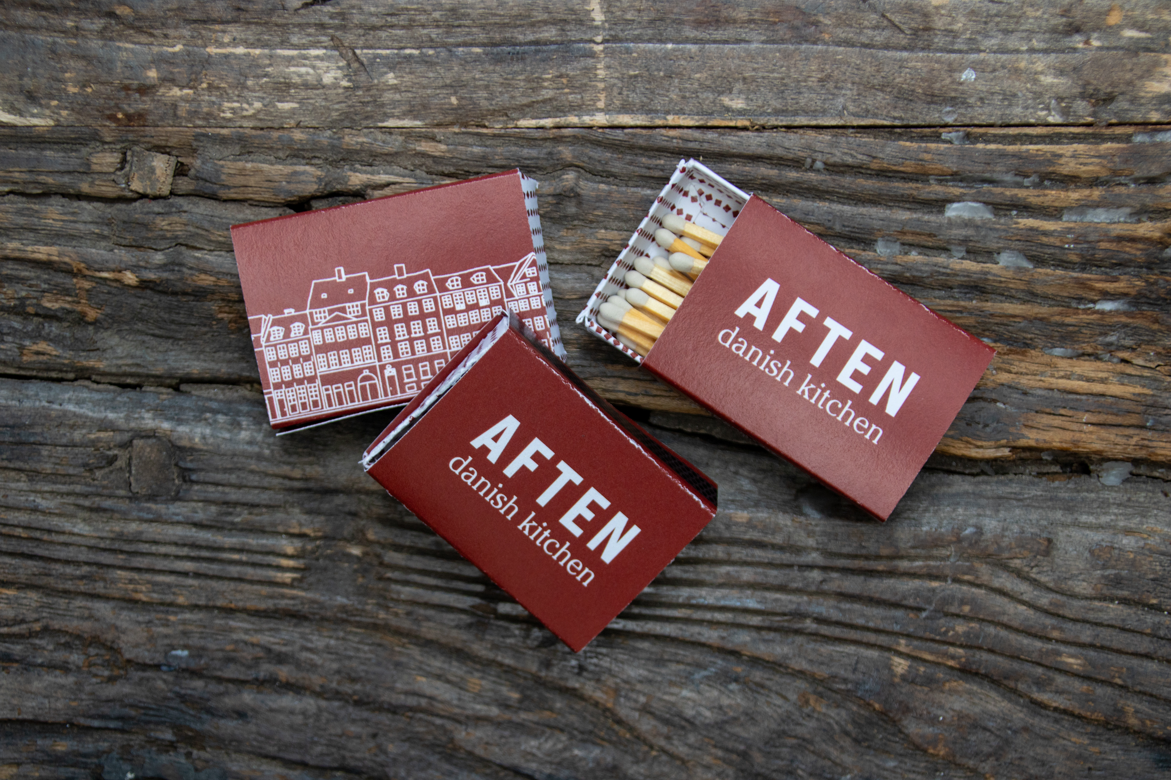
Click to enlarge
Website
Aften's website was created while keeping UI/UX principles center of mind. I began by considering the primary tasks a user would need to complete.
Tasks (in order of importance)
1. View menu
2. Make a reservation
3. View hours
4. View location
5. Contact the restaurant
I used this task list to sketch a wireframe of the website (see right). I kept the two most important tasks, viewing the menu and making a reservation, near the top of the home page and present on every page.
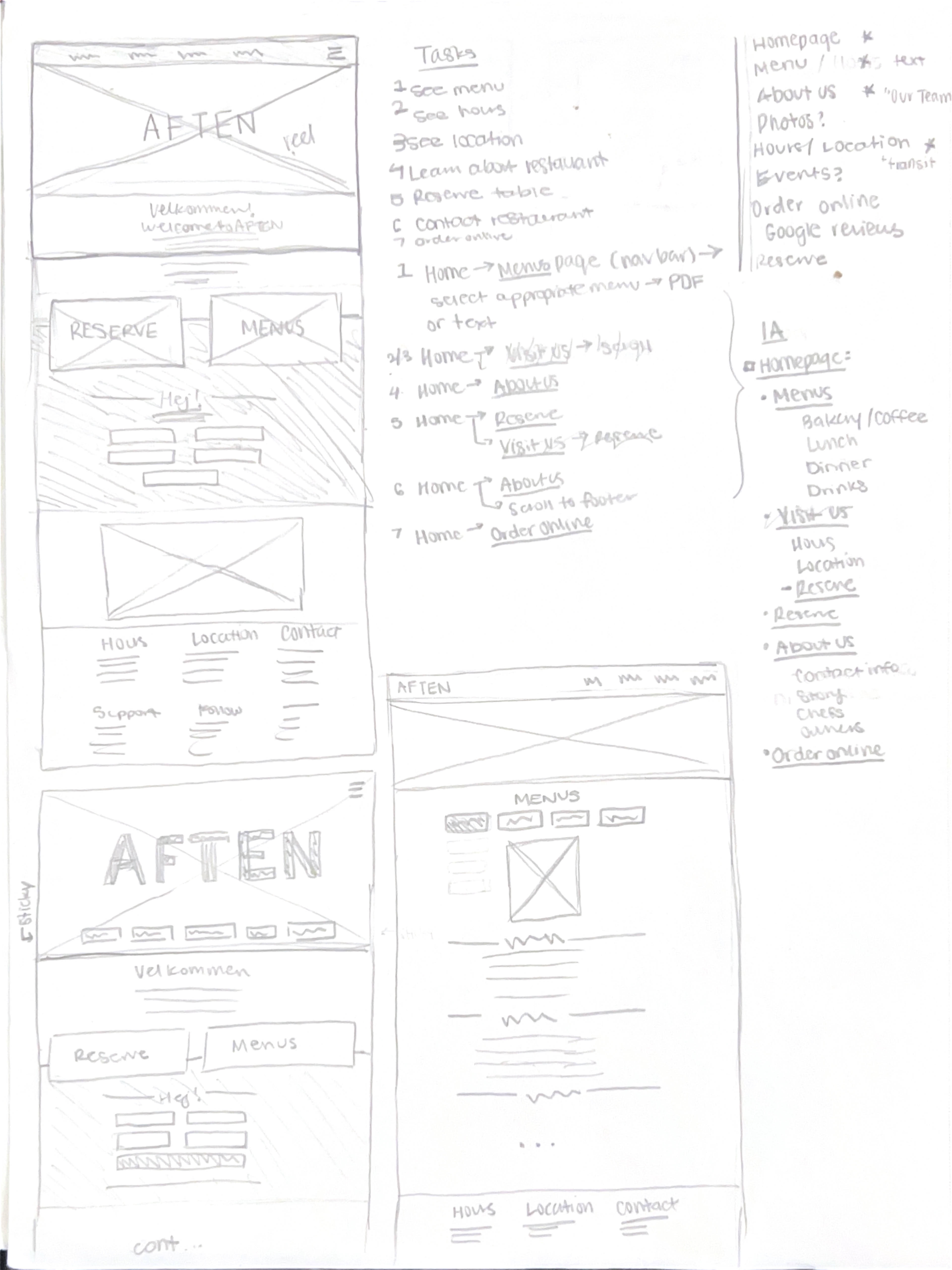
I designed and prototyped the website in Figma.
To view an interactive prototype, click here.
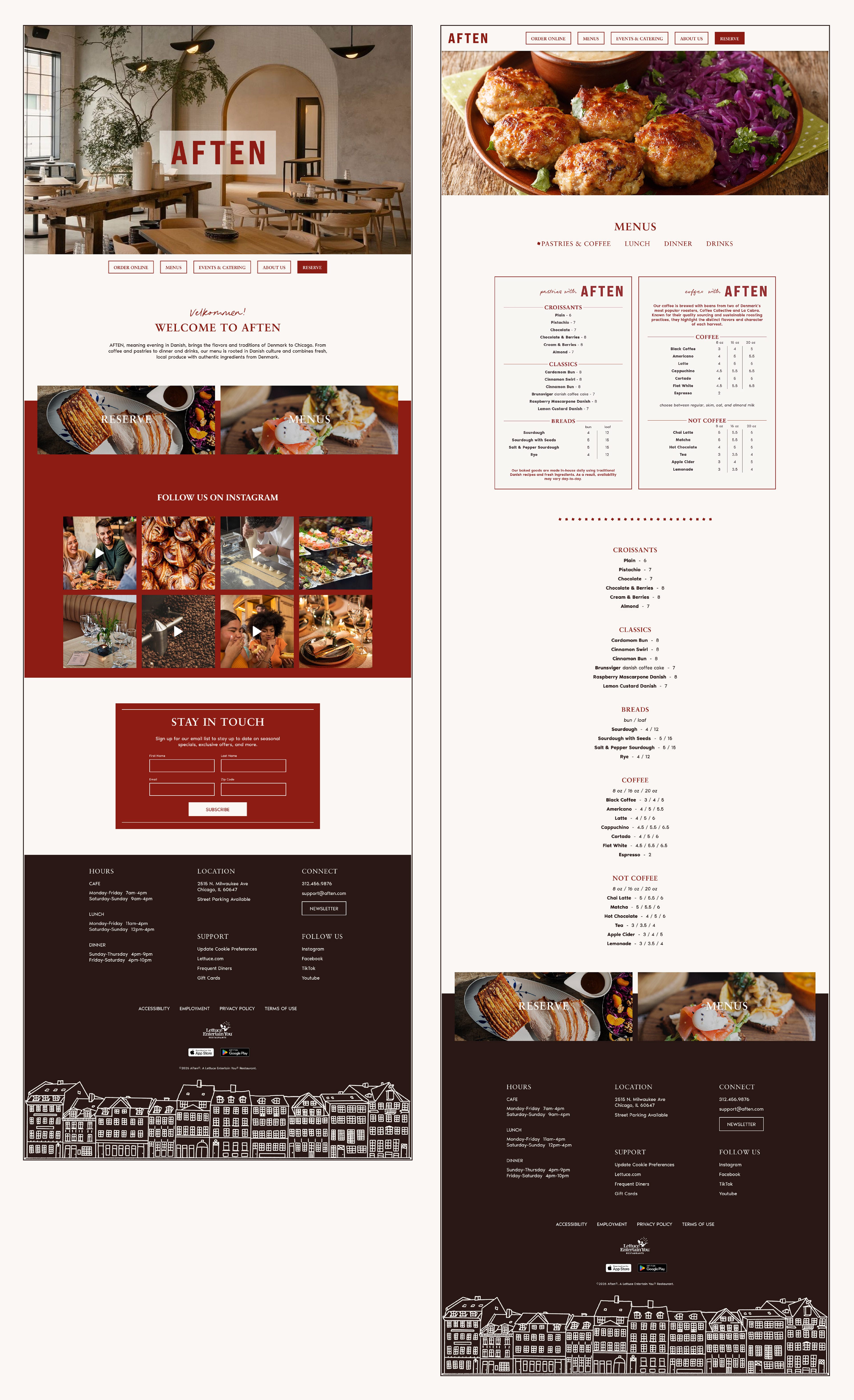
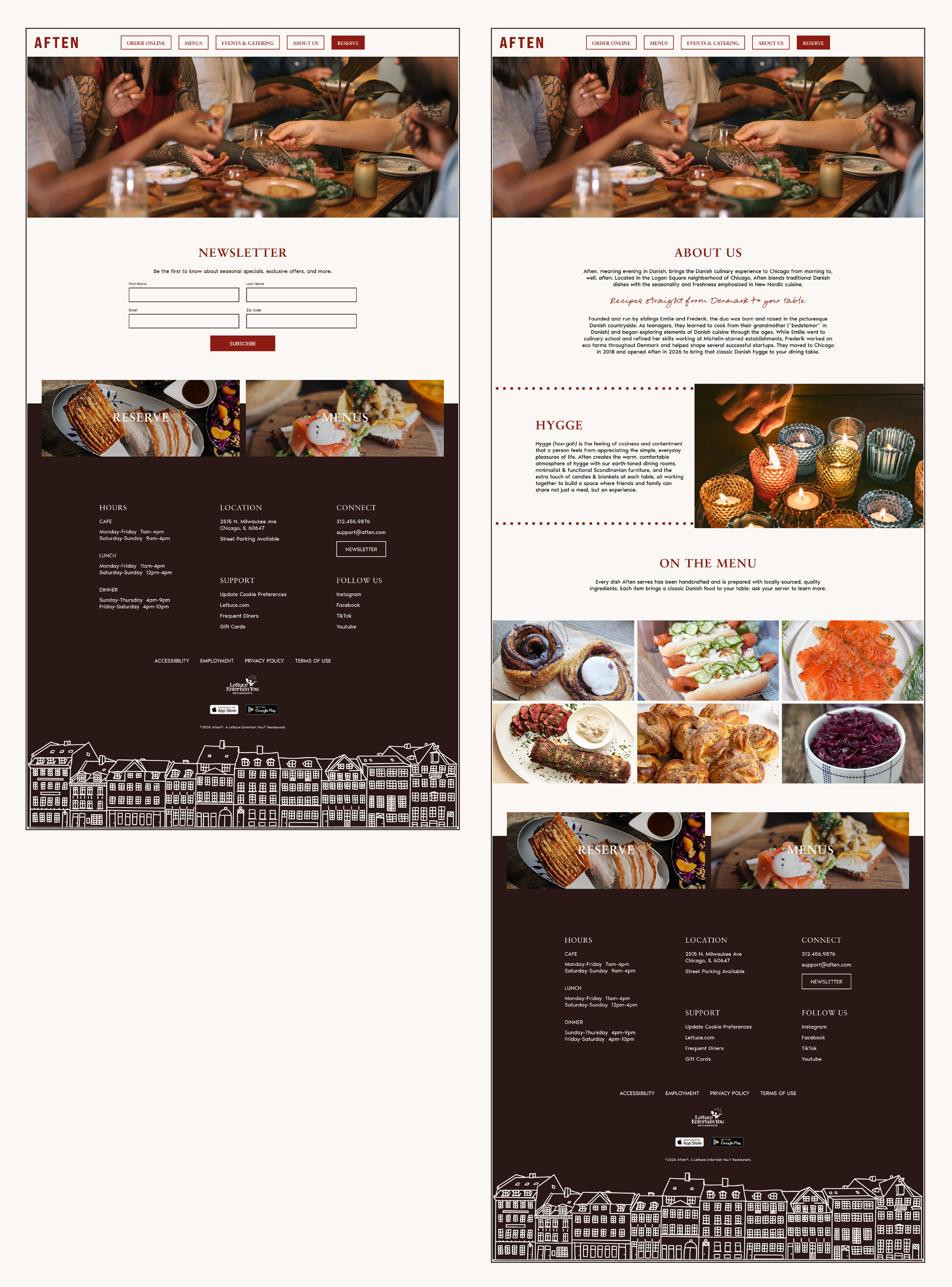
Click to enlarge
This is just a selection of my design process while creating Aften, and highlights some of the bigger decisions I made.