
The goal of this project was to design a visually compelling poster that communicates a single, clear message about a social, environmental, political, or cultural issue.
Brainstorming
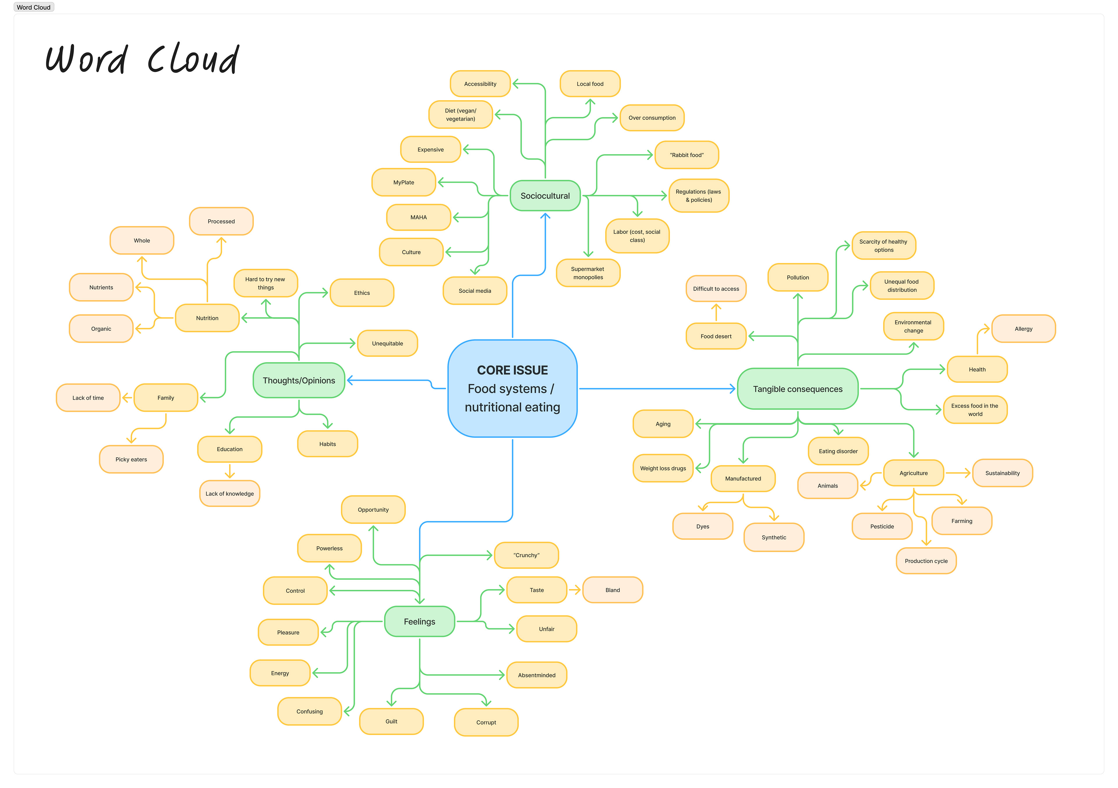
I knew I wanted to focus on nutrition and healthy eating, so I began by brainstorming words related to the topic, no matter how abstract, and organized it into a word cloud.
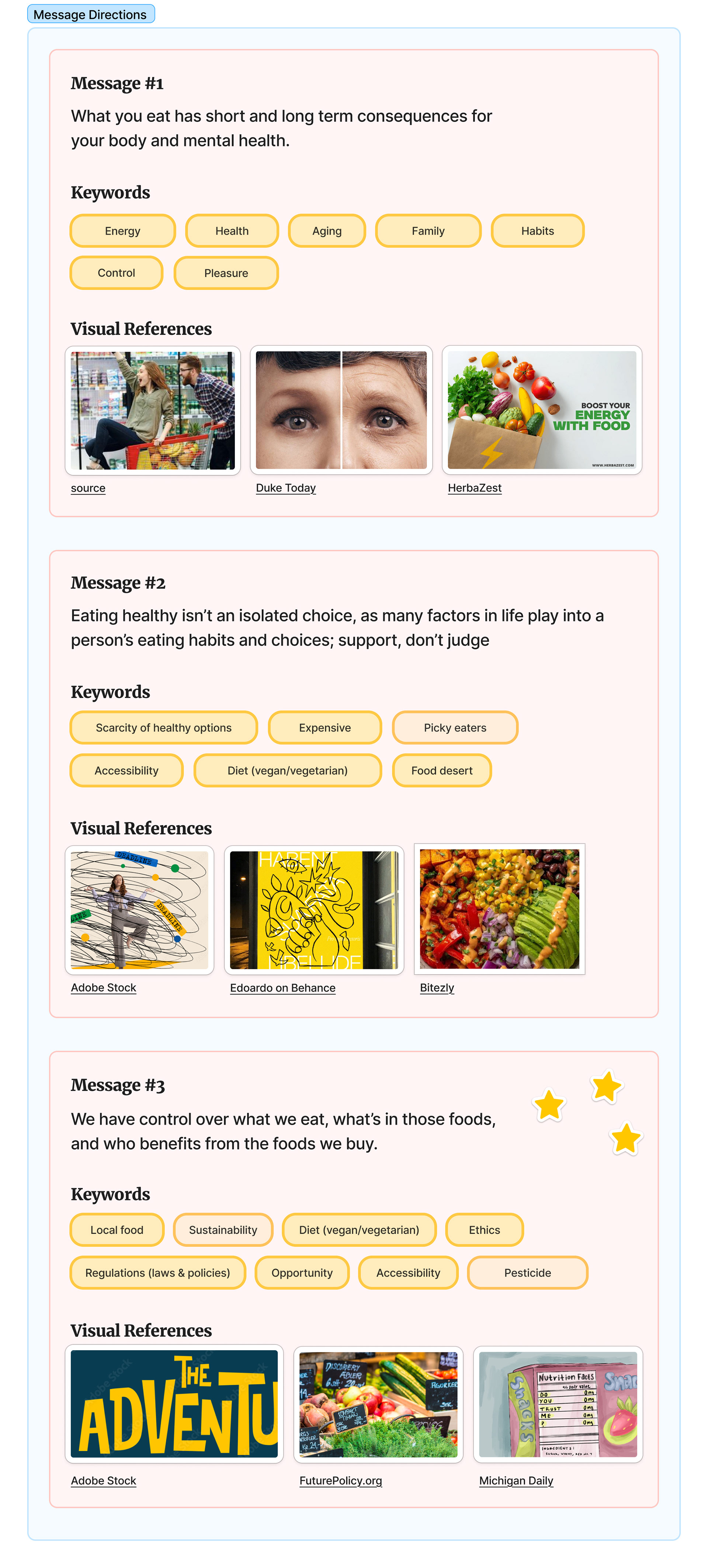
After brainstorming possible messages, I decided moving forward with a variation of #3: Choose to eat fresh, nutritious foods.
I chose this direction for my poster because I wanted to motivate and inspire people to make choices they are proud of. In a world where it can feel like so many bad things are being thrown at us, I wanted to remind people that their choices do matter - no matter how small they might feel.
Word cloud and Message Direction were created in Figma.
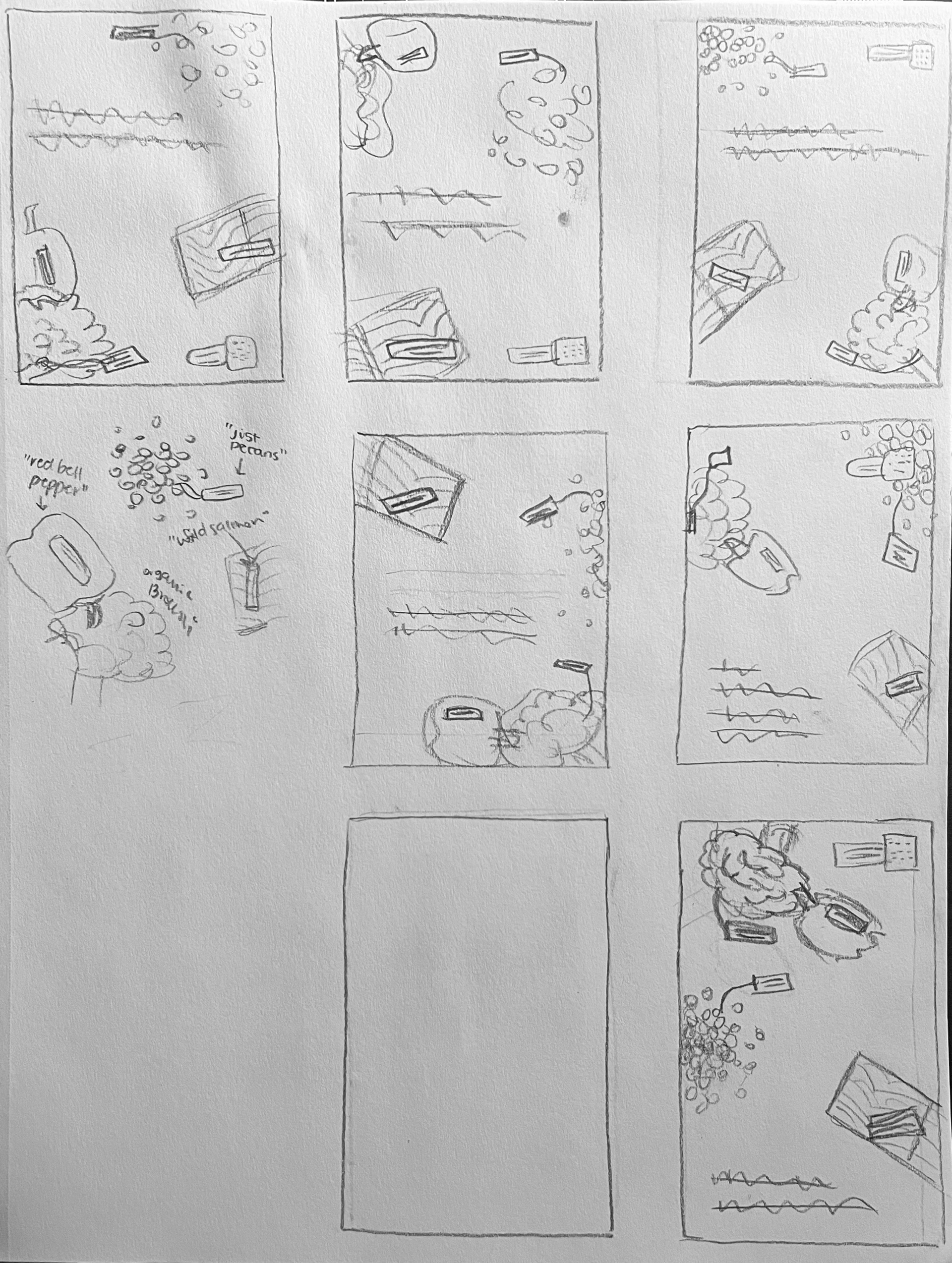
I then sketched thumbnails to explore unusual yet attractive ways to visually convey this message.
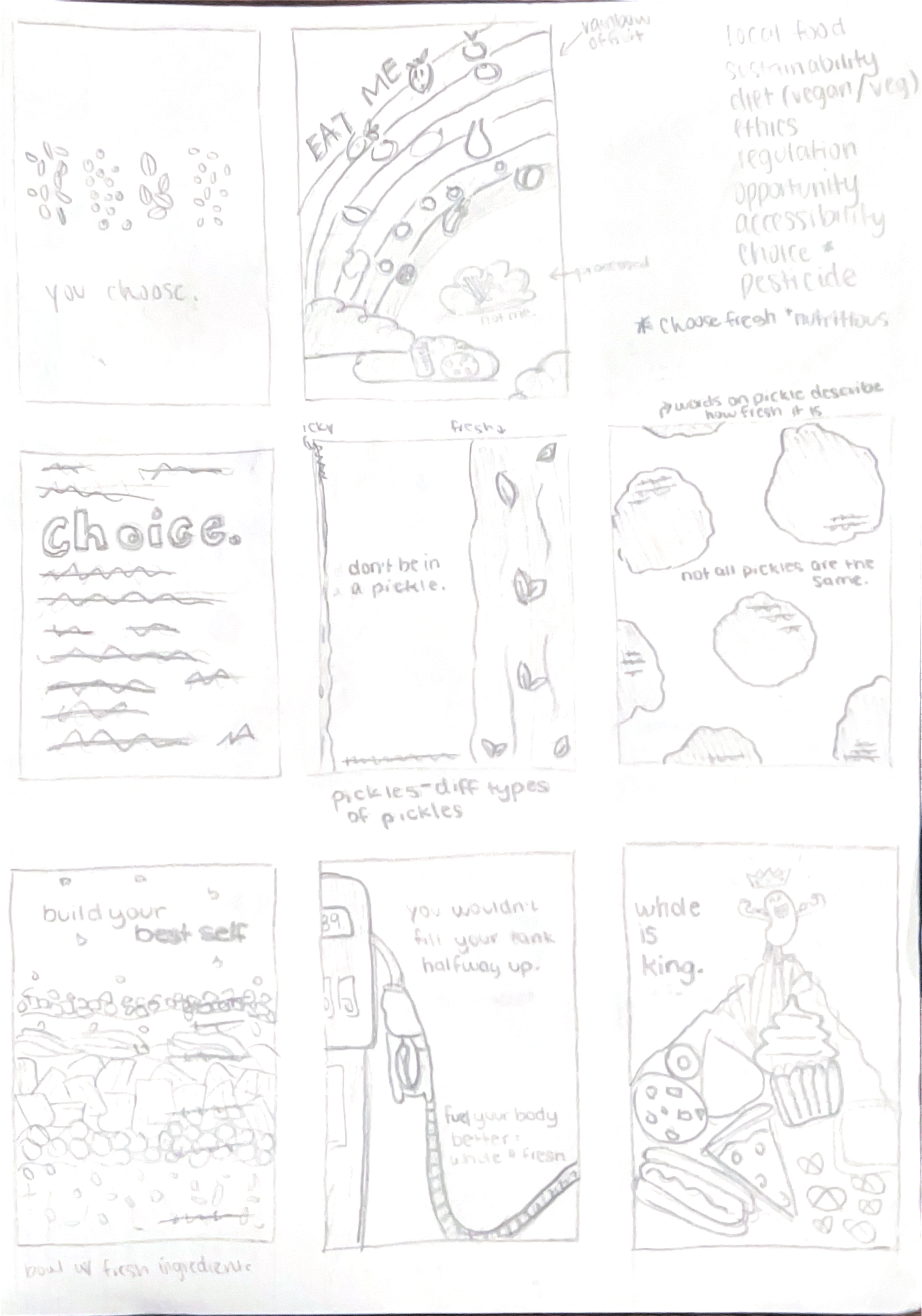
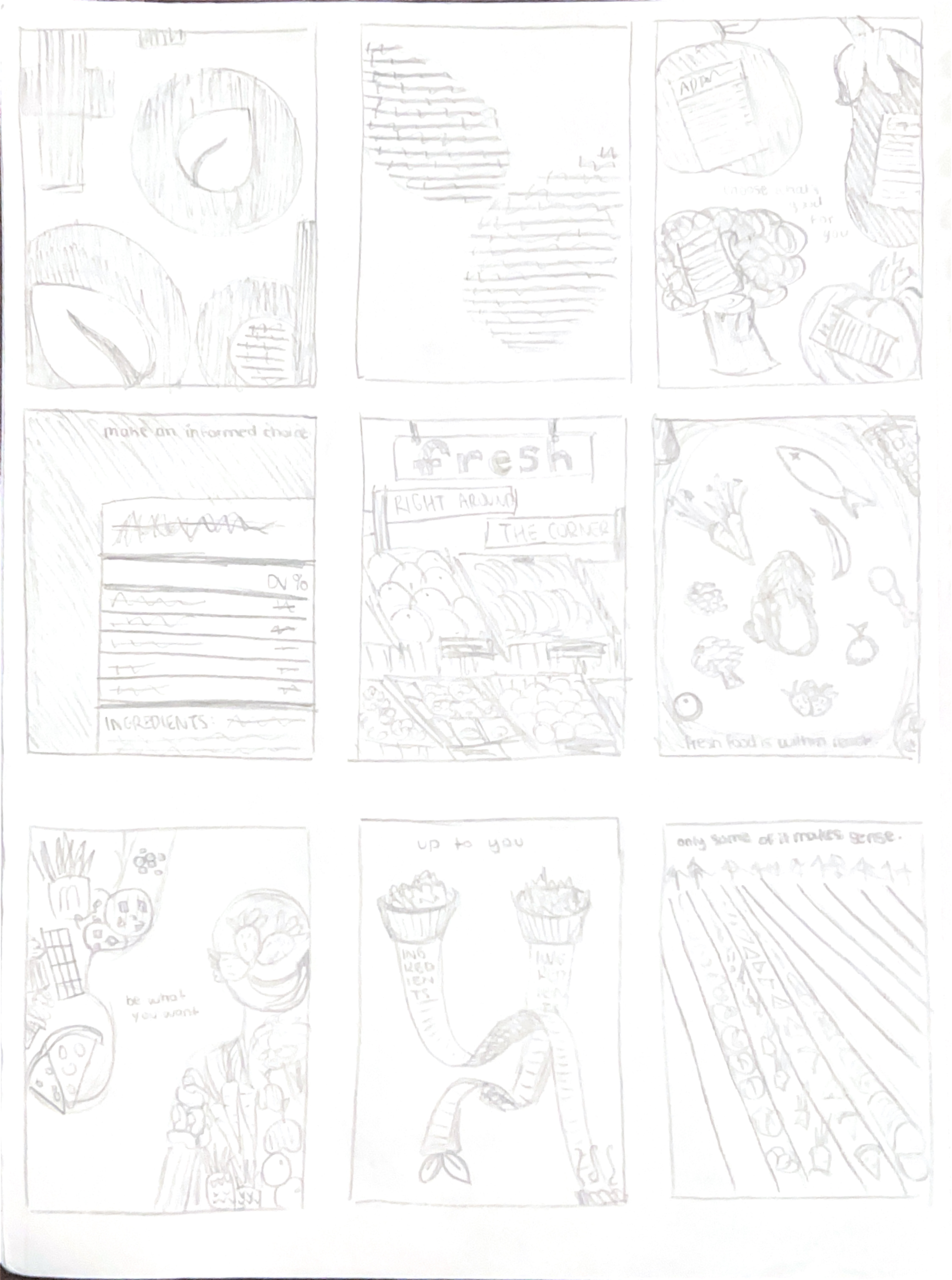
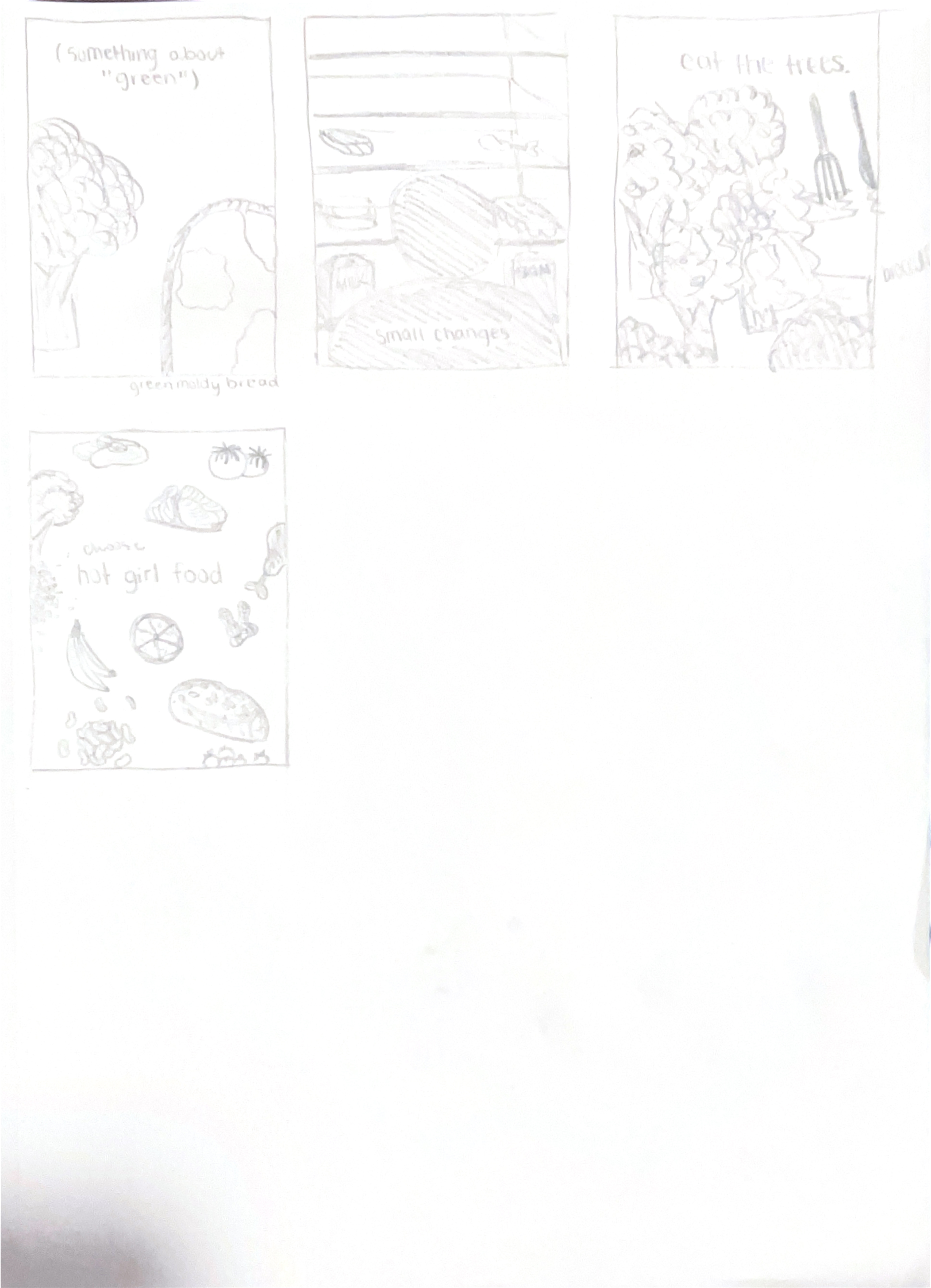
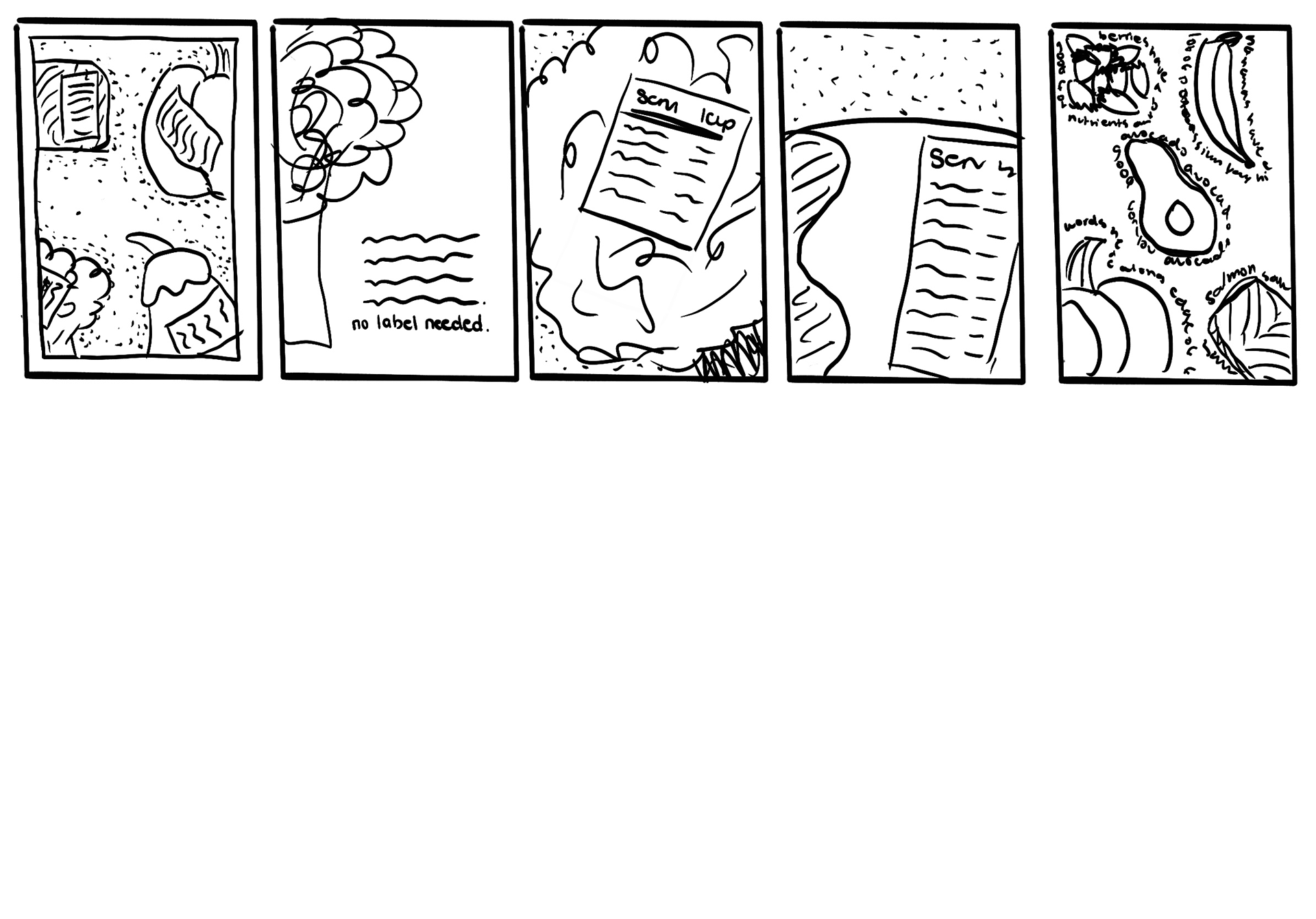
Sketches done digitally in Procreate.
I decided that I was most drawn to the starred thumbnails because these take an uplifting, lighthearted approach to a topic that can feel heavy to many. Choosing fresh, nutritious foods has been proven to be good for a person’s body, and I want my poster come from a place of empowerment, not fear or shame.
These thumbnails approach this topic in a fun way and make healthy eating a choice that is accessible to all. While sketching, I shifted from trying to literally represent choice to showing causes and effects of making healthy choices. Once I got my first thoughts onto paper, I was pushed to continue thinking of new ways to depict my message, which led to some ideas that I love, but took time to uncover.
My message has many nuances: there is research to back up the benefits of eating plant-based foods and whole grains, but a significant amount of caution should be held in sending a message around a nutrition as someone who does not have a background in a related field. I also considered the variety of lived experiences that a viewer could bring, and realized that I wanted to come from this place of encouragement, empowerment, and fun that I mentioned earlier. Through variation while thumbnailing, I became better at balancing these nuances and shifted the tone of my message to relate to an actual viewer.
Research
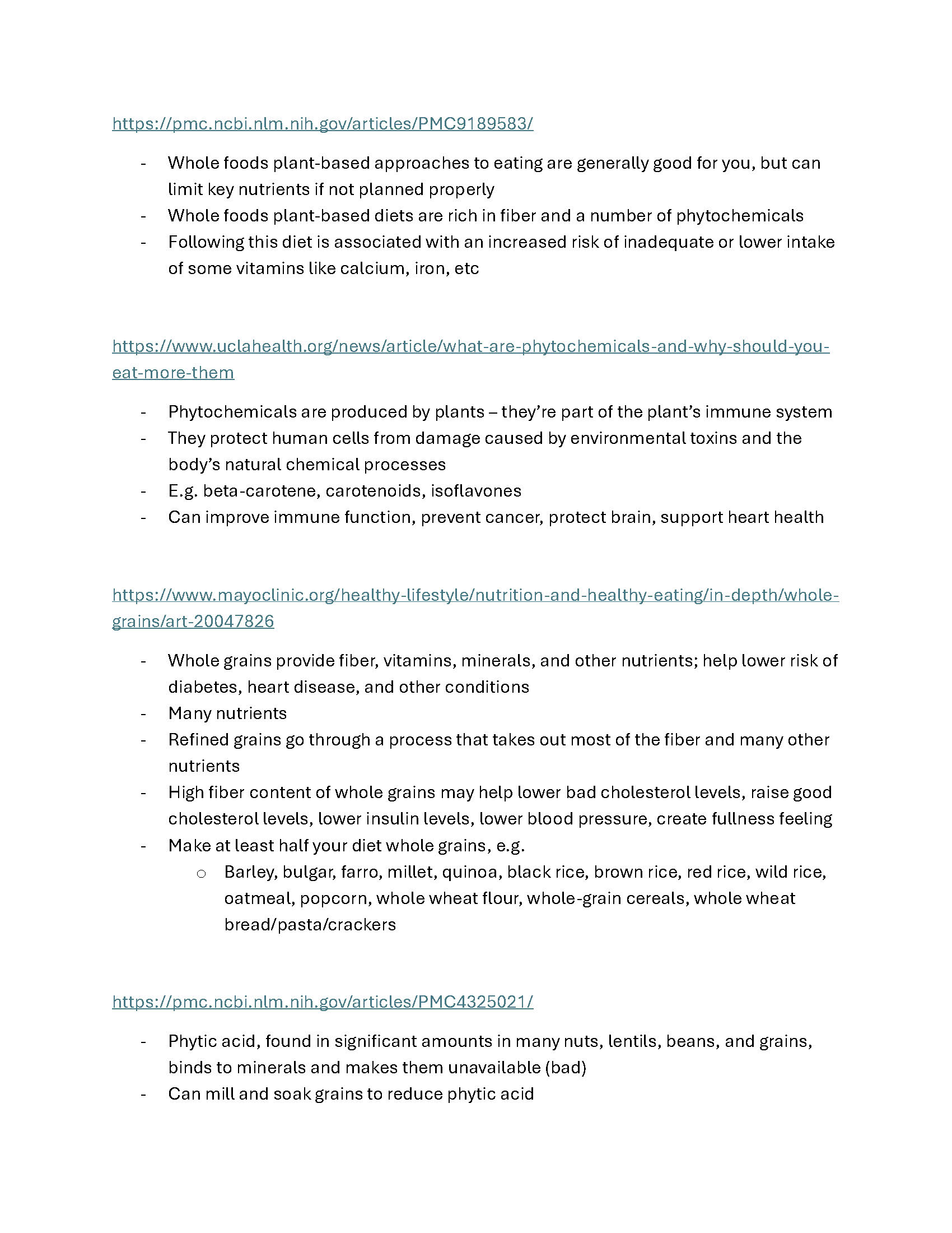
As this topic is one that can affect a person's health and I am not a registered dietician, I did some research to ensure that what I was promoting was backed up by science.
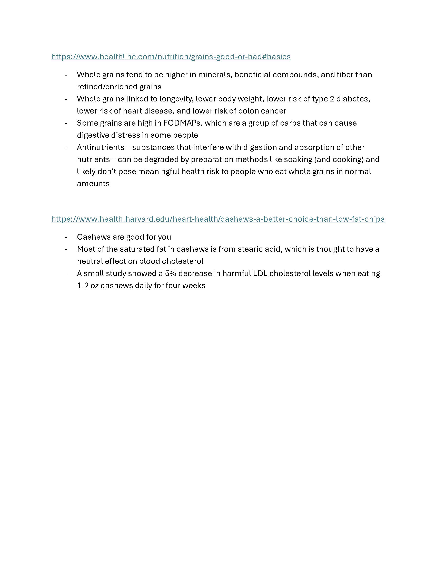
Screenshots of my research on nutrition and healthy eating
My first draft utilized nutrition labels hidden under the food items. While making these, I used verified nutrition databases to check serving sizes and nutritional content.
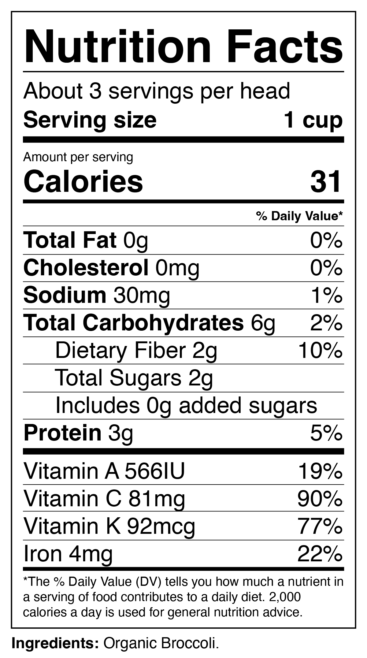
Broccoli Nutrition Label
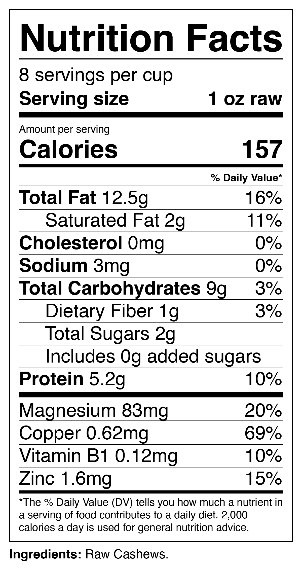
Cashew Nutrition Label
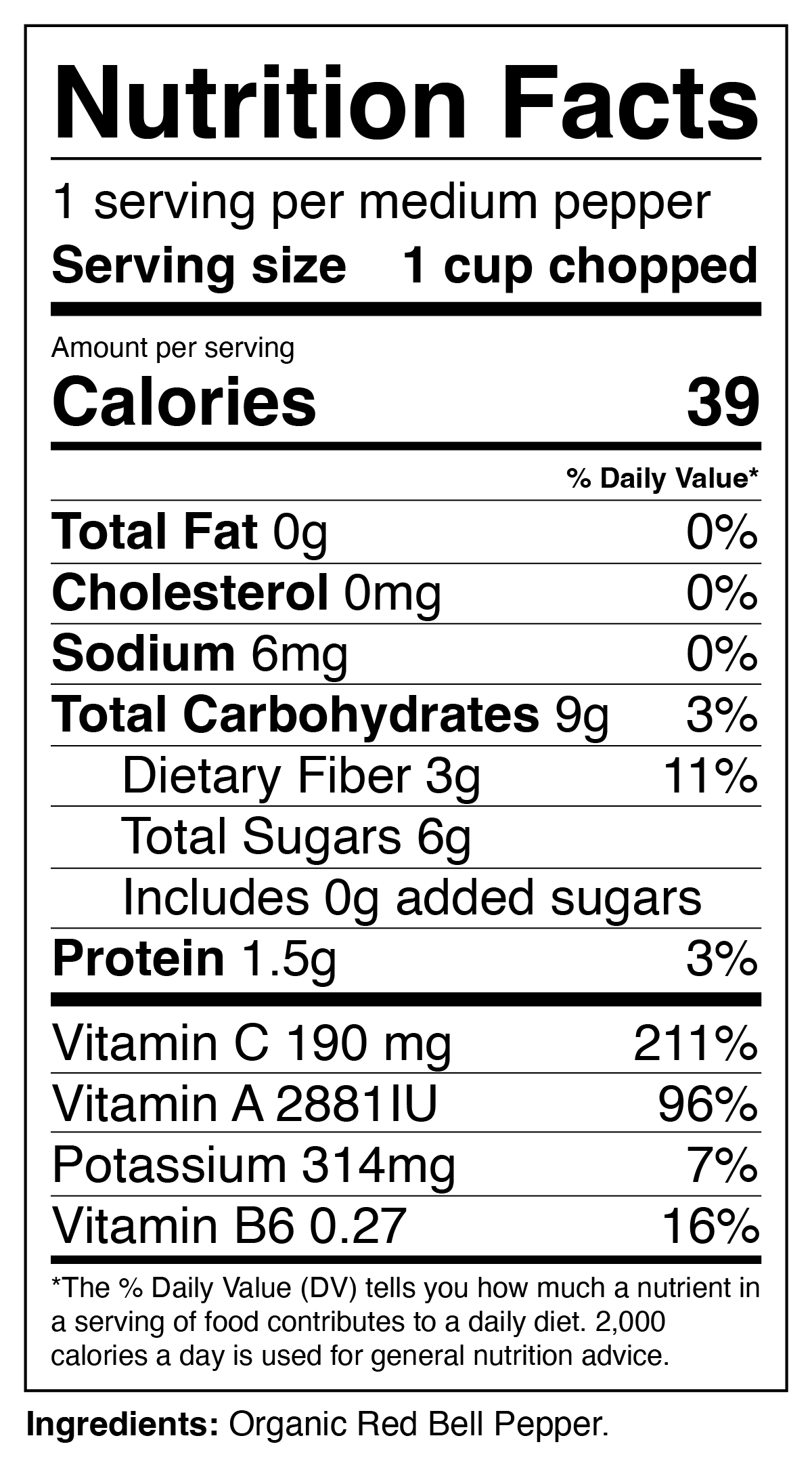
Red Bell Pepper Nutrition Label
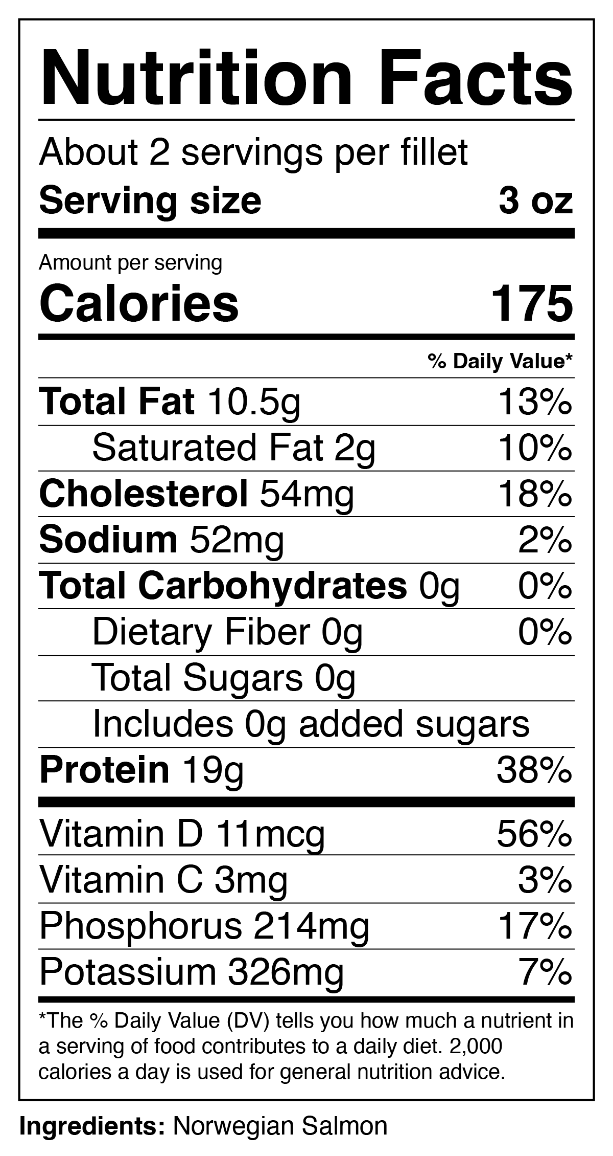
Salmon Nutrition Label
Created in Adobe Illustrator.
Digital Manipulation - First Draft
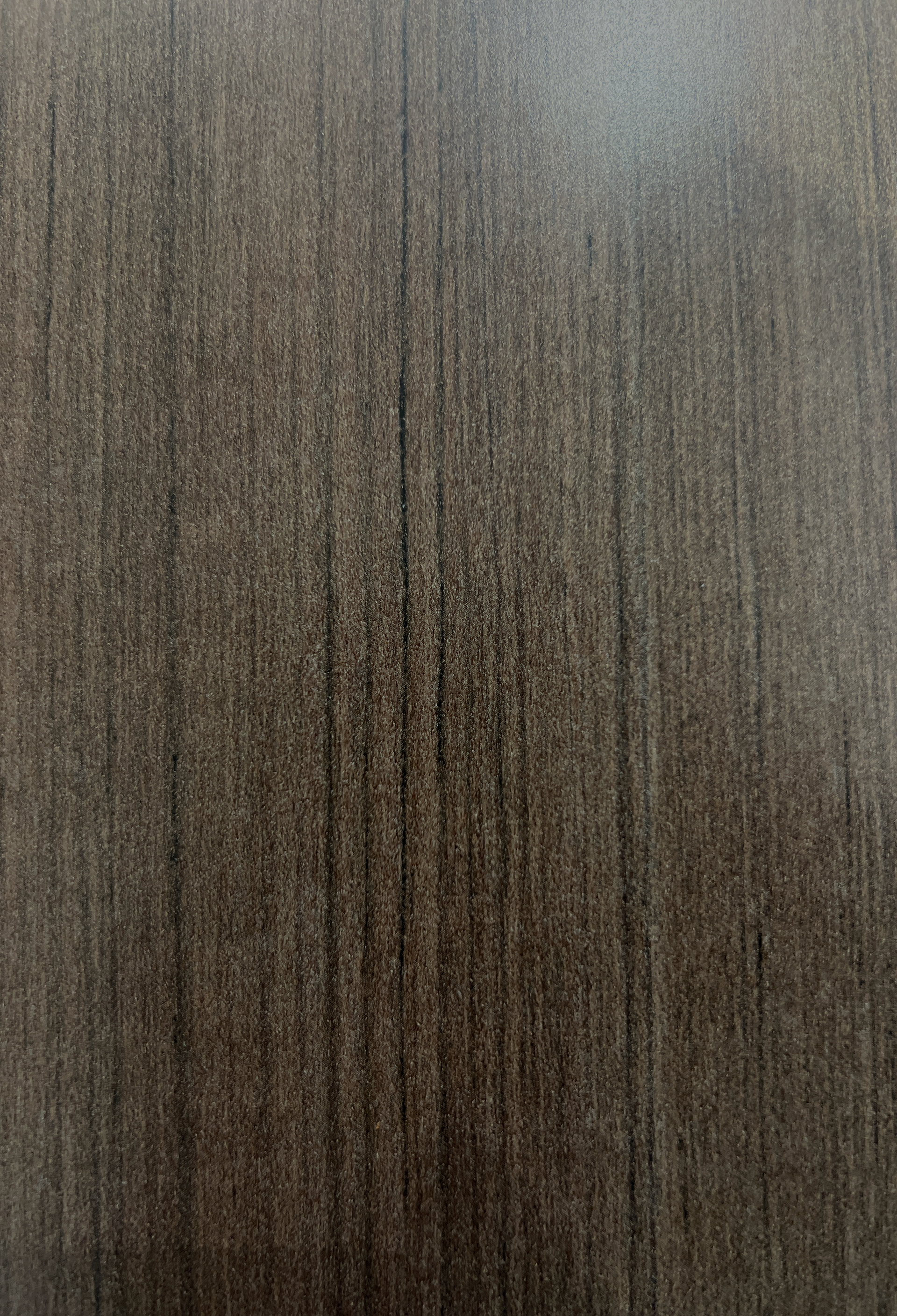
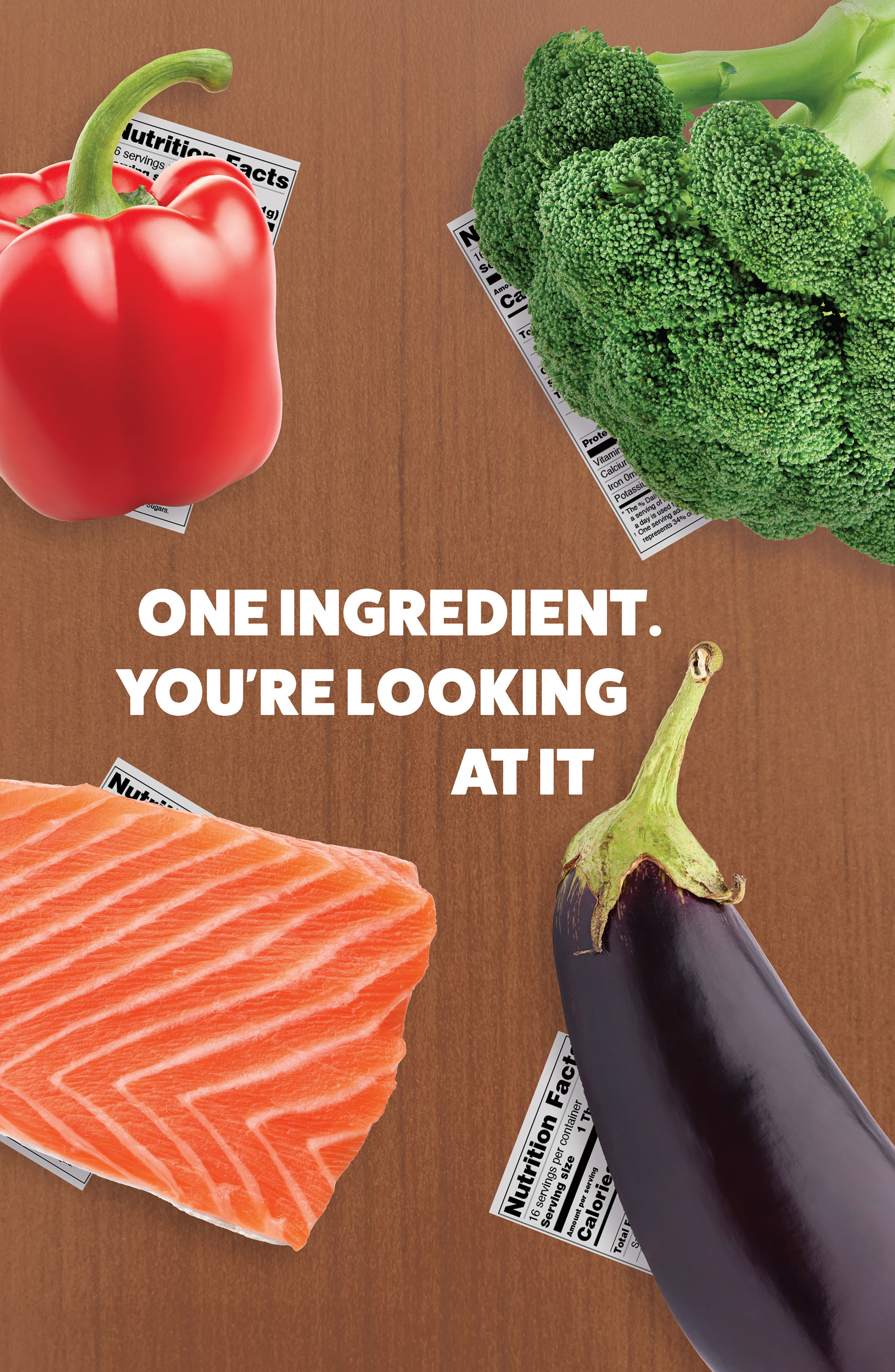
The background of the first draft poster uses a wood texture that I found in the world around me, photographed, and edited in Photoshop.
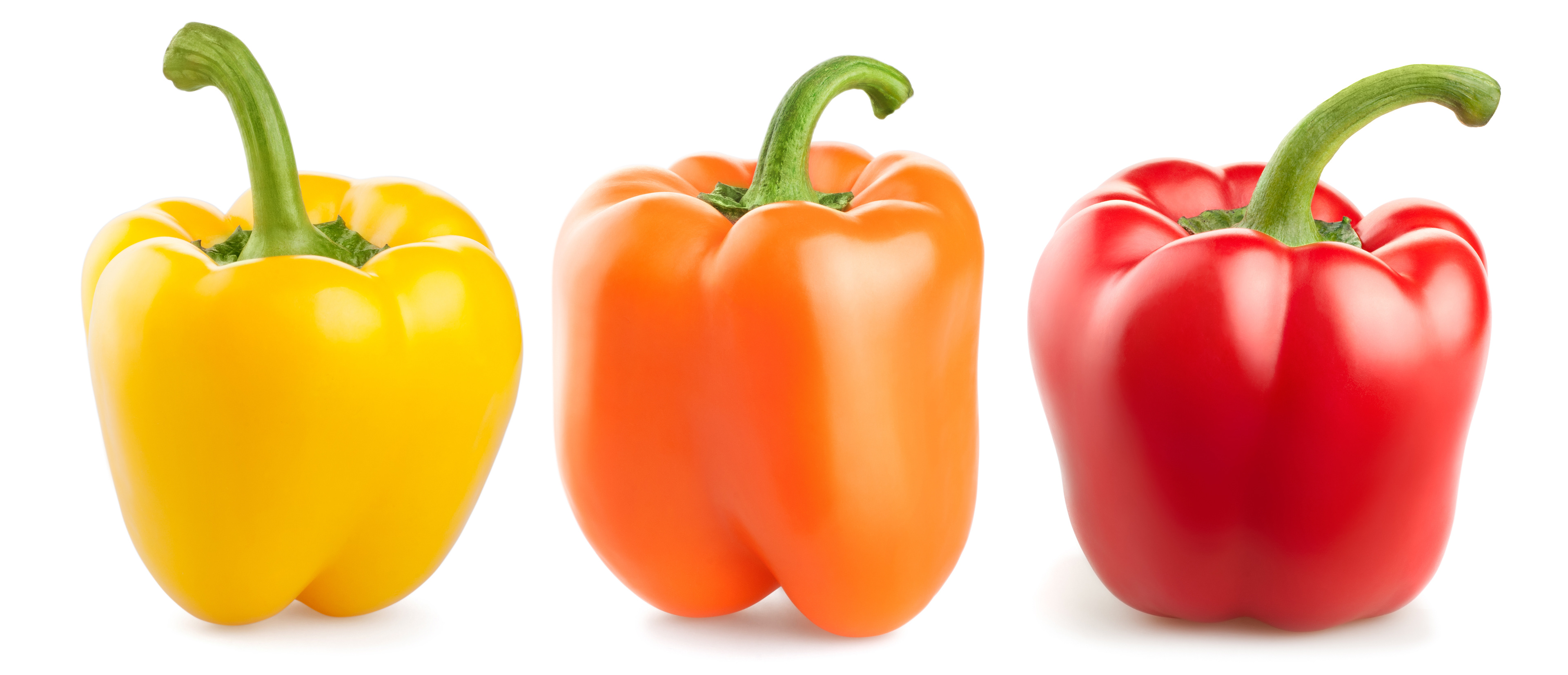
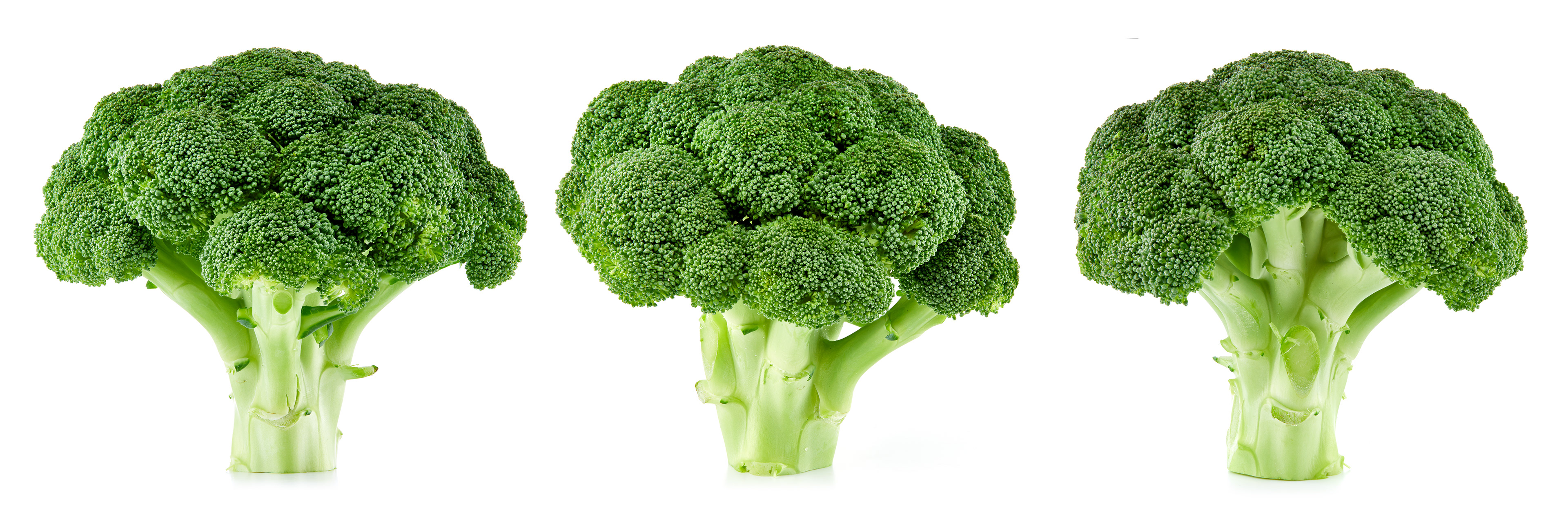
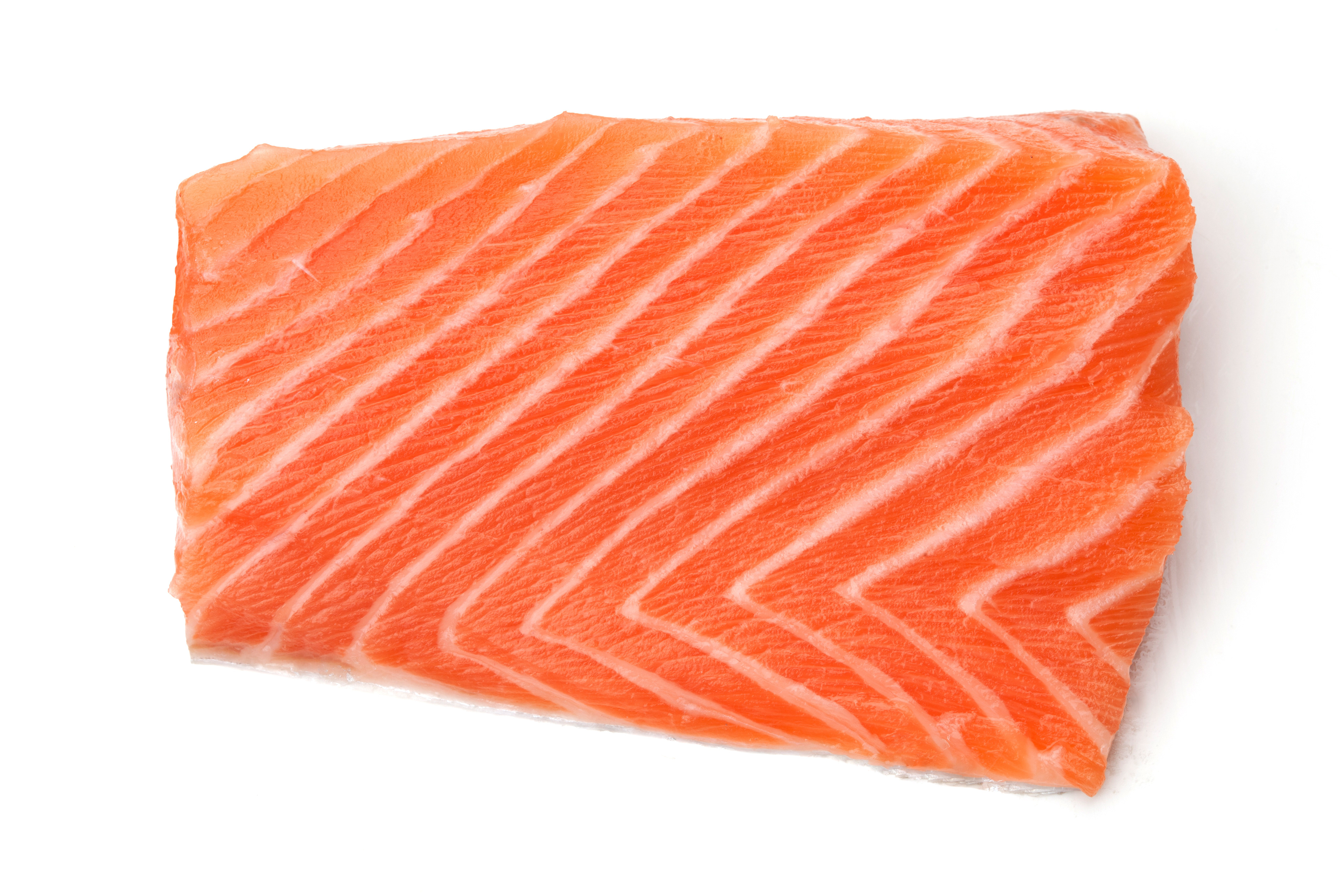
The food items on the first draft poster are Adobe Stock images that I cut out, edited, and added effects to.
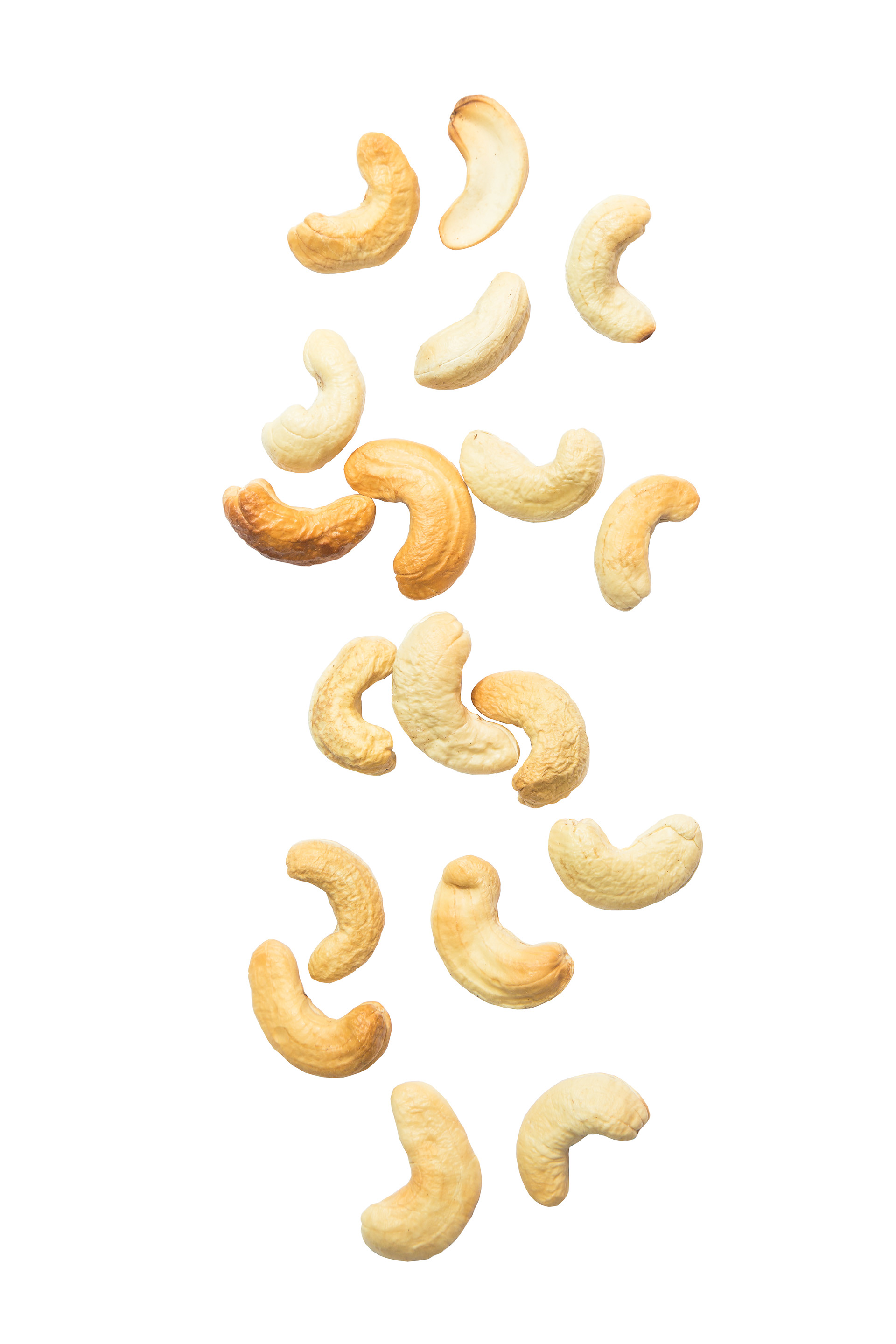
This image was the one I most significantly manipulated. I cut out each individual cashew, duplicated and rearranged them to give the effect of a pile of cashews.
Early Versions
As I worked digitally, the poster evolved from my original sketch. I kept in mind my main message: choose to eat fresh, nutritious foods. I tried things that did not end up working out, like including an eye-catching border. It unfortunately was more of an eyesore.
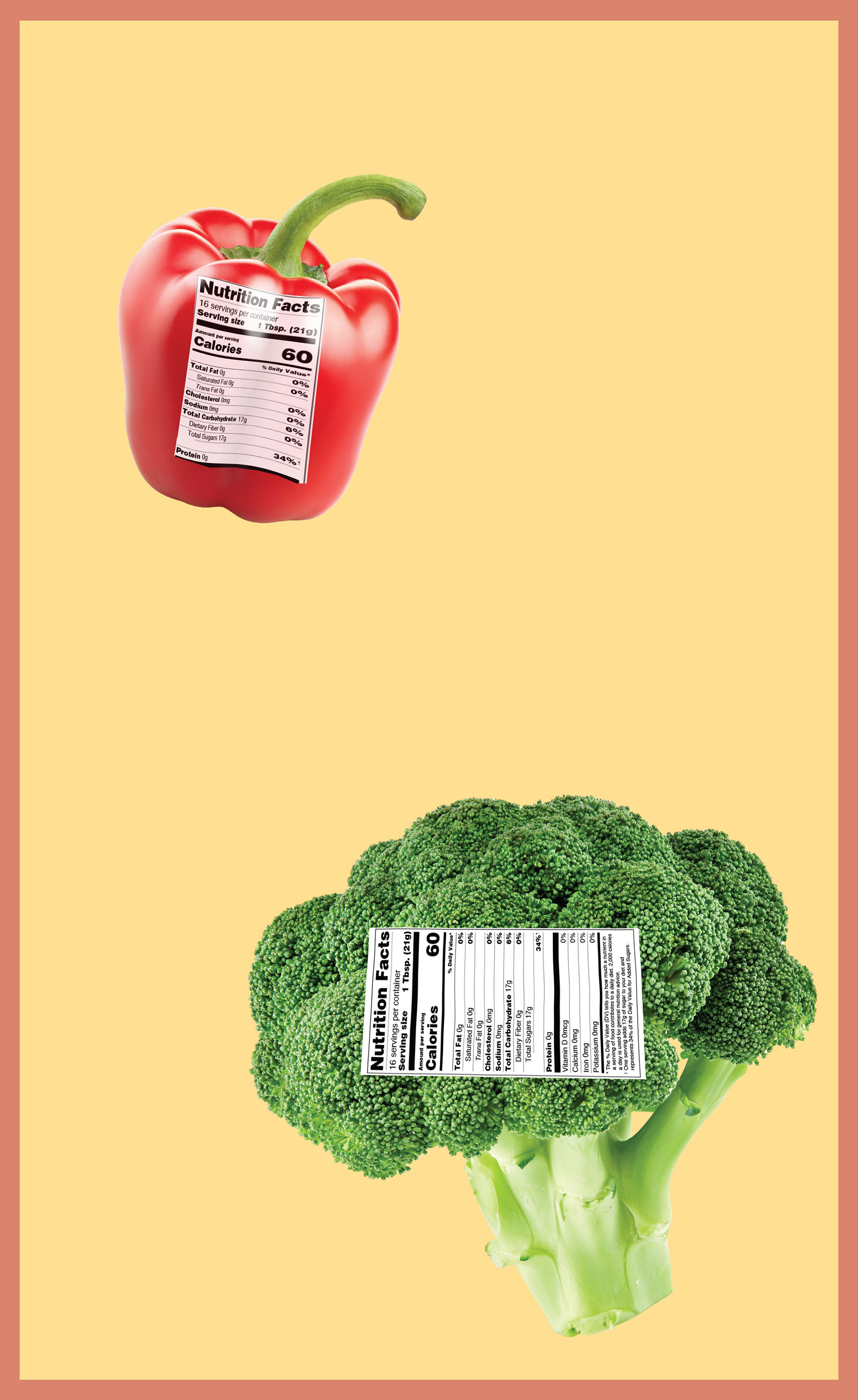
My original idea was to overlay nutrition labels on foods.
I played around with adding an eye-catching border.
Almost there. Working on the main text and details like shading.
Image captions have some further details.
I had a significant "aha!" moment when I decided to move the nutrition label under the food instead of on top of it.
This decision came after realizing that I was trying to communicate that these foods I selected are good for you in a variety of ways, providing healthy fats, vitamins, protein and minerals. Instead of including nutrition labels that are often associated with the stress of calorie counting, I hid them, emphasizing that for these foods, you do not need to read the label because you know they are beneficial for your body.
The first draft poster.
Revisions
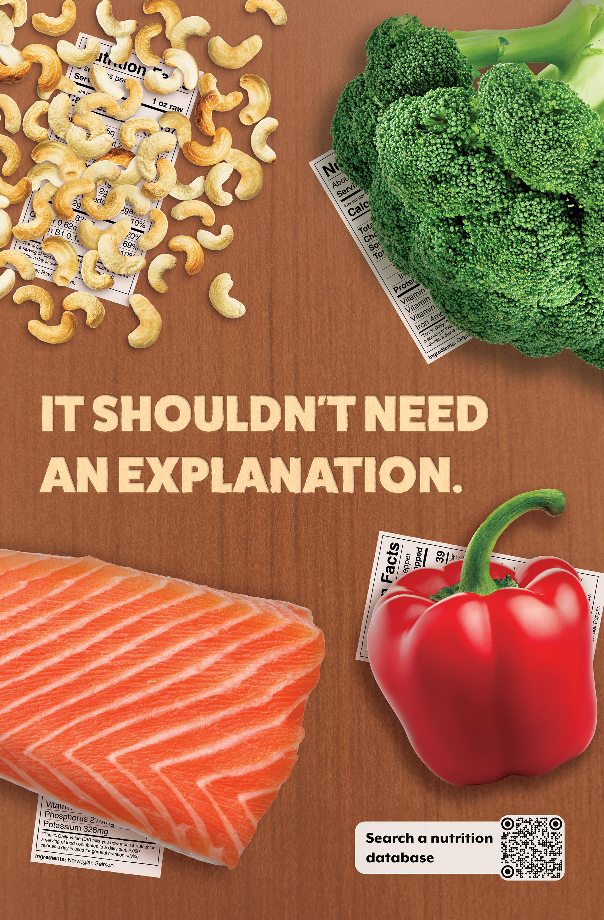
I received feedback that helped me tighten up my poster. One of the bigger comments was that, despite the food items being real and not digitally designed, the poster did not feel real.
I decided to go back and get more hands-on. I purchased the food items at the store and, using natural midday lighting, took photos of them myself. I also felt that the background was flat, despite being original, so I rephotographed it.
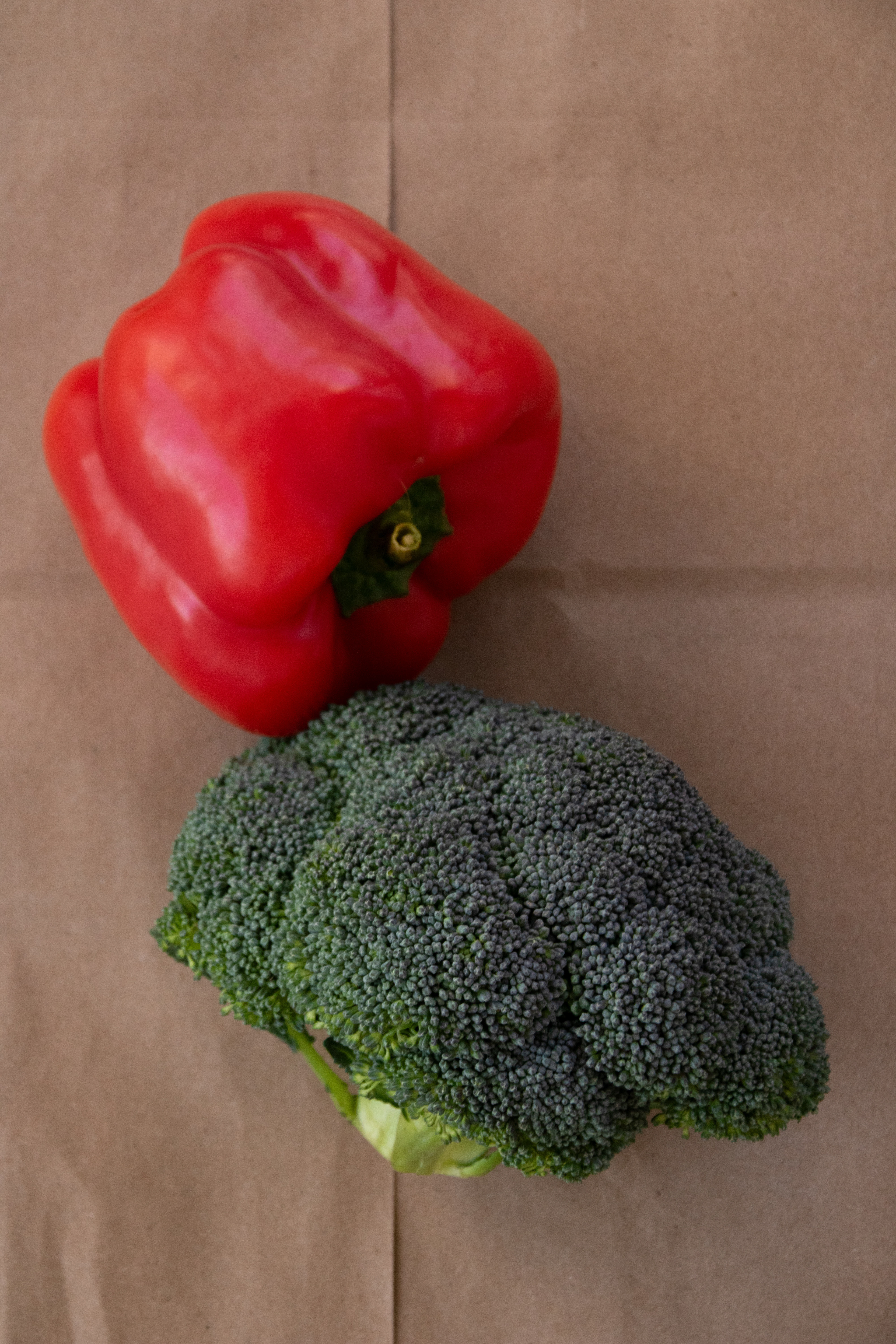
I took many photos of the pepper and broccoli separately, but decided to combine them because three groups of items is more visually appealing on the poster than 1 item in all four corners.

I switched to walnuts because I already had them in my cabinet.
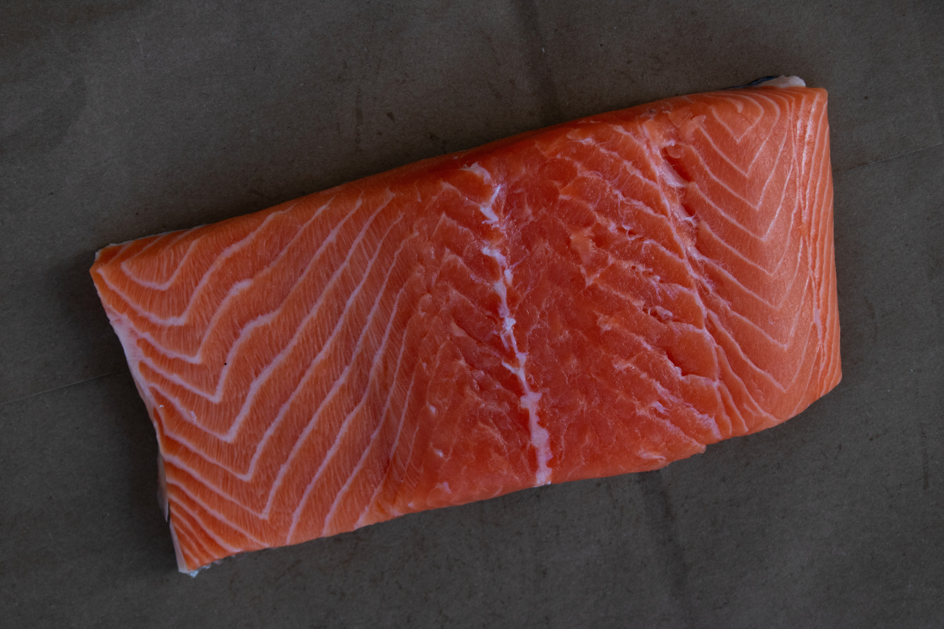
Salmon fillet. It did not go to waste after being used in the photoshoot.
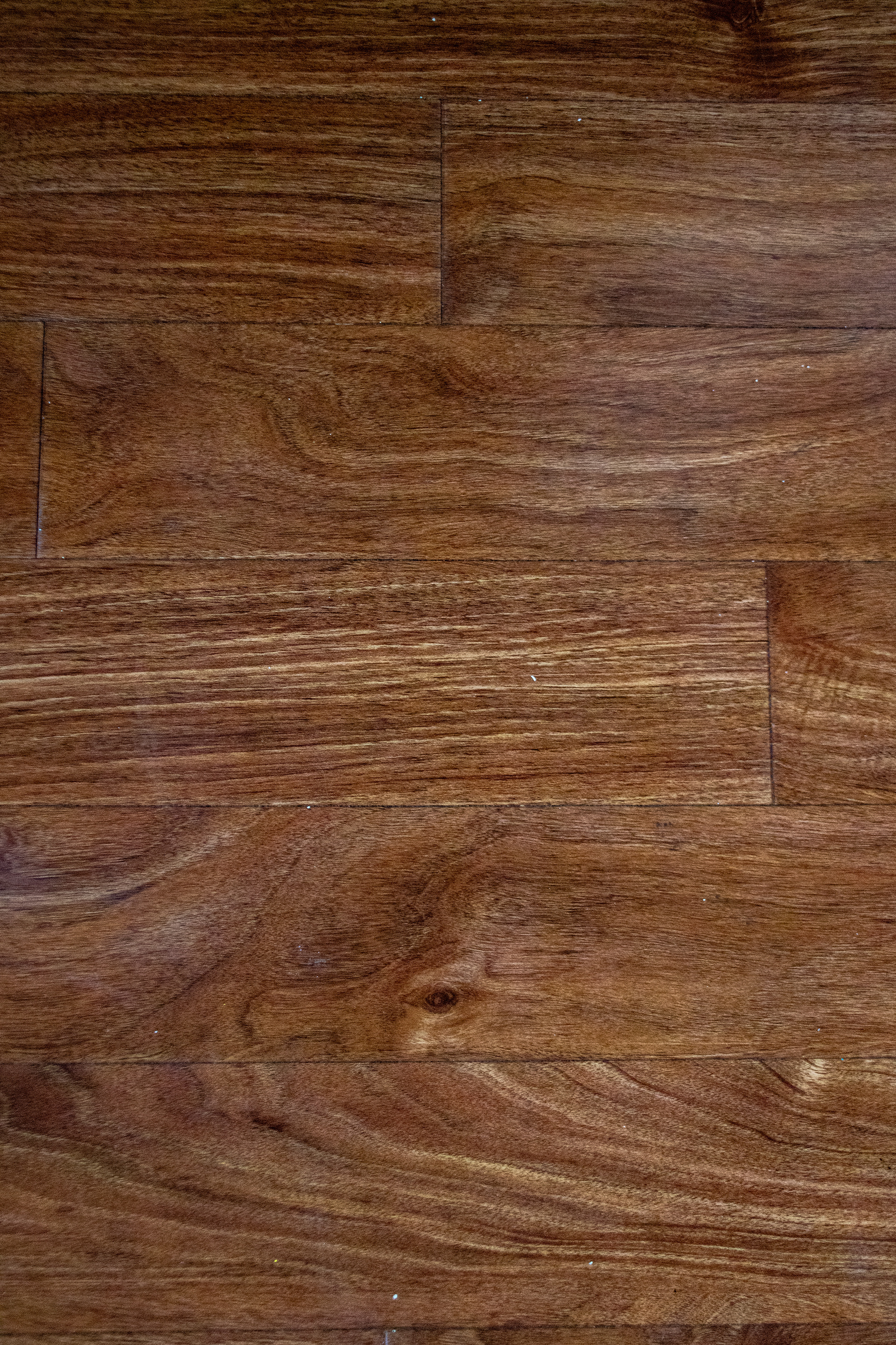
New background
New photographs before being edited in Photoshop. Click on each image for further details.
Another piece of feedback I was given was to rethink the layout and avoid the 4-corners I unintentionally did on the first draft. I had the elements I wanted to work with, and I went back to my sketchbook to try out different layouts.
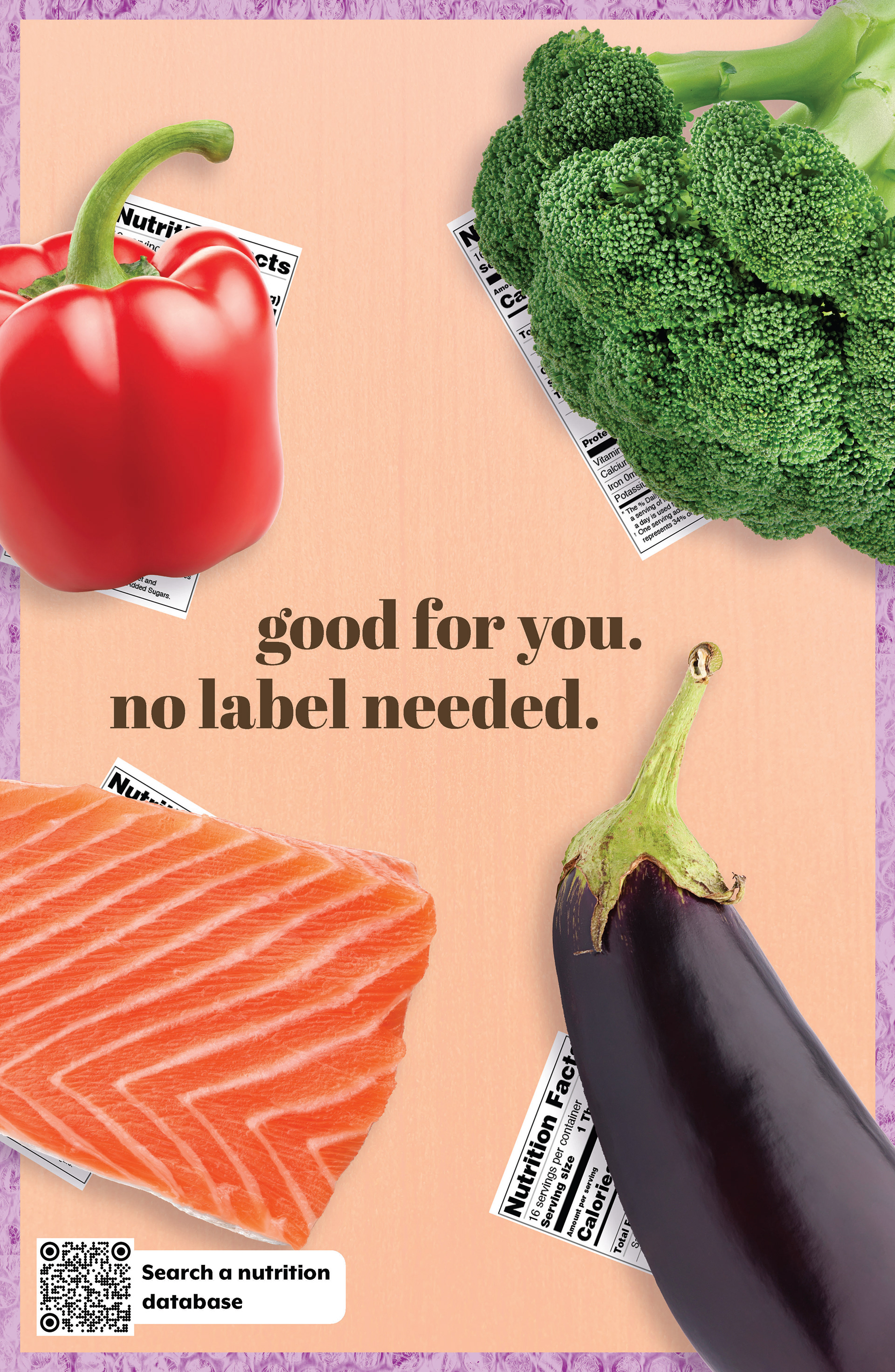
My original idea of putting the nutrition label under the food to communicate "you don't need to read all of this!" was perceived more as the food trying to hide what was in it - exactly the opposite of what I wanted! I decided to simply mark each food with its name, and let the tagline do the rest.
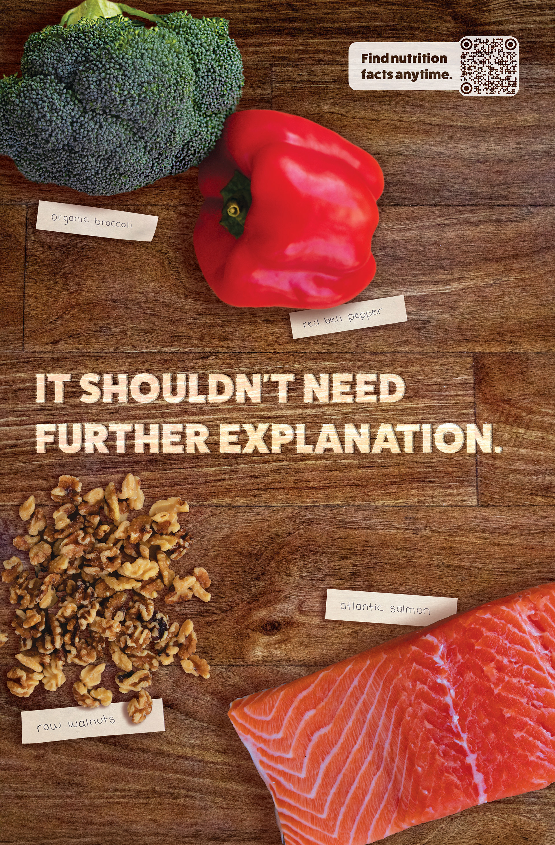
The Final Product
My final poster synthesized these changes to ensure that my message is clearly communicated and the poster is visually cohesive and compelling.
Sticky notes, handwritten and brought in digitally, were used to label each food in a way that feels casual yet is still clean. I settled on this because I want to empower people to choose to eat fresh, nutritious foods and incorporate into their lives in a way that's realistic for them.
AI Disclosure: Photoshop's Generative AI tool was used to extend the wood grain pattern along the top & bottom of the poster by no more than 0.5", as the original was about 1" too short. It was also used to clean up the background. Claude was used to assist in brainstorming taglines, although the final text was something I came up with.